DockedSearchBar
Composable Component
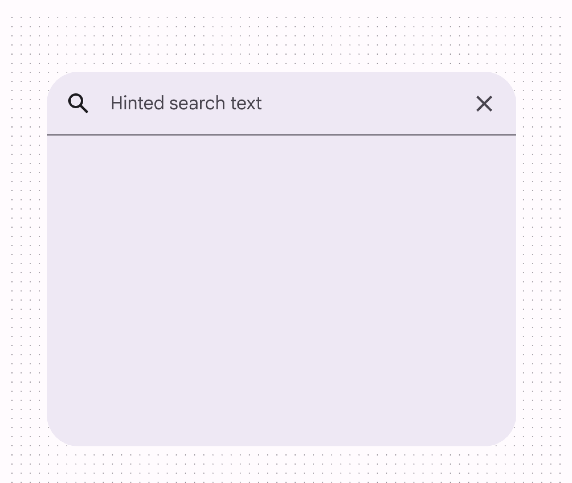
A search bar represents a floating search field that allows users to enter a keyword or phrase and get relevant information. It can be used as a way to navigate through an app via search queries.
Common
@ExperimentalMaterial3Api
@Composable
fun DockedSearchBar(
    inputField: @Composable () -> Unit,
    expanded: Boolean,
    onExpandedChange: (Boolean) -> Unit,
    modifier: Modifier = Modifier,
    shape: Shape = SearchBarDefaults.dockedShape,
    colors: SearchBarColors = SearchBarDefaults.colors(),
    tonalElevation: Dp = SearchBarDefaults.TonalElevation,
    shadowElevation: Dp = SearchBarDefaults.ShadowElevation,
    content: @Composable ColumnScope.() -> Unit,
)
Parameters
| inputField | the input field of this search bar that allows entering a query, typically a SearchBarDefaults.InputField. |
| expanded | whether this search bar is expanded and showing search results. |
| onExpandedChange | the callback to be invoked when this search bar's expanded state is changed. |
| modifier | the Modifier to be applied to this search bar. |
| shape | the shape of this search bar. |
| colors | SearchBarColors that will be used to resolve the colors used for this search bar in different states. See SearchBarDefaults.colors. |
| tonalElevation | when SearchBarColors.containerColor is ColorScheme.surface, a translucent primary color overlay is applied on top of the container. A higher tonal elevation value will result in a darker color in light theme and lighter color in dark theme. See also: Surface. |
| shadowElevation | the elevation for the shadow below the search bar. |
| content | the content of this search bar to display search results below the inputField. |
Common
Deprecated Use overload which takes inputField as a parameter
@ExperimentalMaterial3Api
@Composable
fun DockedSearchBar(
    query: String,
    onQueryChange: (String) -> Unit,
    onSearch: (String) -> Unit,
    active: Boolean,
    onActiveChange: (Boolean) -> Unit,
    modifier: Modifier = Modifier,
    enabled: Boolean = true,
    placeholder: @Composable (() -> Unit)? = null,
    leadingIcon: @Composable (() -> Unit)? = null,
    trailingIcon: @Composable (() -> Unit)? = null,
    shape: Shape = SearchBarDefaults.dockedShape,
    colors: SearchBarColors = SearchBarDefaults.colors(),
    tonalElevation: Dp = SearchBarDefaults.TonalElevation,
    shadowElevation: Dp = SearchBarDefaults.ShadowElevation,
    interactionSource: MutableInteractionSource? = null,
    content: @Composable ColumnScope.() -> Unit,
) =
    DockedSearchBar(
        inputField = {
            SearchBarDefaults.InputField(
                modifier = Modifier.fillMaxWidth(),
                query = query,
                onQueryChange = onQueryChange,
                onSearch = onSearch,
                expanded = active,
                onExpandedChange = onActiveChange,
                enabled = enabled,
                placeholder = placeholder,
                leadingIcon = leadingIcon,
                trailingIcon = trailingIcon,
                colors = colors.inputFieldColors,
                interactionSource = interactionSource,
            )
        },
        expanded = active,
        onExpandedChange = onActiveChange,
        modifier = modifier,
        shape = shape,
        colors = colors,
        tonalElevation = tonalElevation,
        shadowElevation = shadowElevation,
        content = content,
    )
Create your own Component Library
Material Components are meant to be used as is and they do not allow customizations. To build your own Jetpack Compose component library use Compose Unstyled

