ExtendedFloatingActionButton
Composable Component
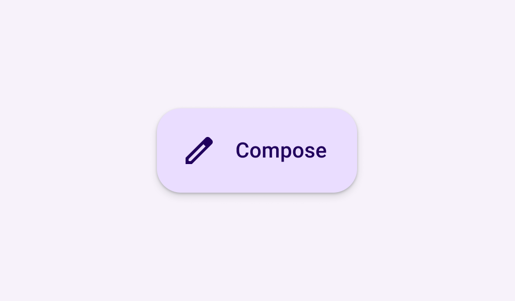
Extended FABs help people take primary actions. They're wider than FABs to accommodate a text label and larger target area.
Common
@Composable
fun ExtendedFloatingActionButton(
    onClick: () -> Unit,
    modifier: Modifier = Modifier,
    shape: Shape = FloatingActionButtonDefaults.extendedFabShape,
    containerColor: Color = FloatingActionButtonDefaults.containerColor,
    contentColor: Color = contentColorFor(containerColor),
    elevation: FloatingActionButtonElevation = FloatingActionButtonDefaults.elevation(),
    interactionSource: MutableInteractionSource? = null,
    content: @Composable RowScope.() -> Unit,
)
Parameters
| onClick | called when this FAB is clicked |
| modifier | the Modifier to be applied to this FAB |
| shape | defines the shape of this FAB's container and shadow (when using elevation) |
| containerColor | the color used for the background of this FAB. Use Color.Transparent to have no color. |
| contentColor | the preferred color for content inside this FAB. Defaults to either the matching content color for containerColor, or to the current LocalContentColor if containerColor is not a color from the theme. |
| elevation | FloatingActionButtonElevation used to resolve the elevation for this FAB in different states. This controls the size of the shadow below the FAB. Additionally, when the container color is ColorScheme.surface, this controls the amount of primary color applied as an overlay. See also: Surface. |
| interactionSource | an optional hoisted MutableInteractionSource for observing and emitting Interactions for this FAB. You can use this to change the FAB's appearance or preview the FAB in different states. Note that if null is provided, interactions will still happen internally. |
| content | the content of this FAB, typically a Text label |
Common
@Composable
fun ExtendedFloatingActionButton(
    text: @Composable () -> Unit,
    icon: @Composable () -> Unit,
    onClick: () -> Unit,
    modifier: Modifier = Modifier,
    expanded: Boolean = true,
    shape: Shape = FloatingActionButtonDefaults.extendedFabShape,
    containerColor: Color = FloatingActionButtonDefaults.containerColor,
    contentColor: Color = contentColorFor(containerColor),
    elevation: FloatingActionButtonElevation = FloatingActionButtonDefaults.elevation(),
    interactionSource: MutableInteractionSource? = null,
)
Parameters
| text | label displayed inside this FAB |
| icon | icon for this FAB, typically an Icon |
| onClick | called when this FAB is clicked |
| modifier | the Modifier to be applied to this FAB |
| expanded | controls the expansion state of this FAB. In an expanded state, the FAB will show both the icon and text. In a collapsed state, the FAB will show only the icon. |
| shape | defines the shape of this FAB's container and shadow (when using elevation) |
| containerColor | the color used for the background of this FAB. Use Color.Transparent to have no color. |
| contentColor | the preferred color for content inside this FAB. Defaults to either the matching content color for containerColor, or to the current LocalContentColor if containerColor is not a color from the theme. |
| elevation | FloatingActionButtonElevation used to resolve the elevation for this FAB in different states. This controls the size of the shadow below the FAB. Additionally, when the container color is ColorScheme.surface, this controls the amount of primary color applied as an overlay. See also: Surface. |
| interactionSource | an optional hoisted MutableInteractionSource for observing and emitting Interactions for this FAB. You can use this to change the FAB's appearance or preview the FAB in different states. Note that if null is provided, interactions will still happen internally. |
Code Examples
AnimatedExtendedFloatingActionButtonSample
@Preview
@Composable
fun AnimatedExtendedFloatingActionButtonSample() {
    val listState = rememberLazyListState()
    // The FAB is initially expanded. Once the first visible item is past the first item we
    // collapse the FAB. We use a remembered derived state to minimize unnecessary compositions.
    val expandedFab by remember { derivedStateOf { listState.firstVisibleItemIndex == 0 } }
    Scaffold(
        floatingActionButton = {
            ExtendedFloatingActionButton(
                onClick = { /* do something */ },
                expanded = expandedFab,
                icon = { Icon(Icons.Filled.Add, "Localized Description") },
                text = { Text(text = "Extended FAB") },
            )
        },
        floatingActionButtonPosition = FabPosition.End,
    ) {
        LazyColumn(state = listState, modifier = Modifier.fillMaxSize()) {
            for (index in 0 until 100) {
                item { Text(text = "List item - $index", modifier = Modifier.padding(24.dp)) }
            }
        }
    }
}
ExtendedFloatingActionButtonSample
@Preview
@Composable
fun ExtendedFloatingActionButtonSample() {
    ExtendedFloatingActionButton(
        onClick = { /* do something */ },
        icon = { Icon(Icons.Filled.Add, "Localized description") },
        text = { Text(text = "Extended FAB") },
    )
}
ExtendedFloatingActionButtonTextSample
@Preview
@Composable
fun ExtendedFloatingActionButtonTextSample() {
    ExtendedFloatingActionButton(onClick = { /* do something */ }) { Text(text = "Extended FAB") }
}
Create your own Component Library
Material Components are meant to be used as is and they do not allow customizations. To build your own Jetpack Compose component library use Compose Unstyled

