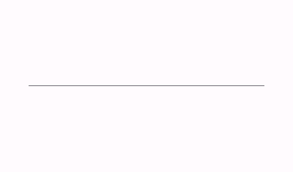
HorizontalDivider
Composable Component
A divider is a thin line that groups content in lists and layouts.

Common
@Composable
fun HorizontalDivider(
    modifier: Modifier = Modifier,
    thickness: Dp = DividerDefaults.Thickness,
    color: Color = DividerDefaults.color,
) =
    Canvas(modifier.fillMaxWidth().height(thickness)) {
        drawLine(
            color = color,
            strokeWidth = thickness.toPx(),
            start = Offset(0f, thickness.toPx() / 2),
            end = Offset(size.width, thickness.toPx() / 2),
        )
    }
Parameters
| modifier | the Modifier to be applied to this divider line. |
| thickness | thickness of this divider line. Using Dp.Hairline will produce a single pixel divider regardless of screen density. |
| color | color of this divider line. |
Create your own Component Library
Material Components are meant to be used as is and they do not allow customizations. To build your own Jetpack Compose component library use Compose Unstyled
