InputChip
Composable Component
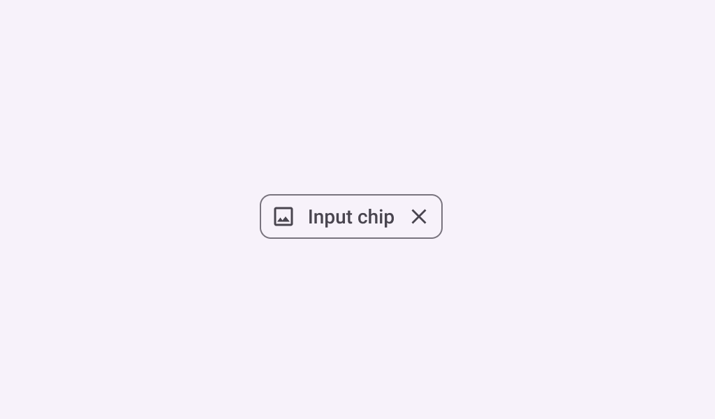
Chips help people enter information, make selections, filter content, or trigger actions. Chips can show multiple interactive elements together in the same area, such as a list of selectable movie times, or a series of email contacts.
Common
@Composable
fun InputChip(
    selected: Boolean,
    onClick: () -> Unit,
    label: @Composable () -> Unit,
    modifier: Modifier = Modifier,
    enabled: Boolean = true,
    leadingIcon: @Composable (() -> Unit)? = null,
    avatar: @Composable (() -> Unit)? = null,
    trailingIcon: @Composable (() -> Unit)? = null,
    shape: Shape = InputChipDefaults.shape,
    colors: SelectableChipColors = InputChipDefaults.inputChipColors(),
    elevation: SelectableChipElevation? = InputChipDefaults.inputChipElevation(),
    border: BorderStroke? = InputChipDefaults.inputChipBorder(enabled, selected),
    interactionSource: MutableInteractionSource? = null,
)
Parameters
| selected | whether this chip is selected or not |
| onClick | called when this chip is clicked |
| label | text label for this chip |
| modifier | the Modifier to be applied to this chip |
| enabled | controls the enabled state of this chip. When false, this component will not respond to user input, and it will appear visually disabled and disabled to accessibility services. |
| leadingIcon | optional icon at the start of the chip, preceding the label text |
| avatar | optional avatar at the start of the chip, preceding the label text |
| trailingIcon | optional icon at the end of the chip |
| shape | defines the shape of this chip's container, border (when border is not null), and shadow (when using elevation) |
| colors | ChipColors that will be used to resolve the colors used for this chip in different states. See InputChipDefaults.inputChipColors. |
| elevation | ChipElevation used to resolve the elevation for this chip in different states. This controls the size of the shadow below the chip. Additionally, when the container color is ColorScheme.surface, this controls the amount of primary color applied as an overlay. See InputChipDefaults.inputChipElevation. |
| border | the border to draw around the container of this chip. Pass null for no border. See InputChipDefaults.inputChipBorder. |
| interactionSource | an optional hoisted MutableInteractionSource for observing and emitting Interactions for this chip. You can use this to change the chip's appearance or preview the chip in different states. Note that if null is provided, interactions will still happen internally. |
Code Examples
ChipGroupReflowSample
@OptIn(ExperimentalLayoutApi::class)
@Preview
@Composable
fun ChipGroupReflowSample() {
    var selected by remember { mutableStateOf(false) }
    val colorNames =
        listOf(
            "Blue",
            "Yellow",
            "Red",
            "Orange",
            "Black",
            "Green",
            "White",
            "Magenta",
            "Gray",
            "Transparent",
        )
    Column {
        FlowRow(
            modifier =
                Modifier.fillMaxWidth(1f)
                    .wrapContentHeight(align = Alignment.Top)
                    .then(
                        if (selected) {
                            Modifier.verticalScroll(rememberScrollState())
                        } else {
                            Modifier.horizontalScroll(rememberScrollState())
                        }
                    ),
            horizontalArrangement = Arrangement.Start,
            maxLines = if (!selected) 1 else Int.MAX_VALUE,
        ) {
            /*
             * When chip lists exceed the available horizontal screen space, one option is to
             * provide a leading chip that expands the list into a vertical scrolling list. This
             * ensures all options are accessible while maintaining the position of the content
             * below the chip list.
             */
            FilterChip(
                selected = selected,
                modifier =
                    Modifier.padding(horizontal = 4.dp)
                        .align(alignment = Alignment.CenterVertically),
                onClick = { selected = !selected },
                label = { Text("Show All") },
                leadingIcon = {
                    Icon(
                        imageVector = Icons.Filled.Tune,
                        contentDescription = "Localized Description",
                        modifier = Modifier.size(FilterChipDefaults.IconSize),
                    )
                },
            )
            Box(
                Modifier.height(FilterChipDefaults.Height)
                    .align(alignment = Alignment.CenterVertically)
            ) {
                VerticalDivider()
            }
            colorNames.fastForEachIndexed { index, element ->
                AssistChip(
                    modifier =
                        Modifier.padding(horizontal = 4.dp)
                            .align(alignment = Alignment.CenterVertically),
                    onClick = { /* do something*/ },
                    label = { Text("$element $index") },
                )
            }
        }
    }
}
ChipGroupSingleLineSample
@Preview
@Composable
fun ChipGroupSingleLineSample() {
    var expanded by remember { mutableStateOf(false) }
    val listSize = 9
    val chipData = List(listSize) { index -> "Chip $index" }
    Column(horizontalAlignment = Alignment.CenterHorizontally) {
        Row(modifier = Modifier.horizontalScroll(rememberScrollState())) {
            AssistChip(
                onClick = { expanded = !expanded },
                label = { Text("Show All") },
                leadingIcon = {
                    Icon(
                        imageVector = Icons.Filled.Tune,
                        contentDescription = "Localized Description",
                        modifier = Modifier.size(FilterChipDefaults.IconSize),
                    )
                },
            )
            /*
             * When chip lists exceed the available horizontal screen space, one option is to
             * provide a chip button that opens a menu displaying all chip options. This ensures
             * all options are accessible while maintaining the position of the content below the
             * chip list.
             */
            DropdownMenu(expanded = expanded, onDismissRequest = { expanded = false }) {
                repeat(listSize) { index ->
                    DropdownMenuItem(
                        text = { Text(chipData[index]) },
                        onClick = {},
                        trailingIcon = {
                            Icon(Icons.AutoMirrored.Filled.ArrowRight, contentDescription = null)
                        },
                    )
                }
            }
            repeat(listSize) { index ->
                AssistChip(
                    modifier = Modifier.padding(horizontal = 4.dp),
                    onClick = { /* do something*/ },
                    label = { Text(chipData[index]) },
                    trailingIcon = { Icon(Icons.Filled.ArrowDropDown, contentDescription = null) },
                )
            }
        }
    }
}
InputChipSample
@Preview
@Composable
fun InputChipSample() {
    var selected by remember { mutableStateOf(false) }
    InputChip(
        selected = selected,
        onClick = { selected = !selected },
        label = { Text("Input Chip") },
    )
}
InputChipWithAvatarSample
@Preview
@Composable
fun InputChipWithAvatarSample() {
    var selected by remember { mutableStateOf(false) }
    InputChip(
        selected = selected,
        onClick = { selected = !selected },
        label = { Text("Input Chip") },
        avatar = {
            Icon(
                Icons.Filled.Person,
                contentDescription = "Localized description",
                Modifier.size(InputChipDefaults.AvatarSize),
            )
        },
    )
}
Create your own Component Library
Material Components are meant to be used as is and they do not allow customizations. To build your own Jetpack Compose component library use Compose Unstyled

