ListItem
Composable Component
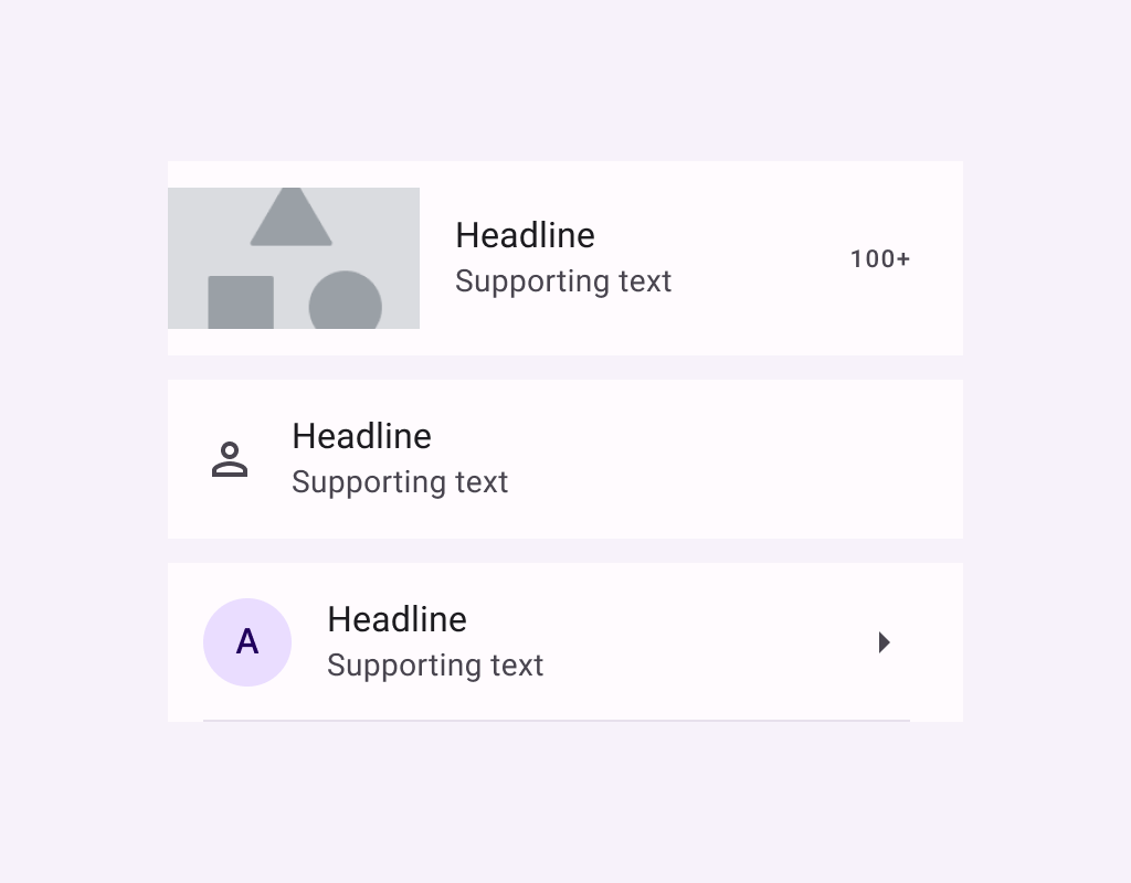
Lists are continuous, vertical indexes of text or images.
Common
@Composable
fun ListItem(
    headlineContent: @Composable () -> Unit,
    modifier: Modifier = Modifier,
    overlineContent: @Composable (() -> Unit)? = null,
    supportingContent: @Composable (() -> Unit)? = null,
    leadingContent: @Composable (() -> Unit)? = null,
    trailingContent: @Composable (() -> Unit)? = null,
    colors: ListItemColors = ListItemDefaults.colors(),
    tonalElevation: Dp = ListItemDefaults.Elevation,
    shadowElevation: Dp = ListItemDefaults.Elevation,
)
Parameters
| headlineContent | the headline content of the list item |
| modifier | Modifier to be applied to the list item |
| overlineContent | the content displayed above the headline content |
| supportingContent | the supporting content of the list item |
| leadingContent | the leading content of the list item |
| trailingContent | the trailing meta text, icon, switch or checkbox |
| colors | ListItemColors that will be used to resolve the background and content color for this list item in different states. See ListItemDefaults.colors |
| tonalElevation | the tonal elevation of this list item |
| shadowElevation | the shadow elevation of this list item |
Code Examples
OneLineListItem
@Preview
@Composable
fun OneLineListItem() {
    Column {
        HorizontalDivider()
        ListItem(
            headlineContent = { Text("One line list item with 24x24 icon") },
            leadingContent = {
                Icon(Icons.Filled.Favorite, contentDescription = "Localized description")
            },
        )
        HorizontalDivider()
    }
}
ThreeLineListItemWithExtendedSupporting
@Preview
@Composable
fun ThreeLineListItemWithExtendedSupporting() {
    Column {
        HorizontalDivider()
        ListItem(
            headlineContent = { Text("Three line list item") },
            supportingContent = { Text("Secondary text that\nspans multiple lines") },
            leadingContent = {
                Icon(Icons.Filled.Favorite, contentDescription = "Localized description")
            },
            trailingContent = { Text("meta") },
        )
        HorizontalDivider()
    }
}
ThreeLineListItemWithOverlineAndSupporting
@Preview
@Composable
fun ThreeLineListItemWithOverlineAndSupporting() {
    Column {
        HorizontalDivider()
        ListItem(
            headlineContent = { Text("Three line list item") },
            overlineContent = { Text("OVERLINE") },
            supportingContent = { Text("Secondary text") },
            leadingContent = {
                Icon(Icons.Filled.Favorite, contentDescription = "Localized description")
            },
            trailingContent = { Text("meta") },
        )
        HorizontalDivider()
    }
}
TwoLineListItem
@Preview
@Composable
fun TwoLineListItem() {
    Column {
        HorizontalDivider()
        ListItem(
            headlineContent = { Text("Two line list item with trailing") },
            supportingContent = { Text("Secondary text") },
            trailingContent = { Text("meta") },
            leadingContent = {
                Icon(Icons.Filled.Favorite, contentDescription = "Localized description")
            },
        )
        HorizontalDivider()
    }
}
Create your own Component Library
Material Components are meant to be used as is and they do not allow customizations. To build your own Jetpack Compose component library use Compose Unstyled

