NavigationRail
Composable Component
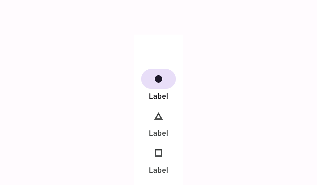
Navigation rails provide access to primary destinations in apps when using tablet and desktop screens.
Common
@Composable
fun NavigationRail(
    modifier: Modifier = Modifier,
    containerColor: Color = NavigationRailDefaults.ContainerColor,
    contentColor: Color = contentColorFor(containerColor),
    header: @Composable (ColumnScope.() -> Unit)? = null,
    windowInsets: WindowInsets = NavigationRailDefaults.windowInsets,
    content: @Composable ColumnScope.() -> Unit,
)
Parameters
| modifier | the Modifier to be applied to this navigation rail |
| containerColor | the color used for the background of this navigation rail. Use Color.Transparent to have no color. |
| contentColor | the preferred color for content inside this navigation rail. Defaults to either the matching content color for containerColor, or to the current LocalContentColor if containerColor is not a color from the theme. |
| header | optional header that may hold a FloatingActionButton or a logo |
| windowInsets | a window insets of the navigation rail. |
| content | the content of this navigation rail, typically 3-7 NavigationRailItems |
Code Examples
NavigationRailSample
@Preview
@Composable
fun NavigationRailSample() {
    var selectedItem by remember { mutableIntStateOf(0) }
    val items = listOf("Home", "Search", "Settings")
    val selectedIcons = listOf(Icons.Filled.Home, Icons.Filled.Favorite, Icons.Filled.Star)
    val unselectedIcons =
        listOf(Icons.Outlined.Home, Icons.Outlined.FavoriteBorder, Icons.Outlined.StarBorder)
    NavigationRail {
        items.forEachIndexed { index, item ->
            NavigationRailItem(
                icon = {
                    Icon(
                        if (selectedItem == index) selectedIcons[index] else unselectedIcons[index],
                        contentDescription = item,
                    )
                },
                label = { Text(item) },
                selected = selectedItem == index,
                onClick = { selectedItem = index },
            )
        }
    }
}
Create your own Component Library
Material Components are meant to be used as is and they do not allow customizations. To build your own Jetpack Compose component library use Compose Unstyled

