Snackbar
Composable Component
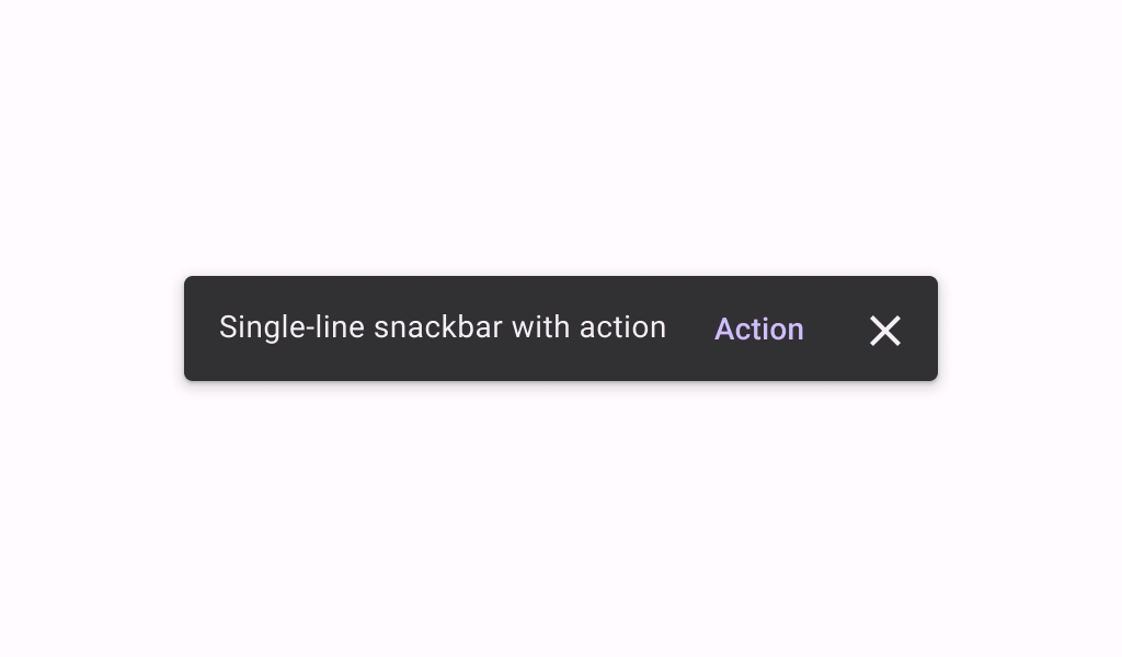
Snackbars provide brief messages about app processes at the bottom of the screen.
Common
@Composable
fun Snackbar(
    modifier: Modifier = Modifier,
    action: @Composable (() -> Unit)? = null,
    dismissAction: @Composable (() -> Unit)? = null,
    actionOnNewLine: Boolean = false,
    shape: Shape = SnackbarDefaults.shape,
    containerColor: Color = SnackbarDefaults.color,
    contentColor: Color = SnackbarDefaults.contentColor,
    actionContentColor: Color = SnackbarDefaults.actionContentColor,
    dismissActionContentColor: Color = SnackbarDefaults.dismissActionContentColor,
    content: @Composable () -> Unit,
)
Parameters
| modifier | the Modifier to be applied to this snackbar |
| action | action / button component to add as an action to the snackbar. Consider using ColorScheme.inversePrimary as the color for the action, if you do not have a predefined color you wish to use instead. |
| dismissAction | action / button component to add as an additional close affordance action when a snackbar is non self-dismissive. Consider using ColorScheme.inverseOnSurface as the color for the action, if you do not have a predefined color you wish to use instead. |
| actionOnNewLine | whether or not action should be put on a separate line. Recommended for action with long action text. |
| shape | defines the shape of this snackbar's container |
| containerColor | the color used for the background of this snackbar. Use Color.Transparent to have no color. |
| contentColor | the preferred color for content inside this snackbar |
| actionContentColor | the preferred content color for the optional action inside this snackbar |
| dismissActionContentColor | the preferred content color for the optional dismissAction inside this snackbar |
| content | content to show information about a process that an app has performed or will perform |
Common
@Composable
fun Snackbar(
    snackbarData: SnackbarData,
    modifier: Modifier = Modifier,
    actionOnNewLine: Boolean = false,
    shape: Shape = SnackbarDefaults.shape,
    containerColor: Color = SnackbarDefaults.color,
    contentColor: Color = SnackbarDefaults.contentColor,
    actionColor: Color = SnackbarDefaults.actionColor,
    actionContentColor: Color = SnackbarDefaults.actionContentColor,
    dismissActionContentColor: Color = SnackbarDefaults.dismissActionContentColor,
)
Parameters
| snackbarData | data about the current snackbar showing via SnackbarHostState |
| modifier | the Modifier to be applied to this snackbar |
| actionOnNewLine | whether or not action should be put on a separate line. Recommended for action with long action text. |
| shape | defines the shape of this snackbar's container |
| containerColor | the color used for the background of this snackbar. Use Color.Transparent to have no color. |
| contentColor | the preferred color for content inside this snackbar |
| actionColor | the color of the snackbar's action |
| actionContentColor | the preferred content color for the optional action inside this snackbar. See SnackbarVisuals.actionLabel. |
| dismissActionContentColor | the preferred content color for the optional dismiss action inside this snackbar. See SnackbarVisuals.withDismissAction. |
Code Examples
ScaffoldWithCustomSnackbar
@Preview
@Composable
fun ScaffoldWithCustomSnackbar() {
    class SnackbarVisualsWithError(override val message: String, val isError: Boolean) :
        SnackbarVisuals {
        override val actionLabel: String
            get() = if (isError) "Error" else "OK"
        override val withDismissAction: Boolean
            get() = false
        override val duration: SnackbarDuration
            get() = SnackbarDuration.Indefinite
    }
    val snackbarHostState = remember { SnackbarHostState() }
    val scope = rememberCoroutineScope()
    Scaffold(
        snackbarHost = {
            // reuse default SnackbarHost to have default animation and timing handling
            SnackbarHost(snackbarHostState) { data ->
                // custom snackbar with the custom action button color and border
                val isError = (data.visuals as? SnackbarVisualsWithError)?.isError ?: false
                val buttonColor =
                    if (isError) {
                        ButtonDefaults.textButtonColors(
                            containerColor = MaterialTheme.colorScheme.errorContainer,
                            contentColor = MaterialTheme.colorScheme.error,
                        )
                    } else {
                        ButtonDefaults.textButtonColors(
                            contentColor = MaterialTheme.colorScheme.inversePrimary
                        )
                    }
                Snackbar(
                    modifier =
                        Modifier.border(2.dp, MaterialTheme.colorScheme.secondary).padding(12.dp),
                    action = {
                        TextButton(
                            onClick = { if (isError) data.dismiss() else data.performAction() },
                            colors = buttonColor,
                        ) {
                            Text(data.visuals.actionLabel ?: "")
                        }
                    },
                ) {
                    Text(data.visuals.message)
                }
            }
        },
        floatingActionButton = {
            var clickCount by remember { mutableStateOf(0) }
            ExtendedFloatingActionButton(
                onClick = {
                    scope.launch {
                        snackbarHostState.showSnackbar(
                            SnackbarVisualsWithError(
                                "Snackbar # ${++clickCount}",
                                isError = clickCount % 2 != 0,
                            )
                        )
                    }
                }
            ) {
                Text("Show snackbar")
            }
        },
        content = { innerPadding ->
            Text(
                text = "Custom Snackbar Demo",
                modifier = Modifier.padding(innerPadding).fillMaxSize().wrapContentSize(),
            )
        },
    )
}
ScaffoldWithIndefiniteSnackbar
@Preview
@Composable
fun ScaffoldWithIndefiniteSnackbar() {
    val snackbarHostState = remember { SnackbarHostState() }
    val scope = rememberCoroutineScope()
    Scaffold(
        snackbarHost = { SnackbarHost(snackbarHostState) },
        floatingActionButton = {
            var clickCount by remember { mutableStateOf(0) }
            ExtendedFloatingActionButton(
                onClick = {
                    // show snackbar as a suspend function
                    scope.launch {
                        snackbarHostState.showSnackbar(
                            message = "Snackbar # ${++clickCount}",
                            actionLabel = "Action",
                            withDismissAction = true,
                            duration = SnackbarDuration.Indefinite,
                        )
                    }
                }
            ) {
                Text("Show snackbar")
            }
        },
        content = { innerPadding ->
            Text(
                text = "Body content",
                modifier = Modifier.padding(innerPadding).fillMaxSize().wrapContentSize(),
            )
        },
    )
}
ScaffoldWithMultilineSnackbar
@Preview
@Composable
fun ScaffoldWithMultilineSnackbar() {
    val snackbarHostState = remember { SnackbarHostState() }
    val scope = rememberCoroutineScope()
    Scaffold(
        snackbarHost = {
            SnackbarHost(snackbarHostState) { data ->
                Snackbar {
                    // The Material spec recommends a maximum of 2 lines of text.
                    Text(data.visuals.message, maxLines = 2, overflow = TextOverflow.Ellipsis)
                }
            }
        },
        floatingActionButton = {
            ExtendedFloatingActionButton(
                onClick = {
                    scope.launch {
                        val longMessage =
                            "Very very very very very very very very very very very very very " +
                                "very very very very very very very very very very very very " +
                                "very very very very very very very very very very long message"
                        snackbarHostState.showSnackbar(longMessage)
                    }
                }
            ) {
                Text("Show snackbar")
            }
        },
        content = { innerPadding ->
            Text(
                text = "Multiline Snackbar Demo",
                modifier = Modifier.padding(innerPadding).fillMaxSize().wrapContentSize(),
            )
        },
    )
}
ScaffoldWithSimpleSnackbar
@Preview
@Composable
fun ScaffoldWithSimpleSnackbar() {
    val snackbarHostState = remember { SnackbarHostState() }
    val scope = rememberCoroutineScope()
    Scaffold(
        snackbarHost = { SnackbarHost(snackbarHostState) },
        floatingActionButton = {
            var clickCount by remember { mutableStateOf(0) }
            ExtendedFloatingActionButton(
                onClick = {
                    // show snackbar as a suspend function
                    scope.launch { snackbarHostState.showSnackbar("Snackbar # ${++clickCount}") }
                }
            ) {
                Text("Show snackbar")
            }
        },
        content = { innerPadding ->
            Text(
                text = "Body content",
                modifier = Modifier.padding(innerPadding).fillMaxSize().wrapContentSize(),
            )
        },
    )
}
Create your own Component Library
Material Components are meant to be used as is and they do not allow customizations. To build your own Jetpack Compose component library use Compose Unstyled

