Switch
Composable Component
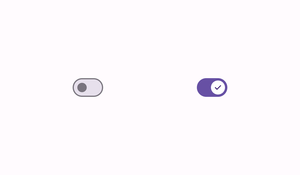
Switches toggle the state of a single item on or off.
Common
@Composable
fun Switch(
    checked: Boolean,
    onCheckedChange: ((Boolean) -> Unit)?,
    modifier: Modifier = Modifier,
    thumbContent: (@Composable () -> Unit)? = null,
    enabled: Boolean = true,
    colors: SwitchColors = SwitchDefaults.colors(),
    interactionSource: MutableInteractionSource? = null,
)
Parameters
| checked | whether or not this switch is checked |
| onCheckedChange | called when this switch is clicked. If null, then this switch will not be interactable, unless something else handles its input events and updates its state. |
| modifier | the Modifier to be applied to this switch |
| thumbContent | content that will be drawn inside the thumb, expected to measure SwitchDefaults.IconSize |
| enabled | controls the enabled state of this switch. When false, this component will not respond to user input, and it will appear visually disabled and disabled to accessibility services. |
| colors | SwitchColors that will be used to resolve the colors used for this switch in different states. See SwitchDefaults.colors. |
| interactionSource | an optional hoisted MutableInteractionSource for observing and emitting Interactions for this switch. You can use this to change the switch's appearance or preview the switch in different states. Note that if null is provided, interactions will still happen internally. |
Code Examples
SwitchSample
@Preview
@Composable
fun SwitchSample() {
    var checked by remember { mutableStateOf(true) }
    Switch(
        modifier = Modifier.semantics { contentDescription = "Demo" },
        checked = checked,
        onCheckedChange = { checked = it },
    )
}
SwitchWithThumbIconSample
@Preview
@Composable
fun SwitchWithThumbIconSample() {
    var checked by remember { mutableStateOf(true) }
    Switch(
        modifier = Modifier.semantics { contentDescription = "Demo with icon" },
        checked = checked,
        onCheckedChange = { checked = it },
        thumbContent = {
            if (checked) {
                // Icon isn't focusable, no need for content description
                Icon(
                    imageVector = Icons.Filled.Check,
                    contentDescription = null,
                    modifier = Modifier.size(SwitchDefaults.IconSize),
                )
            }
        },
    )
}
Create your own Component Library
Material Components are meant to be used as is and they do not allow customizations. To build your own Jetpack Compose component library use Compose Unstyled

