TriStateCheckbox
Composable Component
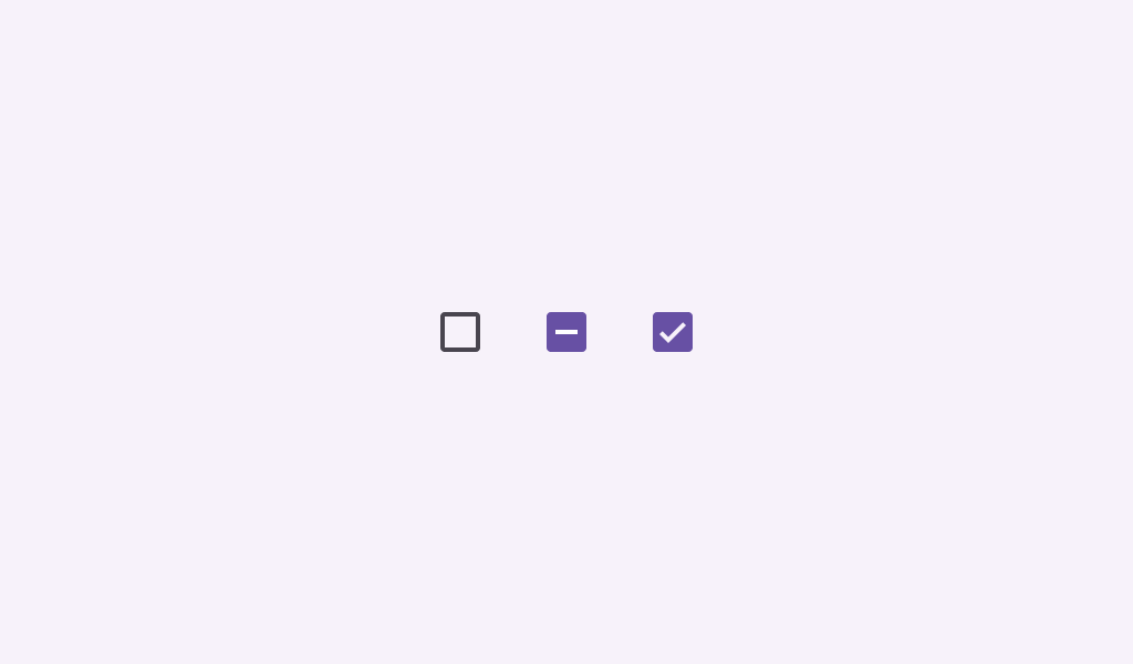
Checkboxes can have a parent-child relationship with other checkboxes. When the parent checkbox is checked, all child checkboxes are checked. If a parent checkbox is unchecked, all child checkboxes are unchecked. If some, but not all, child checkboxes are checked, the parent checkbox becomes an indeterminate checkbox.
Common
@Composable
fun TriStateCheckbox(
    state: ToggleableState,
    onClick: (() -> Unit)?,
    modifier: Modifier = Modifier,
    enabled: Boolean = true,
    colors: CheckboxColors = CheckboxDefaults.colors(),
    interactionSource: MutableInteractionSource? = null,
)
Parameters
| state | whether this checkbox is checked, unchecked, or in an indeterminate state |
| onClick | called when this checkbox is clicked. If null, then this checkbox will not be interactable, unless something else handles its input events and updates its state. |
| modifier | the Modifier to be applied to this checkbox |
| enabled | controls the enabled state of this checkbox. When false, this component will not respond to user input, and it will appear visually disabled and disabled to accessibility services. |
| colors | CheckboxColors that will be used to resolve the colors used for this checkbox in different states. See CheckboxDefaults.colors. |
| interactionSource | an optional hoisted MutableInteractionSource for observing and emitting Interactions for this checkbox. You can use this to change the checkbox's appearance or preview the checkbox in different states. Note that if null is provided, interactions will still happen internally. |
Common
@Composable
fun TriStateCheckbox(
    state: ToggleableState,
    onClick: (() -> Unit)?,
    checkmarkStroke: Stroke,
    outlineStroke: Stroke,
    modifier: Modifier = Modifier,
    enabled: Boolean = true,
    colors: CheckboxColors = CheckboxDefaults.colors(),
    interactionSource: MutableInteractionSource? = null,
)
Parameters
| state | whether this checkbox is checked, unchecked, or in an indeterminate state |
| onClick | called when this checkbox is clicked. If null, then this checkbox will not be interactable, unless something else handles its input events and updates its state. |
| checkmarkStroke | stroke for the checkmark. |
| outlineStroke | stroke for the checkmark's box outline. Note that this stroke is applied when drawing the outline's rounded rectangle, so attributions such as androidx.compose.ui.graphics.StrokeJoin will be ignored. |
| modifier | the Modifier to be applied to this checkbox |
| enabled | controls the enabled state of this checkbox. When false, this component will not respond to user input, and it will appear visually disabled and disabled to accessibility services. |
| colors | CheckboxColors that will be used to resolve the colors used for this checkbox in different states. See CheckboxDefaults.colors. |
| interactionSource | an optional hoisted MutableInteractionSource for observing and emitting Interactions for this checkbox. You can use this to change the checkbox's appearance or preview the checkbox in different states. Note that if null is provided, interactions will still happen internally. |
Code Examples
TriStateCheckboxRoundedStrokesSample
@Preview
@Composable
fun TriStateCheckboxRoundedStrokesSample() {
    val strokeWidthPx = with(LocalDensity.current) { floor(CheckboxDefaults.StrokeWidth.toPx()) }
    val checkmarkStroke =
        remember(strokeWidthPx) {
            Stroke(width = strokeWidthPx, cap = StrokeCap.Round, join = StrokeJoin.Round)
        }
    val outlineStroke = remember(strokeWidthPx) { Stroke(width = strokeWidthPx) }
    Column {
        // define dependent checkboxes states
        val (state, onStateChange) = remember { mutableStateOf(true) }
        val (state2, onStateChange2) = remember { mutableStateOf(true) }
        // TriStateCheckbox state reflects state of dependent checkboxes
        val parentState =
            remember(state, state2) {
                if (state && state2) ToggleableState.On
                else if (!state && !state2) ToggleableState.Off else ToggleableState.Indeterminate
            }
        // click on TriStateCheckbox can set state for dependent checkboxes
        val onParentClick = {
            val s = parentState != ToggleableState.On
            onStateChange(s)
            onStateChange2(s)
        }
        // The sample below composes just basic checkboxes which are not fully accessible on their
        // own. See the CheckboxWithTextSample as a way to ensure your checkboxes are fully
        // accessible.
        Row(
            verticalAlignment = Alignment.CenterVertically,
            modifier =
                Modifier.triStateToggleable(
                    state = parentState,
                    onClick = onParentClick,
                    role = Role.Checkbox,
                ),
        ) {
            TriStateCheckbox(
                state = parentState,
                onClick = null,
                checkmarkStroke = checkmarkStroke,
                outlineStroke = outlineStroke,
            )
            Text("Receive Emails")
        }
        Spacer(Modifier.size(25.dp))
        Column(Modifier.padding(24.dp, 0.dp, 0.dp, 0.dp)) {
            Row(
                verticalAlignment = Alignment.CenterVertically,
                modifier =
                    Modifier.toggleable(
                        value = state,
                        onValueChange = onStateChange,
                        role = Role.Checkbox,
                    ),
            ) {
                Checkbox(
                    checked = state,
                    onCheckedChange = null,
                    checkmarkStroke = checkmarkStroke,
                    outlineStroke = outlineStroke,
                )
                Text("Daily")
            }
            Spacer(Modifier.size(25.dp))
            Row(
                verticalAlignment = Alignment.CenterVertically,
                modifier =
                    Modifier.toggleable(
                        value = state2,
                        onValueChange = onStateChange2,
                        role = Role.Checkbox,
                    ),
            ) {
                Checkbox(
                    checked = state2,
                    onCheckedChange = null,
                    checkmarkStroke = checkmarkStroke,
                    outlineStroke = outlineStroke,
                )
                Text("Weekly")
            }
        }
    }
}
TriStateCheckboxSample
@Preview
@Composable
fun TriStateCheckboxSample() {
    Column {
        // define dependent checkboxes states
        val (state, onStateChange) = remember { mutableStateOf(true) }
        val (state2, onStateChange2) = remember { mutableStateOf(true) }
        // TriStateCheckbox state reflects state of dependent checkboxes
        val parentState =
            remember(state, state2) {
                if (state && state2) ToggleableState.On
                else if (!state && !state2) ToggleableState.Off else ToggleableState.Indeterminate
            }
        // click on TriStateCheckbox can set state for dependent checkboxes
        val onParentClick = {
            val s = parentState != ToggleableState.On
            onStateChange(s)
            onStateChange2(s)
        }
        // The sample below composes just basic checkboxes which are not fully accessible on their
        // own. See the CheckboxWithTextSample as a way to ensure your checkboxes are fully
        // accessible.
        Row(
            verticalAlignment = Alignment.CenterVertically,
            modifier =
                Modifier.triStateToggleable(
                    state = parentState,
                    onClick = onParentClick,
                    role = Role.Checkbox,
                ),
        ) {
            TriStateCheckbox(state = parentState, onClick = null)
            Text("Receive Emails")
        }
        Spacer(Modifier.size(25.dp))
        Column(Modifier.padding(24.dp, 0.dp, 0.dp, 0.dp)) {
            Row(
                verticalAlignment = Alignment.CenterVertically,
                modifier =
                    Modifier.toggleable(
                        value = state,
                        onValueChange = onStateChange,
                        role = Role.Checkbox,
                    ),
            ) {
                Checkbox(state, null)
                Text("Daily")
            }
            Spacer(Modifier.size(25.dp))
            Row(
                verticalAlignment = Alignment.CenterVertically,
                modifier =
                    Modifier.toggleable(
                        value = state2,
                        onValueChange = onStateChange2,
                        role = Role.Checkbox,
                    ),
            ) {
                Checkbox(state2, null)
                Text("Weekly")
            }
        }
    }
}
Create your own Component Library
Material Components are meant to be used as is and they do not allow customizations. To build your own Jetpack Compose component library use Compose Unstyled

