VerticalSlider
Composable Component
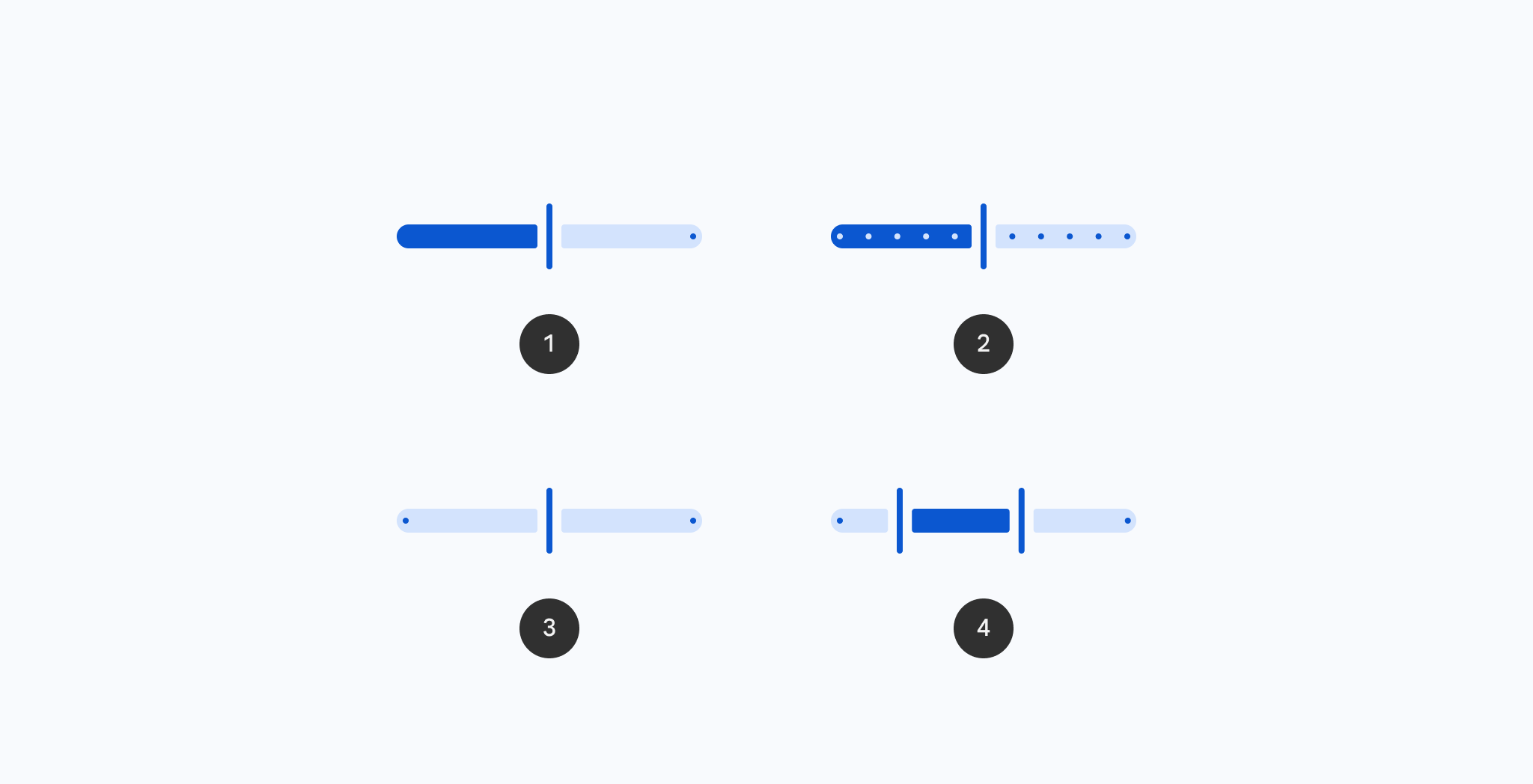
Vertical Sliders allow users to make selections from a range of values.
Common
@ExperimentalMaterial3ExpressiveApi
@Composable
fun VerticalSlider(
    state: SliderState,
    modifier: Modifier = Modifier,
    enabled: Boolean = true,
    reverseDirection: Boolean = false,
    colors: SliderColors = SliderDefaults.colors(),
    interactionSource: MutableInteractionSource = remember { MutableInteractionSource() },
    thumb: @Composable (SliderState) -> Unit = { sliderState ->
        SliderDefaults.Thumb(
            interactionSource = interactionSource,
            sliderState = sliderState,
            colors = colors,
            enabled = enabled,
            thumbSize = VerticalThumbSize,
        )
    },
    track: @Composable (SliderState) -> Unit = { sliderState ->
        SliderDefaults.Track(
            colors = colors,
            enabled = enabled,
            sliderState = sliderState,
            trackCornerSize = Dp.Unspecified,
        )
    },
)
Parameters
| state | SliderState which contains the slider's current value. |
| modifier | the Modifier to be applied to this slider |
| enabled | controls the enabled state of this slider. When false, this component will not respond to user input, and it will appear visually disabled and disabled to accessibility services. |
| reverseDirection | controls the direction of this slider. Default is top to bottom. |
| colors | SliderColors that will be used to resolve the colors used for this slider in different states. See SliderDefaults.colors. |
| interactionSource | the MutableInteractionSource representing the stream of Interactions for this slider. You can create and pass in your own remembered instance to observe Interactions and customize the appearance / behavior of this slider in different states. |
| thumb | the thumb to be displayed on the slider, it is placed on top of the track. The lambda receives a SliderState which is used to obtain the current active track. |
| track | the track to be displayed on the slider, it is placed underneath the thumb. The lambda receives a SliderState which is used to obtain the current active track. |
Code Examples
VerticalCenteredSliderSample
@OptIn(ExperimentalMaterial3Api::class, ExperimentalMaterial3ExpressiveApi::class)
@Preview
@Composable
fun VerticalCenteredSliderSample() {
    val coroutineScope = rememberCoroutineScope()
    val sliderState =
        rememberSliderState(
            // Only allow multiples of 10. Excluding the endpoints of `valueRange`,
            // there are 9 steps (10, 20, ..., 90).
            steps = 9,
            valueRange = -50f..50f,
        )
    val snapAnimationSpec = MaterialTheme.motionScheme.fastEffectsSpec<Float>()
    var currentValue by rememberSaveable { mutableFloatStateOf(sliderState.value) }
    var animateJob: Job? by remember { mutableStateOf(null) }
    sliderState.shouldAutoSnap = false
    sliderState.onValueChange = { newValue ->
        currentValue = newValue
        // only update the sliderState instantly if dragging
        if (sliderState.isDragging) {
            animateJob?.cancel()
            sliderState.value = newValue
        }
    }
    sliderState.onValueChangeFinished = {
        animateJob =
            coroutineScope.launch {
                animate(
                    initialValue = sliderState.value,
                    targetValue = currentValue,
                    animationSpec = snapAnimationSpec,
                ) { value, _ ->
                    sliderState.value = value
                }
            }
    }
    val interactionSource = remember { MutableInteractionSource() }
    Column(modifier = Modifier.padding(horizontal = 16.dp)) {
        Text(
            modifier = Modifier.align(Alignment.CenterHorizontally),
            text = "%.2f".format(sliderState.value),
        )
        Spacer(Modifier.height(16.dp))
        VerticalSlider(
            state = sliderState,
            modifier =
                Modifier.height(300.dp)
                    .align(Alignment.CenterHorizontally)
                    .progressSemantics(
                        currentValue,
                        sliderState.valueRange.start..sliderState.valueRange.endInclusive,
                        sliderState.steps,
                    ),
            interactionSource = interactionSource,
            track = { SliderDefaults.CenteredTrack(sliderState = sliderState) },
            reverseDirection = true,
        )
    }
}
VerticalSliderSample
@OptIn(ExperimentalMaterial3Api::class, ExperimentalMaterial3ExpressiveApi::class)
@Preview
@Composable
fun VerticalSliderSample() {
    val coroutineScope = rememberCoroutineScope()
    val sliderState =
        rememberSliderState(
            // Only allow multiples of 10. Excluding the endpoints of `valueRange`,
            // there are 9 steps (10, 20, ..., 90).
            steps = 9,
            valueRange = 0f..100f,
        )
    val snapAnimationSpec = MaterialTheme.motionScheme.fastEffectsSpec<Float>()
    var currentValue by rememberSaveable { mutableFloatStateOf(sliderState.value) }
    var animateJob: Job? by remember { mutableStateOf(null) }
    sliderState.shouldAutoSnap = false
    sliderState.onValueChange = { newValue ->
        currentValue = newValue
        // only update the sliderState instantly if dragging
        if (sliderState.isDragging) {
            animateJob?.cancel()
            sliderState.value = newValue
        }
    }
    sliderState.onValueChangeFinished = {
        animateJob =
            coroutineScope.launch {
                animate(
                    initialValue = sliderState.value,
                    targetValue = currentValue,
                    animationSpec = snapAnimationSpec,
                ) { value, _ ->
                    sliderState.value = value
                }
            }
    }
    val interactionSource = remember { MutableInteractionSource() }
    Column(modifier = Modifier.padding(horizontal = 16.dp)) {
        Text(
            modifier = Modifier.align(Alignment.CenterHorizontally),
            text = "%.2f".format(sliderState.value),
        )
        Spacer(Modifier.height(16.dp))
        VerticalSlider(
            state = sliderState,
            modifier =
                Modifier.height(300.dp)
                    .align(Alignment.CenterHorizontally)
                    .progressSemantics(
                        currentValue,
                        sliderState.valueRange.start..sliderState.valueRange.endInclusive,
                        sliderState.steps,
                    ),
            interactionSource = interactionSource,
            track = {
                SliderDefaults.Track(
                    sliderState = sliderState,
                    modifier = Modifier.width(36.dp),
                    trackCornerSize = 12.dp,
                )
            },
            reverseDirection = true,
        )
    }
}
Create your own Component Library
Material Components are meant to be used as is and they do not allow customizations. To build your own Jetpack Compose component library use Compose Unstyled

