CircularProgressIndicator
Composable Component
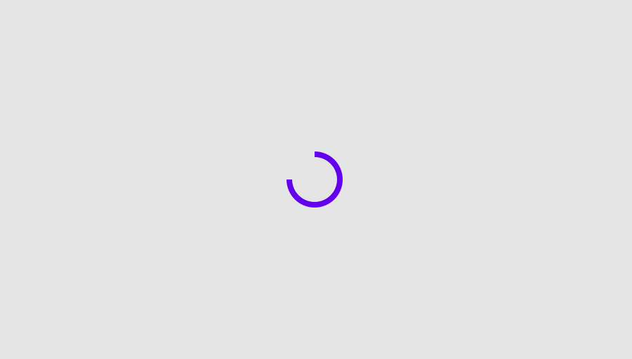
Determinate Material Design circular progress indicator.
Android
@Composable
public fun CircularProgressIndicator(
    @FloatRange(from = 0.0, to = 1.0) progress: Float,
    modifier: Modifier = Modifier,
    startAngle: Float = 270f,
    endAngle: Float = startAngle,
    indicatorColor: Color = MaterialTheme.colors.primary,
    trackColor: Color = MaterialTheme.colors.onBackground.copy(alpha = 0.1f),
    strokeWidth: Dp = ProgressIndicatorDefaults.StrokeWidth,
)
Parameters
| modifier | Modifier to be applied to the CircularProgressIndicator |
| progress | The progress of this progress indicator where 0.0 represents no progress and 1.0 represents completion. Values outside of this range are coerced into the range 0..1. |
| startAngle | The starting position of the progress arc, measured clockwise in degrees (0 to 360) from the 3 o'clock position. For example, 0 and 360 represent 3 o'clock, 90 and 180 represent 6 o'clock and 9 o'clock respectively. Default is 270 degrees (top of the screen) |
| endAngle | The ending position of the progress arc, measured clockwise in degrees (0 to 360) from the 3 o'clock position. For example, 0 and 360 represent 3 o'clock, 90 and 180 represent 6 o'clock and 9 o'clock respectively. By default equal to startAngle |
| indicatorColor | The color of the progress indicator bar. |
| trackColor | The color of the background progress track. |
| strokeWidth | The stroke width for the progress indicator. |
Android
@Composable
public fun CircularProgressIndicator(
    modifier: Modifier = Modifier,
    startAngle: Float = 270f,
    indicatorColor: Color = MaterialTheme.colors.onBackground,
    trackColor: Color = MaterialTheme.colors.onBackground.copy(alpha = 0.3f),
    strokeWidth: Dp = IndeterminateStrokeWidth,
)
Parameters
| modifier | Modifier to be applied to the CircularProgressIndicator |
| startAngle | The starting position of the progress arc, measured clockwise in degrees (0 to 360) from the 3 o'clock position. For example, 0 and 360 represent 3 o'clock, 90 and 180 represent 6 o'clock and 9 o'clock respectively. Default is 270 degrees (top of the screen) |
| indicatorColor | The color of the progress indicator bar. |
| trackColor | The color of the background progress track |
| strokeWidth | The stroke width for the progress indicator. |
