Happy Thursday! Alex here 👋
Following last week's tutorial about themes in Jetpack Compose, this week we are going through how to change themes via code.
Let's jump straight to it 🚀
Define light and dark themes
Here is a slim down version of the theme generated when you create a new Jetpack Compose project in Android Studio:
@Composable
fun MyAppTheme(
    isDarkTheme: Boolean = isSystemInDarkTheme(),
    content: @Composable () -> Unit,
) {
    val colorScheme = if (isDarkTheme) darkColorScheme() else lightColorScheme()

    MaterialTheme(
        colorScheme = colorScheme,
        // shapes = ...,
        // typography = ...,
        content = content
    )
}
The above composable defines a new theme. It will update the look and feel of the children composable passed to content.
Note the isSystemInDarkTheme() function. As soon as the user changes their system wide theme preference (from light to dark and vise versa),
this function will automatically give you a new Boolean representing their preference.
Depending on the value emitted, we are using either the dark or the light color scheme. This is the way Jetpack Compose knows when it is time to update the UI and use dark or light color theme.
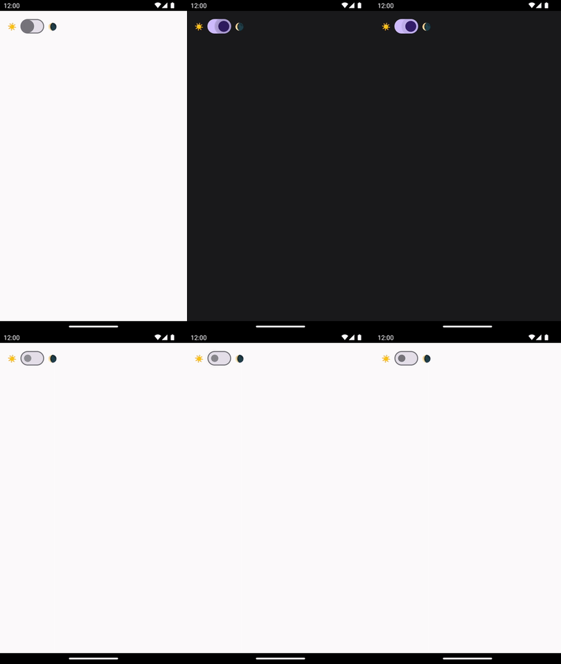
Change themes programmatically
Instead of relying on the isSystemInDarkTheme() function to pick a light or dark theme, we can expect the user of the MyAppTheme to provide the isDarkTheme value instead.
var isDarkTheme by remember { mutableStateOf(true) }

MyAppTheme(isDarkTheme = isDarkTheme) {
    Scaffold {
        Row(
            verticalAlignment = Alignment.CenterVertically,
            modifier = Modifier
                .fillMaxWidth()
                .padding(
                    horizontal = 16.dp,
                    vertical = 10.dp
                ),
            horizontalArrangement = Arrangement.spacedBy(8.dp)
        ) {
            Text("☀️")
            Switch(
                checked = isDarkTheme,
                onCheckedChange = {
                    isDarkTheme = it
                }
            )
            Text("🌘")
        }
    }
}

Bonus 🎁: Implement the On/Off/System user setting for themes
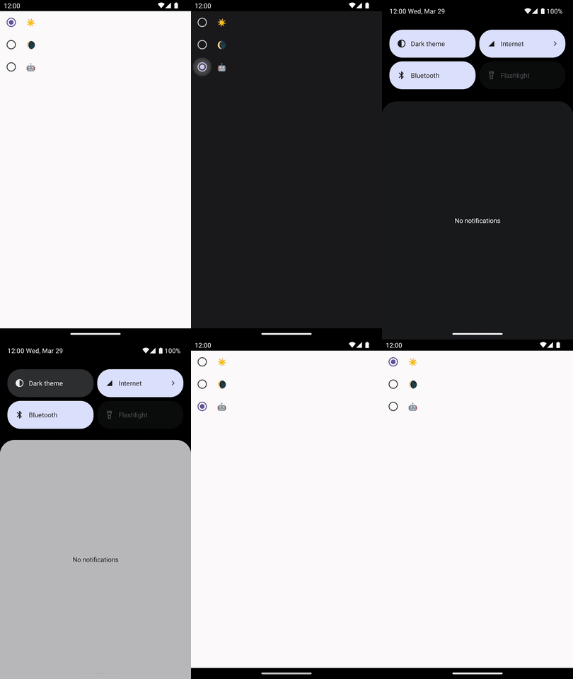
You can take this a step further and introduce a third state for the user. You can let them decide if they want the app to be light, dark or follow the system wide theme.
Here is how to implement this:
var appTheme by remember { mutableStateOf(AppTheme.System) }

MyAppTheme(
    isDarkTheme = when (appTheme) {
        AppTheme.Light -> false
        AppTheme.Dark -> true
        AppTheme.System -> isSystemInDarkTheme()
    }
) {
    Scaffold {
        Column {
            LabeledRadioButton(
                label = "☀️",
                selected = appTheme == AppTheme.Light,
                onClick = {
                    appTheme = AppTheme.Light
                }
            )
            LabeledRadioButton(
                label = "🌘",
                selected = appTheme == AppTheme.Dark,
                onClick = {
                    appTheme = AppTheme.Dark
                }
            )
            LabeledRadioButton(
                label = "🤖",
                selected = appTheme == AppTheme.System,
                onClick = {
                    appTheme = AppTheme.System
                }
            )
        }
    }
}
To simplify the code sample I created a composable that combines some Text and a Radio button:
@Composable
fun LabeledRadioButton(
    selected: Boolean,
    onClick: () -> Unit,
    label: String,
) {
    Row(
        verticalAlignment = Alignment.CenterVertically,
        horizontalArrangement = Arrangement.spacedBy(8.dp)
    ) {
        RadioButton(
            selected = selected,
            onClick = onClick
        )
        Text(label)
    }
}

PS: You would need to persist the theme selected. You can either use SharedPreferences or Data Store to do this. I personally like DataStore more as it exposes Kotlin Flows instead of callbacks.
That's all for today.
Until the next one,
Alex
