BottomDrawer
Common
Component in Material Compose
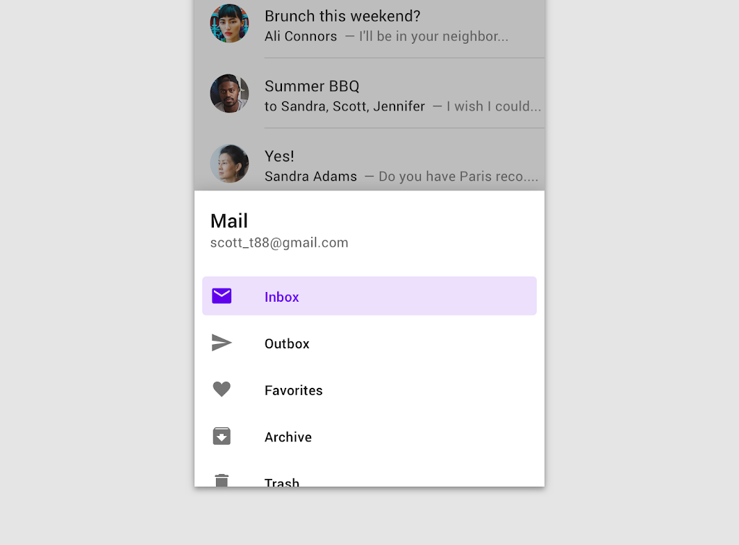
Bottom navigation drawers are modal drawers that are anchored to the bottom of the screen instead of the left or right edge. They are only used with bottom app bars.
Last updated:
Installation
dependencies {
implementation("androidx.compose.material:material:1.8.0-alpha01")
}
Overloads
@OptIn(ExperimentalMaterialApi::class)
@Composable
fun BottomDrawer(
drawerContent: @Composable ColumnScope.() -> Unit,
modifier: Modifier = Modifier,
drawerState: BottomDrawerState = rememberBottomDrawerState(Closed),
gesturesEnabled: Boolean = true,
drawerShape: Shape = DrawerDefaults.shape,
drawerElevation: Dp = DrawerDefaults.Elevation,
drawerBackgroundColor: Color = DrawerDefaults.backgroundColor,
drawerContentColor: Color = contentColorFor(drawerBackgroundColor),
scrimColor: Color = DrawerDefaults.scrimColor,
content: @Composable () -> Unit
)
Parameters
name | description |
---|---|
drawerContent | composable that represents content inside the drawer |
modifier | optional [Modifier] for the entire component |
drawerState | state of the drawer |
gesturesEnabled | whether or not drawer can be interacted by gestures |
drawerShape | shape of the drawer sheet |
drawerElevation | drawer sheet elevation. This controls the size of the shadow below the drawer sheet |
drawerBackgroundColor | background color to be used for the drawer sheet |
drawerContentColor | color of the content to use inside the drawer sheet. Defaults to either the matching content color for [drawerBackgroundColor], or, if it is not a color from the theme, this will keep the same value set above this Surface. |
scrimColor | color of the scrim that obscures content when the drawer is open. If the color passed is [Color.Unspecified], then a scrim will no longer be applied and the bottom drawer will not block interaction with the rest of the screen when visible. |
content | content of the rest of the UI |
Code Example
BottomDrawerSample
@Composable
@OptIn(ExperimentalMaterialApi::class)
fun BottomDrawerSample() {
val (gesturesEnabled, toggleGesturesEnabled) = remember { mutableStateOf(true) }
val scope = rememberCoroutineScope()
Column {
Row(
modifier =
Modifier.fillMaxWidth()
.toggleable(value = gesturesEnabled, onValueChange = toggleGesturesEnabled)
) {
Checkbox(gesturesEnabled, null)
Text(text = if (gesturesEnabled) "Gestures Enabled" else "Gestures Disabled")
}
val drawerState = rememberBottomDrawerState(BottomDrawerValue.Closed)
BottomDrawer(
gesturesEnabled = gesturesEnabled,
drawerState = drawerState,
drawerContent = {
Button(
modifier = Modifier.align(Alignment.CenterHorizontally).padding(top = 16.dp),
onClick = { scope.launch { drawerState.close() } },
content = { Text("Close Drawer") }
)
LazyColumn {
items(25) {
ListItem(
text = { Text("Item $it") },
icon = {
Icon(
Icons.Default.Favorite,
contentDescription = "Localized description"
)
}
)
}
}
},
content = {
Column(
modifier = Modifier.fillMaxSize().padding(16.dp),
horizontalAlignment = Alignment.CenterHorizontally
) {
val openText = if (gesturesEnabled) "▲▲▲ Pull up ▲▲▲" else "Click the button!"
Text(text = if (drawerState.isClosed) openText else "▼▼▼ Drag down ▼▼▼")
Spacer(Modifier.height(20.dp))
Button(onClick = { scope.launch { drawerState.open() } }) {
Text("Click to open")
}
}
}
)
}
}