BottomSheetScaffold
Common
Component in Material Compose
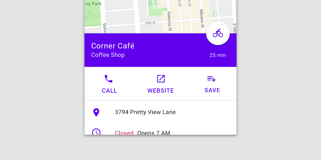
Material Design standard bottom sheet
Standard bottom sheets co-exist with the screen’s main UI region and allow for simultaneously viewing and interacting with both regions. They are commonly used to keep a feature or secondary content visible on screen when content in main UI region is frequently scrolled or panned.

Last updated:
Installation
dependencies {
   implementation("androidx.compose.material:material:1.9.0-alpha04")
}
Overloads
@OptIn(ExperimentalMaterialApi::class)
@Composable
fun BottomSheetScaffold(
    sheetContent: @Composable ColumnScope.() -> Unit,
    modifier: Modifier = Modifier,
    scaffoldState: BottomSheetScaffoldState = rememberBottomSheetScaffoldState(),
    topBar: (@Composable () -> Unit)? = null,
    snackbarHost: @Composable (SnackbarHostState) -> Unit = { SnackbarHost(it) },
    floatingActionButton: (@Composable () -> Unit)? = null,
    floatingActionButtonPosition: FabPosition = FabPosition.End,
    sheetGesturesEnabled: Boolean = true,
    sheetShape: Shape = MaterialTheme.shapes.large,
    sheetElevation: Dp = BottomSheetScaffoldDefaults.SheetElevation,
    sheetBackgroundColor: Color = MaterialTheme.colors.surface,
    sheetContentColor: Color = contentColorFor(sheetBackgroundColor),
    sheetPeekHeight: Dp = BottomSheetScaffoldDefaults.SheetPeekHeight,
    backgroundColor: Color = MaterialTheme.colors.background,
    contentColor: Color = contentColorFor(backgroundColor),
    content: @Composable (PaddingValues) -> Unit,
)
Parameters
| name | description |
|---|---|
sheetContent | The content of the bottom sheet. |
modifier | An optional [Modifier] for the root of the scaffold. |
scaffoldState | The state of the scaffold. |
topBar | An optional top app bar. |
snackbarHost | The composable hosting the snackbars shown inside the scaffold. |
floatingActionButton | An optional floating action button. |
floatingActionButtonPosition | The position of the floating action button. |
sheetGesturesEnabled | Whether the bottom sheet can be interacted with by gestures. |
sheetShape | The shape of the bottom sheet. |
sheetElevation | The elevation of the bottom sheet. |
sheetBackgroundColor | The background color of the bottom sheet. |
sheetContentColor | The preferred content color provided by the bottom sheet to its children. Defaults to the matching content color for [sheetBackgroundColor], or if that is not a color from the theme, this will keep the same content color set above the bottom sheet. |
sheetPeekHeight | The height of the bottom sheet when it is collapsed. If the peek height equals the sheet's full height, the sheet will only have a collapsed state. |
backgroundColor | The background color of the scaffold body. |
contentColor | The color of the content in scaffold body. Defaults to either the matching content color for [backgroundColor], or, if it is not a color from the theme, this will keep the same value set above this Surface. |
content | The main content of the screen. You should use the provided [PaddingValues] to properly offset the content, so that it is not obstructed by the bottom sheet when collapsed. |
Code Example
BottomSheetScaffoldSample
@Composable
@OptIn(ExperimentalMaterialApi::class)
fun BottomSheetScaffoldSample() {
    val scope = rememberCoroutineScope()
    val scaffoldState = rememberBottomSheetScaffoldState()
    BottomSheetScaffold(
        sheetContent = {
            Box(Modifier.fillMaxWidth().height(128.dp), contentAlignment = Alignment.Center) {
                Text("Swipe up to expand sheet")
            }
            Column(
                Modifier.fillMaxWidth().padding(64.dp),
                horizontalAlignment = Alignment.CenterHorizontally,
            ) {
                Text("Sheet content")
                Spacer(Modifier.height(20.dp))
                Button(onClick = { scope.launch { scaffoldState.bottomSheetState.collapse() } }) {
                    Text("Click to collapse sheet")
                }
            }
        },
        scaffoldState = scaffoldState,
        topBar = { TopAppBar { Text("Bottom sheet scaffold") } },
        floatingActionButton = {
            var clickCount by remember { mutableStateOf(0) }
            FloatingActionButton(
                onClick = {
                    // show snackbar as a suspend function
                    scope.launch {
                        scaffoldState.snackbarHostState.showSnackbar("Snackbar #${++clickCount}")
                    }
                }
            ) {
                Icon(Icons.Default.Favorite, contentDescription = "Localized description")
            }
        },
        floatingActionButtonPosition = FabPosition.End,
        sheetPeekHeight = 128.dp,
    ) { innerPadding ->
        LazyColumn(contentPadding = innerPadding) {
            items(100) {
                Box(Modifier.fillMaxWidth().height(50.dp).background(colors[it % colors.size]))
            }
        }
    }
}

