CircularWavyProgressIndicator
Common
Component in Material 3 Compose
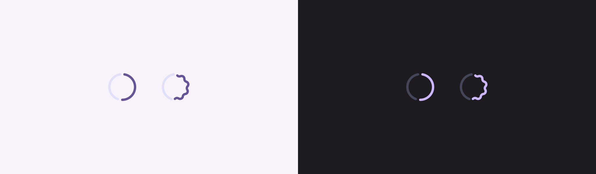
Material Design determinate circular progress indicator
Progress indicators express an unspecified wait time or display the duration of a process.
Last updated:
Installation
dependencies {
   implementation("androidx.compose.material3:material3:1.4.0-alpha15")
}
Overloads
@ExperimentalMaterial3ExpressiveApi
@Composable
fun CircularWavyProgressIndicator(
    progress: () -> Float,
    modifier: Modifier = Modifier,
    color: Color = WavyProgressIndicatorDefaults.indicatorColor,
    trackColor: Color = WavyProgressIndicatorDefaults.trackColor,
    stroke: Stroke = WavyProgressIndicatorDefaults.circularIndicatorStroke,
    trackStroke: Stroke = WavyProgressIndicatorDefaults.circularTrackStroke,
    gapSize: Dp = WavyProgressIndicatorDefaults.CircularIndicatorTrackGapSize,
    amplitude: (progress: Float) -> Float = WavyProgressIndicatorDefaults.indicatorAmplitude,
    wavelength: Dp = WavyProgressIndicatorDefaults.CircularWavelength,
    waveSpeed: Dp = wavelength // Match to 1 wavelength per second
)
Parameters
| name | description |
|---|---|
progress | the progress of this progress indicator, where 0.0 represents no progress and 1.0 represents full progress. Values outside of this range are coerced into the range. |
modifier | the [Modifier] to be applied to this progress indicator |
color | the progress indicator color |
trackColor | the indicator's track color, visible when the progress has not reached the area of the overall indicator yet |
stroke | a [Stroke] that will be used to draw this indicator |
trackStroke | a [Stroke] that will be used to draw the indicator's track |
gapSize | the gap between the track and the progress parts of the indicator |
amplitude | a lambda that provides an amplitude for the wave path as a function of the indicator's progress. 0.0 represents no amplitude, and 1.0 represents a max amplitude. Values outside of this range are coerced into the range. |
wavelength | the length of a wave in this circular indicator. Note that the actual wavelength may be different to ensure a continuous wave shape. |
waveSpeed | the speed in which the wave will move when the [amplitude] is greater than zero. The value here represents a DP per seconds, and by default it's matched to the [wavelength] to render an animation that moves the wave by one wave length per second. Note that the actual speed may be slightly different, as the [wavelength] can be adjusted to ensure a continuous wave shape. |
@ExperimentalMaterial3ExpressiveApi
@Composable
fun CircularWavyProgressIndicator(
    modifier: Modifier = Modifier,
    color: Color = WavyProgressIndicatorDefaults.indicatorColor,
    trackColor: Color = WavyProgressIndicatorDefaults.trackColor,
    stroke: Stroke = WavyProgressIndicatorDefaults.circularIndicatorStroke,
    trackStroke: Stroke = WavyProgressIndicatorDefaults.circularTrackStroke,
    gapSize: Dp = WavyProgressIndicatorDefaults.CircularIndicatorTrackGapSize,
    @FloatRange(from = 0.0, to = 1.0) amplitude: Float = 1f,
    wavelength: Dp = WavyProgressIndicatorDefaults.CircularWavelength,
    waveSpeed: Dp = wavelength // Match to 1 wavelength per second
)
Parameters
| name | description |
|---|---|
modifier | the [Modifier] to be applied to this progress indicator |
color | the progress indicator color |
trackColor | the indicator's track color, visible when the progress has not reached the area of the overall indicator yet |
stroke | a [Stroke] that will be used to draw this indicator |
trackStroke | a [Stroke] that will be used to draw the indicator's track |
gapSize | the gap between the track and the progress parts of the indicator |
amplitude | the wave's amplitude. 0.0 represents no amplitude, and 1.0 represents an amplitude that will take the full height of the progress indicator. Values outside of this range are coerced into the range. |
wavelength | the length of a wave in this circular indicator. Note that the actual wavelength may be different to ensure a continuous wave shape. |
waveSpeed | the speed in which the wave will move when the [amplitude] is greater than zero. The value here represents a DP per seconds, and by default it's matched to the [wavelength] to render an animation that moves the wave by one wave length per second. Note that the actual speed may be slightly different, as the [wavelength] can be adjusted to ensure a continuous wave shape. |
Code Examples
CircularWavyProgressIndicatorSample
@OptIn(ExperimentalMaterial3ExpressiveApi::class)
@Preview
@Composable
fun CircularWavyProgressIndicatorSample() {
    var progress by remember { mutableFloatStateOf(0.1f) }
    val animatedProgress by
        animateFloatAsState(
            targetValue = progress,
            animationSpec = ProgressIndicatorDefaults.ProgressAnimationSpec
        )

    Column(horizontalAlignment = Alignment.CenterHorizontally) {
        CircularWavyProgressIndicator(progress = { animatedProgress })
        Spacer(Modifier.requiredHeight(30.dp))
        Text("Set progress:")
        Slider(
            modifier = Modifier.width(300.dp),
            value = progress,
            valueRange = 0f..1f,
            onValueChange = { progress = it },
        )
    }
}
CircularThickWavyProgressIndicatorSample
@OptIn(ExperimentalMaterial3ExpressiveApi::class)
@Preview
@Composable
fun CircularThickWavyProgressIndicatorSample() {
    var progress by remember { mutableFloatStateOf(0.1f) }
    val animatedProgress by
        animateFloatAsState(
            targetValue = progress,
            animationSpec = ProgressIndicatorDefaults.ProgressAnimationSpec
        )
    val thickStrokeWidth = with(LocalDensity.current) { 8.dp.toPx() }
    val thickStroke =
        remember(thickStrokeWidth) { Stroke(width = thickStrokeWidth, cap = StrokeCap.Round) }
    Column(horizontalAlignment = Alignment.CenterHorizontally) {
        CircularWavyProgressIndicator(
            progress = { animatedProgress },
            // Thick size is slightly larger than the
            // WavyProgressIndicatorDefaults.CircularContainerSize default
            modifier = Modifier.size(52.dp), // Thick size is slightly larger than the default
            stroke = thickStroke,
            trackStroke = thickStroke,
        )
        Spacer(Modifier.requiredHeight(30.dp))
        Text("Set progress:")
        Slider(
            modifier = Modifier.width(300.dp),
            value = progress,
            valueRange = 0f..1f,
            onValueChange = { progress = it },
        )
    }
}
IndeterminateCircularWavyProgressIndicatorSample
@OptIn(ExperimentalMaterial3ExpressiveApi::class)
@Preview
@Composable
fun IndeterminateCircularWavyProgressIndicatorSample() {
    Column(horizontalAlignment = Alignment.CenterHorizontally) { CircularWavyProgressIndicator() }
}
Sponsored by


