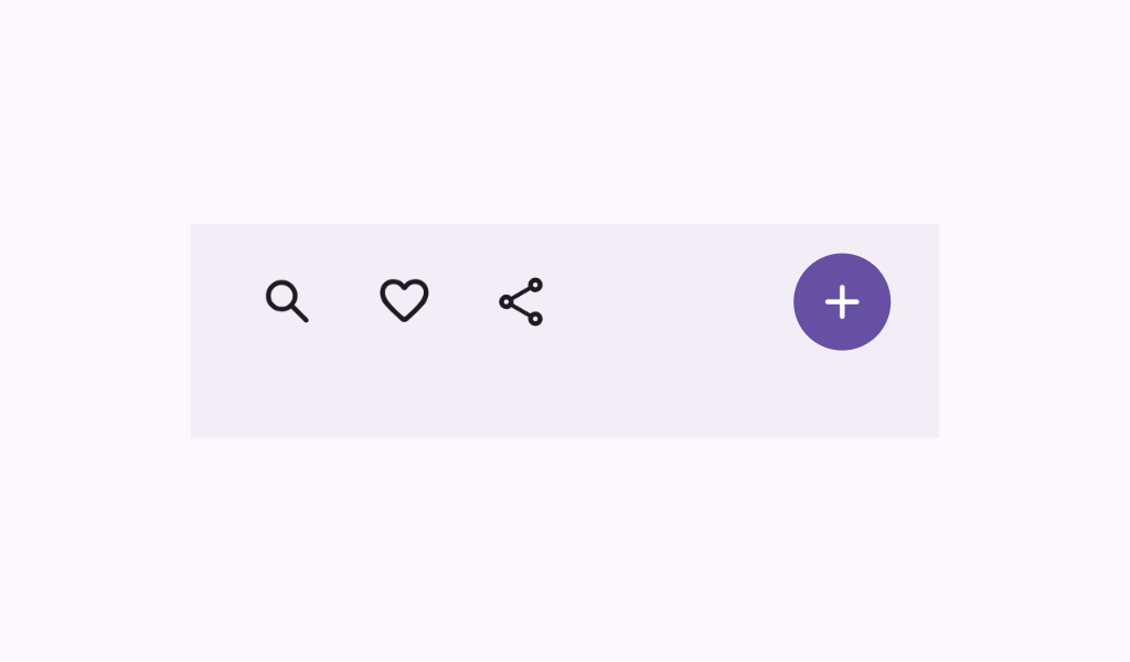
FlexibleBottomAppBar
Source set: Common
@ExperimentalMaterial3ExpressiveApi
@Composable
fun FlexibleBottomAppBar(
    modifier: Modifier = Modifier,
    containerColor: Color = BottomAppBarDefaults.containerColor,
    contentColor: Color = contentColorFor(containerColor),
    contentPadding: PaddingValues = BottomAppBarDefaults.FlexibleContentPadding,
    horizontalArrangement: Arrangement.Horizontal =
        BottomAppBarDefaults.FlexibleHorizontalArrangement,
    expandedHeight: Dp = BottomAppBarDefaults.FlexibleBottomAppBarHeight,
    windowInsets: WindowInsets = BottomAppBarDefaults.windowInsets,
    scrollBehavior: BottomAppBarScrollBehavior? = null,
    content: @Composable RowScope.() -> Unit,
)
Parameters
| modifier | the Modifier to be applied to this BottomAppBar |
| containerColor | the color used for the background of this BottomAppBar. Use Color.Transparent to have no color. |
| contentColor | the preferred color for content inside this BottomAppBar. Defaults to either the matching content color for containerColor, or to the current LocalContentColor if containerColor is not a color from the theme. |
| contentPadding | the padding applied to the content of this BottomAppBar |
| horizontalArrangement | the horizontal arrangement of the content inside this BottomAppBar |
| expandedHeight | the maximum height this bottom bar can reach when fully expanded. If a scrollBehavior is provided, the bar might collapse or expand based on scrolling. In that case, this value sets the upper limit for the bar's height during expansion. This Dp value must be specified, finite, and greater than zero; otherwise, BottomAppBarDefaults.FlexibleBottomAppBarHeight will be used as a default. In case the scrollBehavior is null, this value will simply be the fixed height of the bottom bar. |
| windowInsets | a window insets that app bar will respect. |
| scrollBehavior | a BottomAppBarScrollBehavior which holds various offset values that will be applied by this bottom app bar to set up its height. A scroll behavior is designed to work in conjunction with a scrolled content to change the bottom app bar appearance as the content scrolls. Note that the bottom app bar will not react to scrolling in case a touch exploration service (e.g., TalkBack) is active. See BottomAppBarScrollBehavior.nestedScrollConnection. |
| content | the content of this BottomAppBar. The default layout here is a Row, so content inside will be placed horizontally. |
