Composable Component
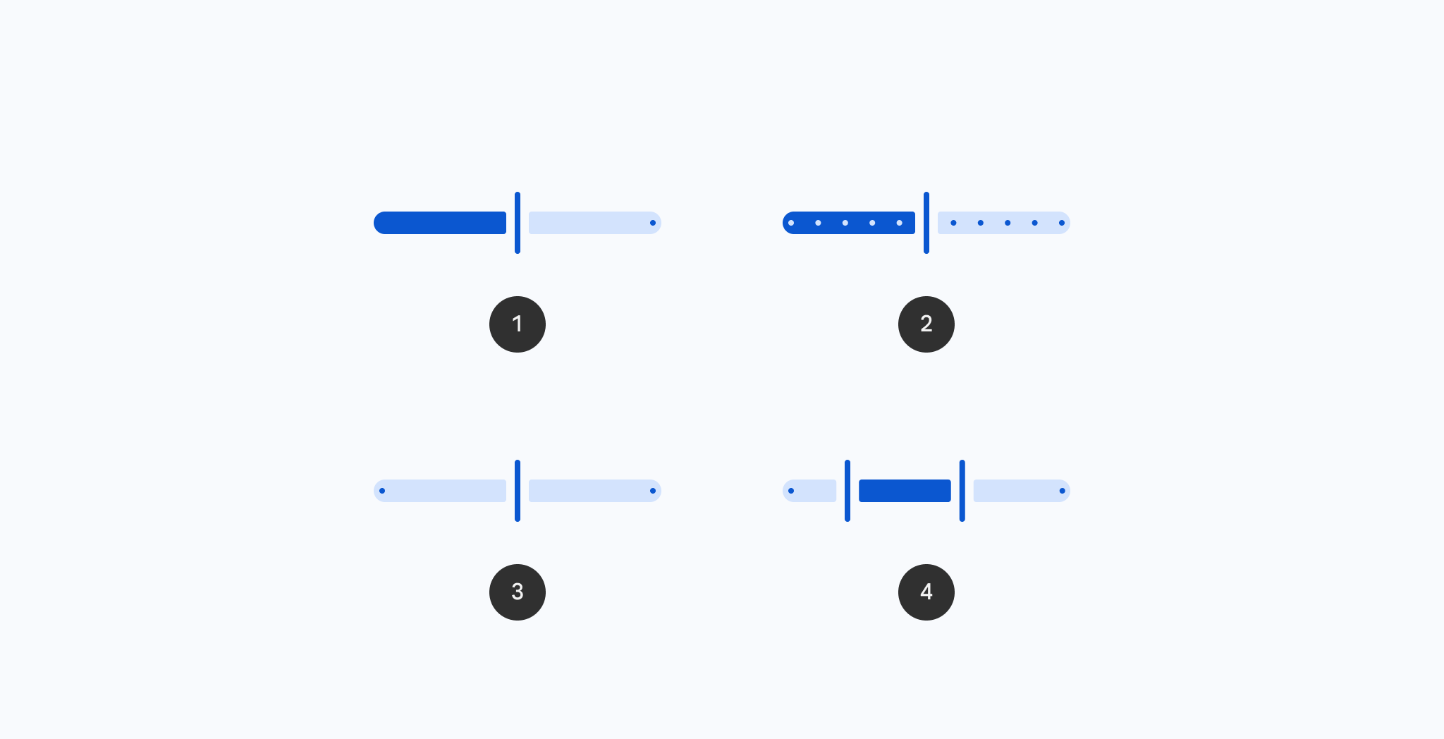
Sliders allow users to make selections from a range of values.
Common
@Composable
fun Slider(
    value: Float,
    onValueChange: (Float) -> Unit,
    modifier: Modifier = Modifier,
    enabled: Boolean = true,
    valueRange: ClosedFloatingPointRange<Float> = 0f..1f,
    @IntRange(from = 0) steps: Int = 0,
    onValueChangeFinished: (() -> Unit)? = null,
    colors: SliderColors = SliderDefaults.colors(),
    interactionSource: MutableInteractionSource = remember { MutableInteractionSource() },
)
Parameters
| value | current value of the slider. If outside of valueRange provided, value will be coerced to this range. |
| onValueChange | callback in which value should be updated |
| modifier | the Modifier to be applied to this slider |
| enabled | controls the enabled state of this slider. When false, this component will not respond to user input, and it will appear visually disabled and disabled to accessibility services. |
| valueRange | range of values that this slider can take. The passed value will be coerced to this range. |
| steps | if positive, specifies the amount of discrete allowable values between the endpoints of valueRange. For example, a range from 0 to 10 with 4 steps allows 4 values evenly distributed between 0 and 10 (i.e., 2, 4, 6, 8). If steps is 0, the slider will behave continuously and allow any value from the range. Must not be negative. |
| onValueChangeFinished | called when value change has ended. This should not be used to update the slider value (use onValueChange instead), but rather to know when the user has completed selecting a new value by ending a drag or a click. |
| colors | SliderColors that will be used to resolve the colors used for this slider in different states. See SliderDefaults.colors. |
| interactionSource | the MutableInteractionSource representing the stream of Interactions for this slider. You can create and pass in your own remembered instance to observe Interactions and customize the appearance / behavior of this slider in different states. |
Common
@Composable
fun Slider(
    value: Float,
    onValueChange: (Float) -> Unit,
    modifier: Modifier = Modifier,
    enabled: Boolean = true,
    onValueChangeFinished: (() -> Unit)? = null,
    colors: SliderColors = SliderDefaults.colors(),
    interactionSource: MutableInteractionSource = remember { MutableInteractionSource() },
    @IntRange(from = 0) steps: Int = 0,
    thumb: @Composable (SliderState) -> Unit = {
        SliderDefaults.Thumb(
            interactionSource = interactionSource,
            colors = colors,
            enabled = enabled,
        )
    },
    track: @Composable (SliderState) -> Unit = { sliderState ->
        SliderDefaults.Track(colors = colors, enabled = enabled, sliderState = sliderState)
    },
    valueRange: ClosedFloatingPointRange<Float> = 0f..1f,
)
Parameters
| value | current value of the slider. If outside of valueRange provided, value will be coerced to this range. |
| onValueChange | callback in which value should be updated |
| modifier | the Modifier to be applied to this slider |
| enabled | controls the enabled state of this slider. When false, this component will not respond to user input, and it will appear visually disabled and disabled to accessibility services. |
| onValueChangeFinished | called when value change has ended. This should not be used to update the slider value (use onValueChange instead), but rather to know when the user has completed selecting a new value by ending a drag or a click. |
| colors | SliderColors that will be used to resolve the colors used for this slider in different states. See SliderDefaults.colors. |
| interactionSource | the MutableInteractionSource representing the stream of Interactions for this slider. You can create and pass in your own remembered instance to observe Interactions and customize the appearance / behavior of this slider in different states. |
| steps | if positive, specifies the amount of discrete allowable values between the endpoints of valueRange. For example, a range from 0 to 10 with 4 steps allows 4 values evenly distributed between 0 and 10 (i.e., 2, 4, 6, 8). If steps is 0, the slider will behave continuously and allow any value from the range. Must not be negative. |
| thumb | the thumb to be displayed on the slider, it is placed on top of the track. The lambda receives a SliderState which is used to obtain the current active track. |
| track | the track to be displayed on the slider, it is placed underneath the thumb. The lambda receives a SliderState which is used to obtain the current active track. |
| valueRange | range of values that this slider can take. The passed value will be coerced to this range. |
Common
@Composable
fun Slider(
    state: SliderState,
    modifier: Modifier = Modifier,
    enabled: Boolean = true,
    colors: SliderColors = SliderDefaults.colors(),
    interactionSource: MutableInteractionSource = remember { MutableInteractionSource() },
    thumb: @Composable (SliderState) -> Unit = {
        SliderDefaults.Thumb(
            interactionSource = interactionSource,
            colors = colors,
            enabled = enabled,
        )
    },
    track: @Composable (SliderState) -> Unit = { sliderState ->
        SliderDefaults.Track(colors = colors, enabled = enabled, sliderState = sliderState)
    },
)
Parameters
| state | SliderState which contains the slider's current value. |
| modifier | the Modifier to be applied to this slider |
| enabled | controls the enabled state of this slider. When false, this component will not respond to user input, and it will appear visually disabled and disabled to accessibility services. |
| colors | SliderColors that will be used to resolve the colors used for this slider in different states. See SliderDefaults.colors. |
| interactionSource | the MutableInteractionSource representing the stream of Interactions for this slider. You can create and pass in your own remembered instance to observe Interactions and customize the appearance / behavior of this slider in different states. |
| thumb | the thumb to be displayed on the slider, it is placed on top of the track. The lambda receives a SliderState which is used to obtain the current active track. |
| track | the track to be displayed on the slider, it is placed underneath the thumb. The lambda receives a SliderState which is used to obtain the current active track. |
Code Examples
CenteredSliderSample
@OptIn(ExperimentalMaterial3ExpressiveApi::class)
@Preview
@Composable
fun CenteredSliderSample() {
    val sliderState =
        rememberSliderState(
            valueRange = -50f..50f,
            onValueChangeFinished = {
                // launch some business logic update with the state you hold
                // viewModel.updateSelectedSliderValue(sliderPosition)
            },
        )
    val interactionSource = remember { MutableInteractionSource() }
    Column(modifier = Modifier.padding(horizontal = 16.dp)) {
        Text(text = "%.2f".format(sliderState.value))
        Slider(
            state = sliderState,
            interactionSource = interactionSource,
            thumb = { SliderDefaults.Thumb(interactionSource = interactionSource) },
            track = { SliderDefaults.CenteredTrack(sliderState = sliderState) },
        )
    }
}
SliderSample
@Preview
@Composable
fun SliderSample() {
    var sliderPosition by rememberSaveable { mutableStateOf(0f) }
    Column(modifier = Modifier.padding(horizontal = 16.dp)) {
        Text(text = "%.2f".format(sliderPosition))
        Slider(value = sliderPosition, onValueChange = { sliderPosition = it })
    }
}
SliderWithCustomThumbSample
@OptIn(ExperimentalMaterial3Api::class)
@Preview
@Composable
fun SliderWithCustomThumbSample() {
    var sliderPosition by rememberSaveable { mutableStateOf(0f) }
    val interactionSource: MutableInteractionSource = remember { MutableInteractionSource() }
    Column(modifier = Modifier.padding(horizontal = 16.dp)) {
        Slider(
            value = sliderPosition,
            onValueChange = { sliderPosition = it },
            valueRange = 0f..100f,
            interactionSource = interactionSource,
            onValueChangeFinished = {
                // launch some business logic update with the state you hold
                // viewModel.updateSelectedSliderValue(sliderPosition)
            },
            thumb = {
                Label(
                    label = {
                        PlainTooltip(modifier = Modifier.sizeIn(45.dp, 25.dp).wrapContentWidth()) {
                            Text("%.2f".format(sliderPosition))
                        }
                    },
                    interactionSource = interactionSource,
                ) {
                    Icon(
                        imageVector = Icons.Filled.Favorite,
                        contentDescription = null,
                        modifier = Modifier.size(ButtonDefaults.IconSize),
                        tint = Color.Red,
                    )
                }
            },
        )
    }
}
SliderWithCustomTrackAndThumbSample
@Preview
@Composable
fun SliderWithCustomTrackAndThumbSample() {
    val sliderState =
        rememberSliderState(
            valueRange = 0f..100f,
            onValueChangeFinished = {
                // launch some business logic update with the state you hold
                // viewModel.updateSelectedSliderValue(sliderPosition)
            },
        )
    val interactionSource = remember { MutableInteractionSource() }
    val colors = SliderDefaults.colors(thumbColor = Color.Red, activeTrackColor = Color.Red)
    Column(modifier = Modifier.padding(horizontal = 16.dp)) {
        Text(text = "%.2f".format(sliderState.value))
        Slider(
            state = sliderState,
            interactionSource = interactionSource,
            thumb = {
                SliderDefaults.Thumb(interactionSource = interactionSource, colors = colors)
            },
            track = { SliderDefaults.Track(colors = colors, sliderState = sliderState) },
        )
    }
}
SliderWithTrackIconsSample
@OptIn(ExperimentalMaterial3ExpressiveApi::class)
@Preview
@Composable
fun SliderWithTrackIconsSample() {
    val sliderState =
        rememberSliderState(
            valueRange = 0f..100f,
            onValueChangeFinished = {
                // launch some business logic update with the state you hold
                // viewModel.updateSelectedSliderValue(sliderPosition)
            },
        )
    val interactionSource = remember { MutableInteractionSource() }
    val startIcon = rememberVectorPainter(Icons.Filled.MusicNote)
    val endIcon = rememberVectorPainter(Icons.Filled.MusicOff)
    Column(modifier = Modifier.padding(horizontal = 16.dp)) {
        Text(text = "%.2f".format(sliderState.value))
        Slider(
            state = sliderState,
            interactionSource = interactionSource,
            track = {
                val iconSize = DpSize(20.dp, 20.dp)
                val iconPadding = 10.dp
                val thumbTrackGapSize = 6.dp
                val activeIconColor = SliderDefaults.colors().activeTickColor
                val inactiveIconColor = SliderDefaults.colors().inactiveTickColor
                val trackIconStart: DrawScope.(Offset, Color) -> Unit = { offset, color ->
                    translate(offset.x + iconPadding.toPx(), offset.y) {
                        with(startIcon) {
                            draw(iconSize.toSize(), colorFilter = ColorFilter.tint(color))
                        }
                    }
                }
                val trackIconEnd: DrawScope.(Offset, Color) -> Unit = { offset, color ->
                    translate(offset.x - iconPadding.toPx() - iconSize.toSize().width, offset.y) {
                        with(endIcon) {
                            draw(iconSize.toSize(), colorFilter = ColorFilter.tint(color))
                        }
                    }
                }
                SliderDefaults.Track(
                    sliderState = sliderState,
                    modifier =
                        Modifier.height(36.dp).drawWithContent {
                            drawContent()
                            val yOffset = size.height / 2 - iconSize.toSize().height / 2
                            val activeTrackStart = 0f
                            val activeTrackEnd =
                                size.width * sliderState.coercedValueAsFraction -
                                    thumbTrackGapSize.toPx()
                            val inactiveTrackStart = activeTrackEnd + thumbTrackGapSize.toPx() * 2
                            val inactiveTrackEnd = size.width
                            val activeTrackWidth = activeTrackEnd - activeTrackStart
                            val inactiveTrackWidth = inactiveTrackEnd - inactiveTrackStart
                            if (
                                iconSize.toSize().width < activeTrackWidth - iconPadding.toPx() * 2
                            ) {
                                trackIconStart(Offset(activeTrackStart, yOffset), activeIconColor)
                                trackIconEnd(Offset(activeTrackEnd, yOffset), activeIconColor)
                            }
                            if (
                                iconSize.toSize().width <
                                    inactiveTrackWidth - iconPadding.toPx() * 2
                            ) {
                                trackIconStart(
                                    Offset(inactiveTrackStart, yOffset),
                                    inactiveIconColor,
                                )
                                trackIconEnd(Offset(inactiveTrackEnd, yOffset), inactiveIconColor)
                            }
                        },
                    trackCornerSize = 12.dp,
                    drawStopIndicator = null,
                    thumbTrackGapSize = thumbTrackGapSize,
                )
            },
        )
    }
}
StepsSliderSample
@Preview
@Composable
fun StepsSliderSample() {
    val sliderState =
        rememberSliderState(
            // Only allow multiples of 10. Excluding the endpoints of `valueRange`,
            // there are 9 steps (10, 20, ..., 90).
            steps = 9,
            valueRange = 0f..100f,
            onValueChangeFinished = {
                // launch some business logic update with the state you hold
                // viewModel.updateSelectedSliderValue(sliderPosition)
            },
        )
    Column(modifier = Modifier.padding(horizontal = 16.dp)) {
        Text(text = "%.2f".format(sliderState.value))
        Slider(state = sliderState)
    }
}