VerticalSlider
Common
Component in Material 3 Compose
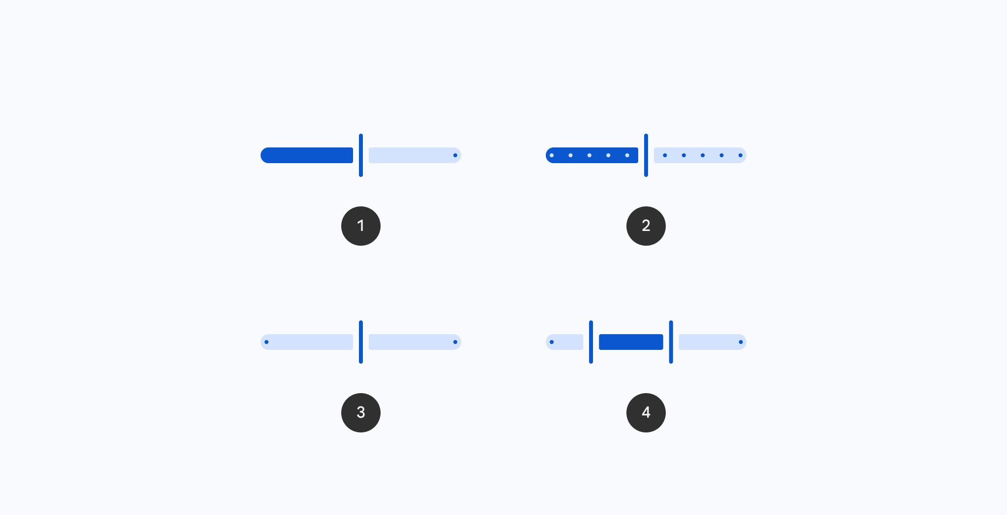
Vertical Sliders allow users to make selections from a range of values.
Vertical Sliders reflect a range of values along a vertical bar, from which users may select a single value. They are ideal for adjusting settings such as volume, brightness, or applying image filters.
Last updated:
Installation
dependencies {
   implementation("androidx.compose.material3:material3:1.4.0-alpha17")
}
Overloads
@OptIn(ExperimentalMaterial3Api::class)
@ExperimentalMaterial3ExpressiveApi
@Composable
fun VerticalSlider(
    state: SliderState,
    modifier: Modifier = Modifier,
    enabled: Boolean = true,
    reverseDirection: Boolean = false,
    colors: SliderColors = SliderDefaults.colors(),
    interactionSource: MutableInteractionSource = remember { MutableInteractionSource() },
    thumb: @Composable (SliderState) -> Unit = { sliderState ->
        SliderDefaults.Thumb(
            interactionSource = interactionSource,
            sliderState = sliderState,
            colors = colors,
            enabled = enabled,
            thumbSize = VerticalThumbSize,
        )
    },
    track: @Composable (SliderState) -> Unit = { sliderState ->
        SliderDefaults.Track(
            colors = colors,
            enabled = enabled,
            sliderState = sliderState,
            trackCornerSize = Dp.Unspecified,
        )
    },
)
Parameters
| name | description |
|---|---|
state | [SliderState] which contains the slider's current value. |
modifier | the [Modifier] to be applied to this slider |
enabled | controls the enabled state of this slider. When false, this component will not respond to user input, and it will appear visually disabled and disabled to accessibility services. |
reverseDirection | controls the direction of this slider. Default is top to bottom. |
colors | [SliderColors] that will be used to resolve the colors used for this slider in different states. See [SliderDefaults.colors]. |
interactionSource | the [MutableInteractionSource] representing the stream of [Interaction]s for this slider. You can create and pass in your own remembered instance to observe [Interaction]s and customize the appearance / behavior of this slider in different states. |
thumb | the thumb to be displayed on the slider, it is placed on top of the track. The lambda receives a [SliderState] which is used to obtain the current active track. |
track | the track to be displayed on the slider, it is placed underneath the thumb. The lambda receives a [SliderState] which is used to obtain the current active track. |
Code Examples
VerticalSliderSample
@OptIn(ExperimentalMaterial3Api::class, ExperimentalMaterial3ExpressiveApi::class)
@Preview
@Composable
fun VerticalSliderSample() {
    val coroutineScope = rememberCoroutineScope()
    val sliderState =
        rememberSliderState(
            // Only allow multiples of 10. Excluding the endpoints of `valueRange`,
            // there are 9 steps (10, 20, ..., 90).
            steps = 9,
            valueRange = 0f..100f,
        )
    val snapAnimationSpec = MaterialTheme.motionScheme.fastEffectsSpec<Float>()
    var currentValue by rememberSaveable { mutableFloatStateOf(sliderState.value) }
    var animateJob: Job? by remember { mutableStateOf(null) }
    sliderState.shouldAutoSnap = false
    sliderState.onValueChange = { newValue ->
        currentValue = newValue
        // only update the sliderState instantly if dragging
        if (sliderState.isDragging) {
            animateJob?.cancel()
            sliderState.value = newValue
        }
    }
    sliderState.onValueChangeFinished = {
        animateJob =
            coroutineScope.launch {
                animate(
                    initialValue = sliderState.value,
                    targetValue = currentValue,
                    animationSpec = snapAnimationSpec,
                ) { value, _ ->
                    sliderState.value = value
                }
            }
    }
    val interactionSource = remember { MutableInteractionSource() }
    Column(modifier = Modifier.padding(horizontal = 16.dp)) {
        Text(
            modifier = Modifier.align(Alignment.CenterHorizontally),
            text = "%.2f".format(sliderState.value),
        )
        Spacer(Modifier.height(16.dp))
        VerticalSlider(
            state = sliderState,
            modifier =
                Modifier.height(300.dp)
                    .align(Alignment.CenterHorizontally)
                    .progressSemantics(
                        currentValue,
                        sliderState.valueRange.start..sliderState.valueRange.endInclusive,
                        sliderState.steps,
                    ),
            interactionSource = interactionSource,
            track = {
                SliderDefaults.Track(
                    sliderState = sliderState,
                    modifier = Modifier.width(36.dp),
                    trackCornerSize = 12.dp,
                )
            },
            reverseDirection = true,
        )
    }
}
VerticalCenteredSliderSample
@OptIn(ExperimentalMaterial3Api::class, ExperimentalMaterial3ExpressiveApi::class)
@Preview
@Composable
fun VerticalCenteredSliderSample() {
    val coroutineScope = rememberCoroutineScope()
    val sliderState =
        rememberSliderState(
            // Only allow multiples of 10. Excluding the endpoints of `valueRange`,
            // there are 9 steps (10, 20, ..., 90).
            steps = 9,
            valueRange = -50f..50f,
        )
    val snapAnimationSpec = MaterialTheme.motionScheme.fastEffectsSpec<Float>()
    var currentValue by rememberSaveable { mutableFloatStateOf(sliderState.value) }
    var animateJob: Job? by remember { mutableStateOf(null) }
    sliderState.shouldAutoSnap = false
    sliderState.onValueChange = { newValue ->
        currentValue = newValue
        // only update the sliderState instantly if dragging
        if (sliderState.isDragging) {
            animateJob?.cancel()
            sliderState.value = newValue
        }
    }
    sliderState.onValueChangeFinished = {
        animateJob =
            coroutineScope.launch {
                animate(
                    initialValue = sliderState.value,
                    targetValue = currentValue,
                    animationSpec = snapAnimationSpec,
                ) { value, _ ->
                    sliderState.value = value
                }
            }
    }
    val interactionSource = remember { MutableInteractionSource() }
    Column(modifier = Modifier.padding(horizontal = 16.dp)) {
        Text(
            modifier = Modifier.align(Alignment.CenterHorizontally),
            text = "%.2f".format(sliderState.value),
        )
        Spacer(Modifier.height(16.dp))
        VerticalSlider(
            state = sliderState,
            modifier =
                Modifier.height(300.dp)
                    .align(Alignment.CenterHorizontally)
                    .progressSemantics(
                        currentValue,
                        sliderState.valueRange.start..sliderState.valueRange.endInclusive,
                        sliderState.steps,
                    ),
            interactionSource = interactionSource,
            track = { SliderDefaults.CenteredTrack(sliderState = sliderState) },
            reverseDirection = true,
        )
    }
}
