Building User Interfaces (UIs) using Jetpack Compose can be daunting after years of building interfaces with Android Views (XML anyone?). This article covers the basics of Jetpack Compose from an Android View background in order to speed up your learning of Compose.
This article was featured in Android Weekly #528 & jetc.dev Newsletter Issue #125 🎉
From View to @Composable
In Jetpack Compose, each component that needs to be rendered on the screen can be defined as a Kotlin Unit function marked with the @Composable annotation like this:
@Composable
fun Article(title: String, description: String) {
    Card {
        Column {
            Text(title)
            Spacer(Modifier.height(10.dp))
            Text(description)
        }
    }
}
We call those functions composables. The above composable will render a Card with a title and a subtitle, with a spacing of 10 dp in between.
Every time the title and description change, the UI will be updated to reflect the updated values. This is what we call recomposition.
You may only call composable functions from other composable functions. Because of this, activities that use Composable to render their layouts will look like this:
class MyActivity : ComponentActivity() {
    override fun onCreate(savedInstanceState: Bundle?) {
        super.onCreate(savedInstanceState)
        setContent {
            // use your composables here
        }
    }
}
setContent {} is an extension function of the ComponentActivity1. Using composables in a Fragment needs a ComposeView like so:
class MyFragment : Fragment() {
    override fun onCreateView(
        inflater: LayoutInflater?,
        container: ViewGroup?,
        savedInstanceState: Bundle?
    ): View {
        return ComposeView(requireContext()).apply {
            setViewCompositionStrategy(DisposeOnViewTreeLifecycleDestroyed)
            setContent {
                // use your composables here
            }
        }
    }
}
Set listeners and other common attributes using Modifiers
In the View world, there are some common attributes and features found in most Views out there. Things like setting click and touch listeners, applying elevation, alpha, to name a few. For anyone creating their own custom views, there was a lot of boilerplate code to implement for your view to support such operations.
Compose introduces the concept of Modifiers. Modifiers provide functionality and features to composables without being tied to specific composables. Some Modifiers can be used for styling the composable (see background(), border() , clip() , shadow(), alpha(), animateContentSize()), others help with the placement and sizing of the composable (see fillMaxWidth() , size(), heightIn(), padding()) and others can bring functionality to the composable such as enabling click behavior or dragging (see clickable() , draggable(), toggleable(), swipeable()).
For a full list of available modifiers check the official documentation.
From ViewGroups to Rows, Columns and Boxes
There are some composables whose main purpose is to help you arrange other composables on the screen. Those composables are the ViewGroups of the Compose world.
The most common ones to get started are: Column, Row, Box, LazyColumn and LazyRow. These composables accept the composables they need to arrange within a content lambda function. Some tend to provide a special Scope class receiver that enables access to specific Modifiers.
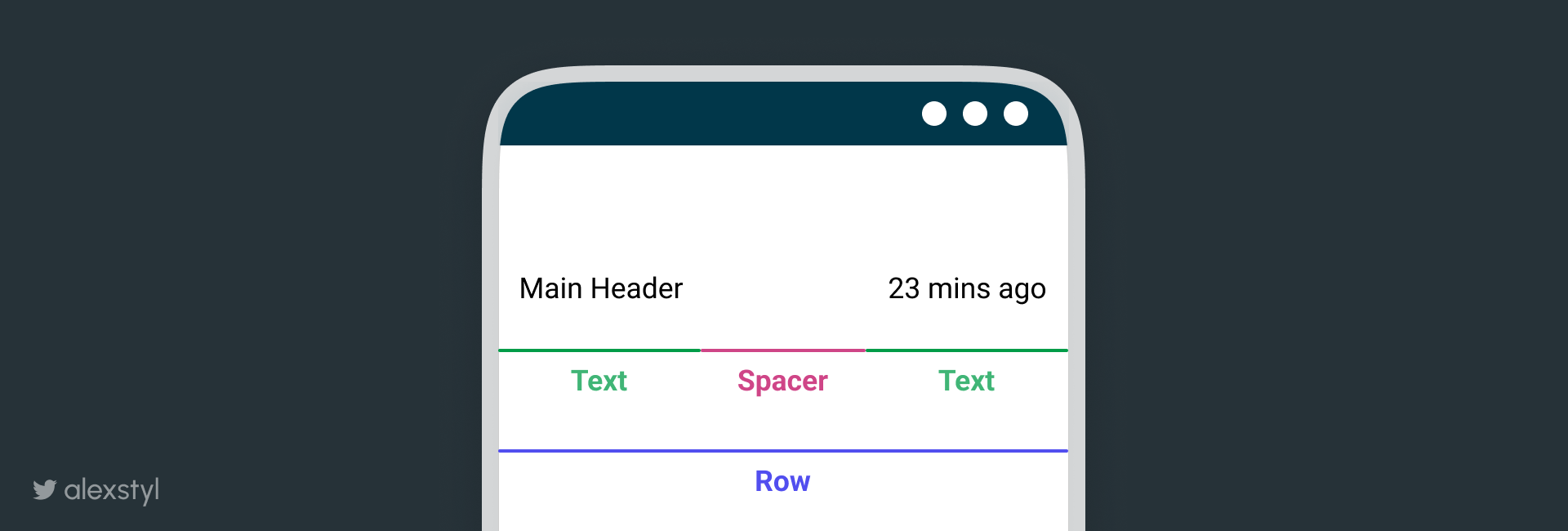
Instead of using a LinearLayout with a VERTICAL or HORIZONTAL orientation, use a Column or Row to arrange their composables vertically or horizontally respectively. Within their respective scope, you have access to the weight() modifier, which works the same way as a LinearLayout’s weight.
Row {
    Text("Main Header")
    Spacer(Modifier.weight(1f))
    Text("23 mins ago")
}

Instead of using a FrameLayout , use a Box in order to place composables on top of each other. In the Box’s Scope you have access to align which provides similar functionality to FrameLayout’s gravity.
Box {
    Image(
        painter = painterResource(R.drawable.landscape_horizontal),
        contentDescription = null
    )
    Text(
        "Preview",
        modifier = Modifier
            .padding(4.dp)
            .clip(RoundedCornerShape(14.dp))
            .background(Color.DarkGray)
            .padding(
                horizontal = 8.dp,
                vertical = 4.dp
            )
            .align(Alignment.BottomEnd),
        color = Color.White
    )
}

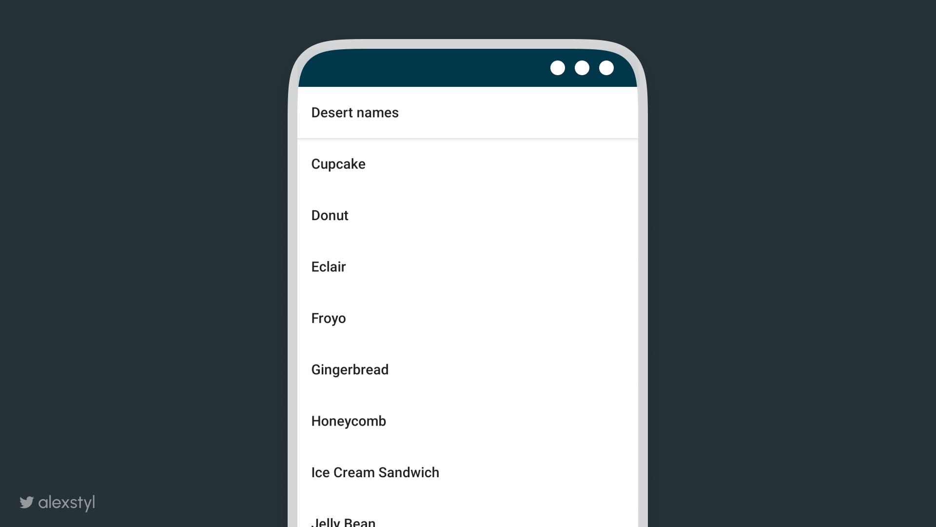
Working with lists is straightforward in Compose. Instead of using a RecyclerView with an adapter and view holders, use a LazyColumn or LazyRow to create a vertically or horizontally scrolling list respectively. The LazyListScope grants you access to the item {} function, in which you can place the items of the list without having to specify a ViewType anymore. As a bonus, there is a stickyHeader {} function which will provide sticky header functionality to the item.
val desertNames = listOf("...")
LazyColumn(Modifier.fillMaxSize()) {
    stickyHeader {
        Text(
            "Desert names",
            modifier = Modifier
                .fillMaxWidth()
                .shadow(4.dp)
                .background(Color.White)
                .padding(
                    vertical = 20.dp,
                    horizontal = 16.dp
                )
        )
    }
    desertNames.forEach { item ->
        item {
            Text(
                item,
                modifier = Modifier.padding(
                    vertical = 20.dp,
                    horizontal = 16.dp
                )
            )
        }
    }

Wiring business logic in your Screen level composables
Even though all composables are pure Kotlin functions, you will quickly realise that some are different than others. A composable might represent an element on the screen (such as a contact photo) and others might represent an entire screen. The screen level composable (the top level one) is the place where you want to be holding objects such as your ViewModels, and pass down values emitted from the ViewModel to nested composables, while reacting to events emitted from its nested composables.
Having a composable receive the values it needs to render on the screen as parameters, while bubbling up any events such as click listeners is what we call state hoisting. It makes the composable stateless and enables reusability and flexibility. As an added bonus, any business logic wiring ends up living in a single composable instead of being scattered around.
@Composable
fun MessagingScreen(viewmodel : MessagingViewModel = viewModel()){
    val typedText = viewmodel.typedText
    ReplyBar(
        text = typedText,
        onTextChange = {
            viewmodel.onTextChange(it)
        },
        onSendClick = {
            viewmodel.onSendClick()
        }
    )
}
Recap
This was a quick jump into Jetpack Compose coming from an Android View background. In the Compose world, each component that needs to be rendered on the screen is marked @Composable called a composable.
Use Modifiers to apply common functionality to any composable such as click listeners and elevation.
Composables such as Column , Row , Box,LazyColumn and LazyRow are the ViewGroups of the Compose world and can be used to arrange your composables on the screen.
Keep your composables stateless and do the wiring in the screen level composable to enable reusability and flexibility.
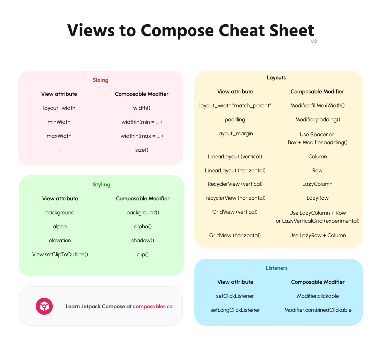
⚡️ BONUS⚡ Views to Compose Cheat Sheet
Here is everything covered in a glimpsable cheat sheet:

Related Videos for Jetpack Compose
Jetpack Compose Basics (Go to lesson)
This is an updated version of a blog post I first shared on medium called: From View to @Composable
Footnotes
-
ComponentActivity is part of the androidx.activity:activity-compose dependency. ↩
