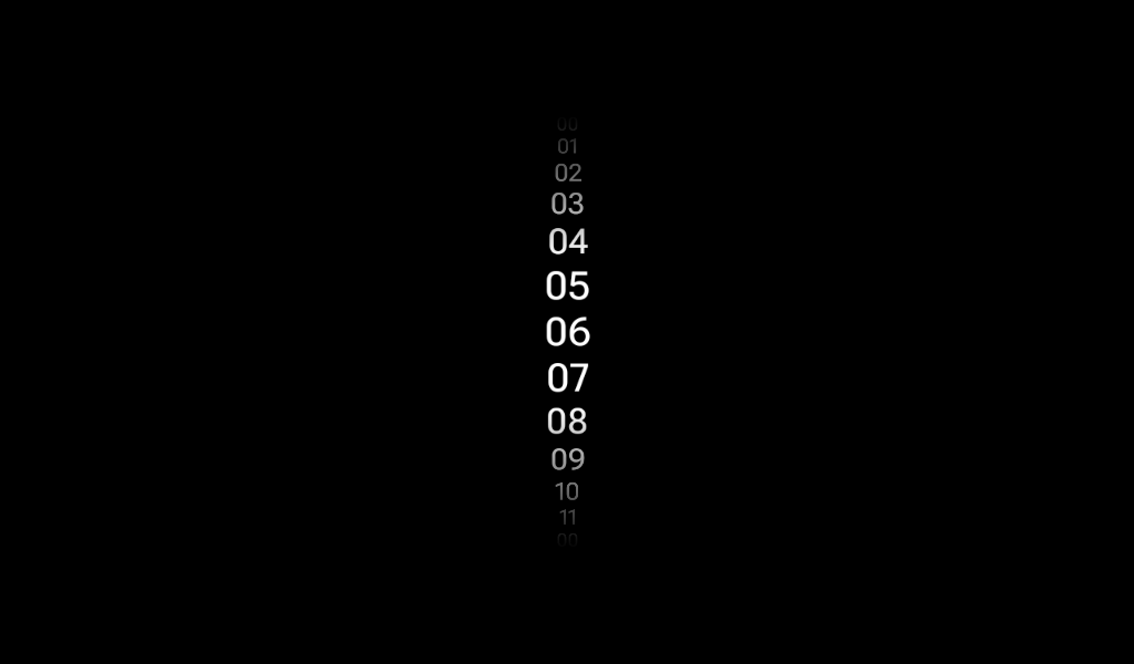
We just launched Compose Examples featuring over 150+ components! Check it out →

Picker

Android

Component in Wear Material 3 Compose

A scrollable list of items to pick from. By default, items will be repeated "infinitely" in both directions, unless [PickerState#repeatItems] is specified as false.

This overload supports rotary input. Rotary input allows users to scroll the content of the [Picker] - by using a crown or a rotating bezel on their Wear OS device. It can be modified with [rotaryScrollableBehavior] param. Note that rotary scroll and touch scroll should be aligned. If [rotaryScrollableBehavior] is set for snap (using [RotaryScrollableDefaults.snapBehavior]), [flingBehavior] should be set for snap as well (using [PickerDefaults.flingBehavior]).

Last updated:

Installation

dependencies {
   implementation("androidx.wear.compose:compose-material3:1.0.0-alpha24")
}

Overloads

@Composable
fun Picker(
    state: PickerState,
    contentDescription: String?,
    modifier: Modifier = Modifier,
    readOnly: Boolean = false,
    readOnlyLabel: @Composable (BoxScope.() -> Unit)? = null,
    onSelected: () -> Unit = {},
    scalingParams: ScalingParams = PickerDefaults.scalingParams(),
    spacing: Dp = 0.dp,
    @FloatRange(from = 0.0, to = 0.5) gradientRatio: Float = PickerDefaults.GradientRatio,
    gradientColor: Color = MaterialTheme.colorScheme.background,
    flingBehavior: FlingBehavior = PickerDefaults.flingBehavior(state),
    userScrollEnabled: Boolean = true,
    rotaryScrollableBehavior: RotaryScrollableBehavior? =
        RotaryScrollableDefaults.snapBehavior(state, state.toRotarySnapLayoutInfoProvider()),
    option: @Composable PickerScope.(optionIndex: Int) -> Unit
)

Parameters

namedescription
stateThe state of the component
contentDescriptionText used by accessibility services to describe what the selected option represents. This text should be localized, such as by using [androidx.compose.ui.res.stringResource] or similar. Typically, the content description is inferred via derivedStateOf to avoid unnecessary recompositions, like this: val description by remember { derivedStateOf { /* expression using state.selectedOption */ } }
modifier[Modifier] to be applied to the Picker.
readOnlyDetermines whether the [Picker] should display other available options for this field, inviting the user to scroll to change the value. When readOnly = true, only displays the currently selected option (and optionally a label). This is intended to be used for screens that display multiple Pickers, only one of which has the focus at a time.
readOnlyLabelA slot for providing a label, displayed above the selected option when the [Picker] is read-only. The label is overlaid with the currently selected option within a Box, so it is recommended that the label is given [Alignment.TopCenter].
onSelectedAction triggered when the Picker is selected by clicking. Used by accessibility semantics, which facilitates implementation of multi-picker screens.
scalingParamsThe parameters to configure the scaling and transparency effects for the component. See [ScalingParams].
spacingThe amount of spacing in [Dp] between items. Can be negative, which can be useful for Text if it has plenty of whitespace.
gradientRatioThe size relative to the Picker height that the top and bottom gradients take. These gradients blur the picker content on the top and bottom. The default is 0.33, so the top 1/3 and the bottom 1/3 of the picker are taken by gradients. Should be between 0.0 and 0.5. Use 0.0 to disable the gradient.
gradientColorShould be the color outside of the Picker, so there is continuity.
flingBehaviorlogic describing fling behavior. Note that when configuring fling or snap behavior, this flingBehavior parameter and the [rotaryScrollableBehavior] parameter that controls rotary scroll are expected to be consistent.
userScrollEnabledDetermines whether the picker should be scrollable or not. When userScrollEnabled = true, picker is scrollable. This is different from [readOnly] as it changes the scrolling behaviour.
rotaryScrollableBehaviorParameter for changing rotary behavior. Supports scroll [RotaryScrollableDefaults.behavior] and snap [RotaryScrollableDefaults.snapBehavior]. We do recommend to use [RotaryScrollableDefaults.snapBehavior] as this is a recommended behavior for Pickers. Note that when configuring fling or snap behavior, this rotaryBehavior parameter and the [flingBehavior] parameter that controls touch scroll are expected to be consistent. Can be null if rotary support is not required.
optionA block which describes the content. Inside this block you can reference [PickerScope.selectedOption] and other properties in [PickerScope]. When read-only mode is in use on a screen, it is recommended that this content is given [Alignment.Center] in order to align with the centrally selected Picker value.

Code Examples

SimplePicker

@Composable
fun SimplePicker() {
    val items = listOf("One", "Two", "Three", "Four", "Five")
    val state = rememberPickerState(items.size)
    val contentDescription by remember { derivedStateOf { "${state.selectedOption + 1}" } }
    Box(modifier = Modifier.fillMaxSize(), contentAlignment = Alignment.Center) {
        Text(
            modifier = Modifier.align(Alignment.TopCenter).padding(top = 10.dp),
            text = "Selected: ${items[state.selectedOption]}"
        )
        Picker(
            modifier = Modifier.size(100.dp, 100.dp),
            state = state,
            contentDescription = contentDescription,
        ) {
            Text(items[it])
        }
    }
}

PickerGroupSample

@Composable
fun PickerGroupSample() {
    val pickerGroupState = rememberPickerGroupState()
    val pickerStateHour = rememberPickerState(initialNumberOfOptions = 24)
    val pickerStateMinute = rememberPickerState(initialNumberOfOptions = 60)
    Column(
        modifier = Modifier.fillMaxWidth(),
        verticalArrangement = Arrangement.Center,
        horizontalAlignment = Alignment.CenterHorizontally
    ) {
        Spacer(modifier = Modifier.size(30.dp))
        Text(text = if (pickerGroupState.selectedIndex == 0) "Hours" else "Minutes")
        Spacer(modifier = Modifier.size(10.dp))
        PickerGroup(
            PickerGroupItem(
                pickerState = pickerStateHour,
                option = { optionIndex, _ -> Text(text = "%02d".format(optionIndex)) },
                modifier = Modifier.size(80.dp, 100.dp)
            ),
            PickerGroupItem(
                pickerState = pickerStateMinute,
                option = { optionIndex, _ -> Text(text = "%02d".format(optionIndex)) },
                modifier = Modifier.size(80.dp, 100.dp)
            ),
            pickerGroupState = pickerGroupState,
            autoCenter = false
        )
    }
}
by @alexstyl