Source set: Android
Added in 1.7.0-alpha01
@Composable
public fun SegmentedCircularProgressIndicator(
    @IntRange(from = 1) segmentCount: Int,
    progress: () -> Float,
    modifier: Modifier = Modifier,
    allowProgressOverflow: Boolean = false,
    startAngle: Float = CircularProgressIndicatorDefaults.StartAngle,
    endAngle: Float = startAngle,
    colors: ProgressIndicatorColors = ProgressIndicatorDefaults.colors(),
    strokeWidth: Dp = CircularProgressIndicatorDefaults.largeStrokeWidth,
    gapSize: Dp = CircularProgressIndicatorDefaults.calculateRecommendedGapSize(strokeWidth),
    enabled: Boolean = true,
)
Parameters
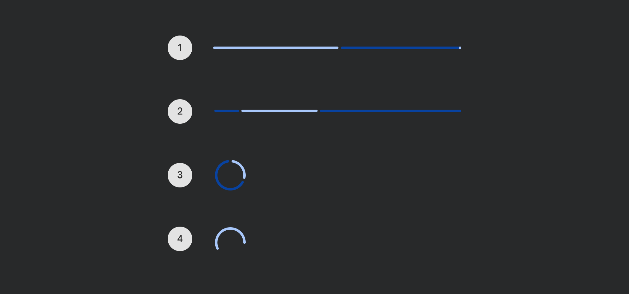
| segmentCount | Number of equal segments that the progress indicator should be divided into. Has to be a number equal or greater to 1. |
| progress | The progress of this progress indicator where 0.0 represents no progress and 1.0 represents completion. Values smaller than 0.0 will be coerced to 0, while values larger than 1.0 will be wrapped around and shown as overflow with a different track color. The progress is applied to the entire SegmentedCircularProgressIndicator across all segments. Progress changes will be animated. |
| modifier | Modifier to be applied to the SegmentedCircularProgressIndicator. |
| allowProgressOverflow | When progress overflow is allowed, values smaller than 0.0 will be coerced to 0, while values larger than 1.0 will be wrapped around and shown as overflow with a different track color ProgressIndicatorColors.overflowTrackBrush. For example values 1.2, 2.2 etc will be shown as 20% progress with the overflow color. When progress overflow is not allowed, progress values will be coerced into the range 0..1. |
| startAngle | The starting position of the progress arc, measured clockwise in degrees (0 to 360) from the 3 o'clock position. For example, 0 and 360 represent 3 o'clock, 90 and 180 represent 6 o'clock and 9 o'clock respectively. Default is 270 degrees CircularProgressIndicatorDefaults.StartAngle (top of the screen). |
| endAngle | The ending position of the progress arc, measured clockwise in degrees (0 to 360) from the 3 o'clock position. For example, 0 and 360 represent 3 o'clock, 90 and 180 represent 6 o'clock and 9 o'clock respectively. By default equal to startAngle. |
| colors | ProgressIndicatorColors that will be used to resolve the indicator and track color for this progress indicator in different states. |
| strokeWidth | The stroke width for the progress indicator. |
| gapSize | The size of the gap between segments (in Dp). |
| enabled | controls the enabled state. Although this component is not clickable, it can be contained within a clickable component. When enabled is false, this component will appear visually disabled. |
Source set: Android
Added in 1.7.0-alpha01
@Composable
public fun SegmentedCircularProgressIndicator(
    @IntRange(from = 1) segmentCount: Int,
    segmentValue: (segmentIndex: Int) -> Boolean,
    modifier: Modifier = Modifier,
    startAngle: Float = CircularProgressIndicatorDefaults.StartAngle,
    endAngle: Float = startAngle,
    colors: ProgressIndicatorColors = ProgressIndicatorDefaults.colors(),
    strokeWidth: Dp = CircularProgressIndicatorDefaults.largeStrokeWidth,
    gapSize: Dp = CircularProgressIndicatorDefaults.calculateRecommendedGapSize(strokeWidth),
    enabled: Boolean = true,
)
Parameters
| segmentCount | Number of equal segments that the progress indicator should be divided into. Has to be a number equal or greater to 1. |
| segmentValue | A function that for each segment between 1..segmentCount returns true if this segment should be displayed with the indicator color to show progress, and false if the segment should be displayed with the track color. |
| modifier | Modifier to be applied to the SegmentedCircularProgressIndicator. |
| startAngle | The starting position of the progress arc, measured clockwise in degrees (0 to 360) from the 3 o'clock position. For example, 0 and 360 represent 3 o'clock, 90 and 180 represent 6 o'clock and 9 o'clock respectively. Default is 270 degrees CircularProgressIndicatorDefaults.StartAngle (top of the screen). |
| endAngle | The ending position of the progress arc, measured clockwise in degrees (0 to 360) from the 3 o'clock position. For example, 0 and 360 represent 3 o'clock, 90 and 180 represent 6 o'clock and 9 o'clock respectively. By default equal to startAngle. |
| colors | ProgressIndicatorColors that will be used to resolve the indicator and track color for this progress indicator in different states. |
| strokeWidth | The stroke width for the progress indicator. |
| gapSize | The size of the gap between segments (in Dp). |
| enabled | controls the enabled state. Although this component is not clickable, it can be contained within a clickable component. When enabled is false, this component will appear visually disabled. |


