Source set: Android
Added in 1.7.0-alpha01
@Composable
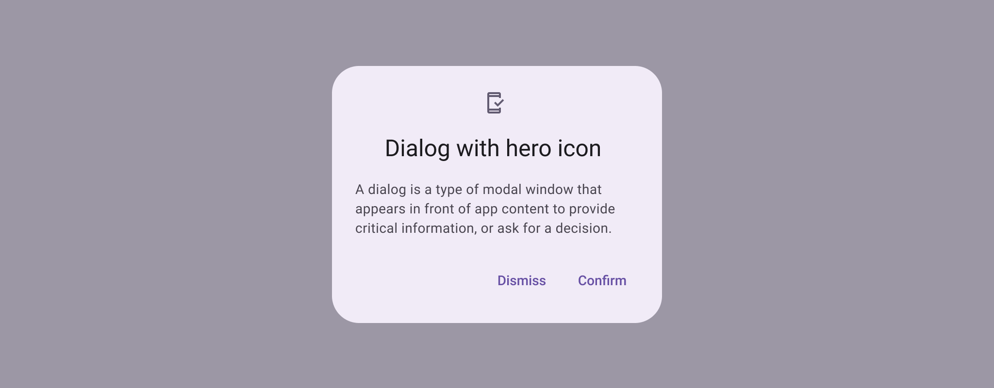
public fun SuccessConfirmationDialogContent(
curvedText: (CurvedScope.() -> Unit)?,
modifier: Modifier = Modifier,
colors: ConfirmationDialogColors = ConfirmationDialogDefaults.successColors(),
content: @Composable () -> Unit = { ConfirmationDialogDefaults.SuccessIcon() },
)Parameters
| curvedText | A slot for displaying curved text content which will be shown along the bottom edge of the dialog. We recommend using confirmationDialogCurvedText for this parameter, which will give the default sweep angle and padding, and ConfirmationDialogDefaults.curvedTextStyle as the style. |
| modifier | Modifier to be applied to the confirmation content. |
| colors | A ConfirmationDialogColors object for customizing the colors used in this SuccessConfirmationDialog. will be adjusted by the accessibility manager according to the content displayed. |
| content | A slot for displaying an icon inside the confirmation dialog, which can be animated. Defaults to an animated ConfirmationDialogDefaults.SuccessIcon. |
