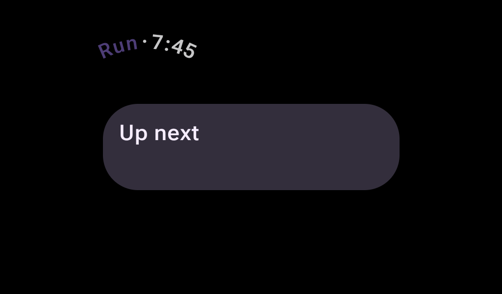
TimeText
Source set: Android
@Composable
public fun TimeText(
    modifier: Modifier = Modifier,
    curvedModifier: CurvedModifier = CurvedModifier,
    maxSweepAngle: Float = TimeTextDefaults.MaxSweepAngle,
    backgroundColor: Color = TimeTextDefaults.backgroundColor(),
    timeSource: TimeSource = TimeTextDefaults.rememberTimeSource(timeFormat()),
    contentPadding: PaddingValues = TimeTextDefaults.ContentPadding,
    content: CurvedScope.(String) -> Unit = { time -> timeTextCurvedText(time) },
)
Parameters
| modifier | The modifier to be applied to the component. |
| curvedModifier | The CurvedModifier used to restrict the arc in which TimeText is drawn. |
| maxSweepAngle | The default maximum sweep angle in degrees. |
| backgroundColor | The background color of the arc drawn behind the TimeText. |
| timeSource | TimeSource which retrieves the current time and formats it. |
| contentPadding | The spacing values between the container and the content. |
| content | The content of the TimeText - displays the current time by default. This lambda receives the current time as a String and should display it using curvedText. Note that if long curved text is included here, it should specify androidx.wear.compose.foundation.weight on it so that the space available is suitably allocated. |
