
Compose Unstyled v1.40.0 is out, and it comes with an API I wish existed ever since I started using Jetpack Compose.
Let me tell you all about it in today's blog!
Introducing the resolveTheme API
v1.40.0 introduces a new resolveThemeX() API to make the migration to Jetpack Compose simpler.
It is a series of helper functions that connect the XML Android Theme world to Compose's.
The API is very simple:
val color = resolveThemeColor(context, R.attr.primary_color)
val spacing = resolveThemeDp(context, R.attr.spacing)
val textSize = resolveThemeSp(context, R.attr.text_size)
val pixels = resolveThemePx(context, R.attr.number_float)
val number = resolveThemeInt(context, R.attr.number)
val floatNumber = resolveThemeFloat(context, R.attr.number_float)
val textAppearance = resolveThemeTextAppearance(context, R.attr.textStyle)
Each resolveThemeX() function will resolve the given attribute from the given context's theme and remember {} the result.
As a result, you can keep using your XML themes, without having to maintain two sources of truth during your migration!
Gradually migrate from Views to Compose
The resolveThemeX API is intended to be used during that awkward period while moving from Android Views to Jetpack Compose.
Instead of having to maintain two sources of truth for your theme, it creates a bridge so that you can use the XML theme values directly in Compose.
The API is not intended to be used as a permanent solution for maintaining your XML themes forever.
This is by design as resolving XML themes come with a cost:
What about performance?
In one of my API progress posts on X, Ian Lake (@ianhlake) from Google made an excellent point on performance:
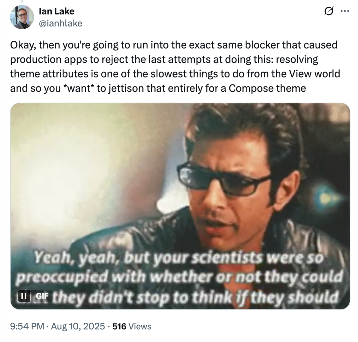
And he is absolutely right!
Resolving XML themes is indeed a costly process. Ian pointed out how the Material Components Theme Adapter was already that bridge API but was removed due to the performance cost.
Even though there is a cost in resolving XML themes, this cost works differently in Compose Unstyled's case.
The Material Adapter was built in order to resolve Google's Material theme. That design system contains a lot of attributes. The way the Material adapter works is by resolving every single attribute of the entirety of the Material theme in one go. That is a >lot< of upfront cost which you cannot control and as a result can slow down your app's performance.
Compose Unstyled has been designed so that you can implement any design system in Compose. The resolveTheme API is designed with a gradual migration to Compose in mind.
This means that you can pick the specific XML theme attributes you need to use from Compose instead of every single one of them in one go. This makes the cost much more manageable and more importantly temporary.
There is a measurable cost for each resolution, but as soon as you no longer need to keep the attribute in your XML theme, you can replace the resolveX call and the cost becomes 0.
In other words, it's an API designed to be deleted 🫶
Let's put this into perspective with a more realistic example:
A pragmatic View to Compose migration scenario
Let's assume that you have an Android app using Views with many happy users, and you want to move to Jetpack Compose.
So to test out the waters, you decide to write a small banner component in Compose and use that somewhere in your app:
@Composable
fun Banner(
    modifier: Modifier = Modifier,
    content: @Composable () -> Unit
) {
    Row(
        modifier
            .clip(RoundedCornerShape(20.dp))
            .background(Color(0xFF34D399))
            .padding(vertical = 24.dp, horizontal = 16.dp),
        verticalAlignment = Alignment.CenterVertically,
        horizontalArrangement = Arrangement.spacedBy(8.dp)
    ) {
        Box(Modifier.weight(1f), contentAlignment = Alignment.CenterStart) {
            content()
        }
        Icon(Lucide.ChevronRight, contentDescription = null)
    }
}
Which is a start. However, as you use strict styling rules in your app, our new component has to be styled after the current XML theme's banner and onBanner colors.
Let's create a Compose theme that will let us use our banner colors in Compose.
Here we define the color tokens that we will use to style our component with:
val colors = ThemeProperty<Color>("colors")

val banner = ThemeToken<Color>("banner")
val onBanner = ThemeToken<Color>("onBanner")

val MyTheme = buildTheme {
    val context = LocalContext.current

    // map our XML attributes to our theme tokens
    properties[colors] = mapOf(
        banner to resolveThemeColor(context, R.attr.color_banner),
        onBanner to resolveThemeColor(context, R.attr.color_onBanner),
    )
}
We can now use our tokens instead of hardcoded values via the Theme object:
@Composable
fun Banner(
    modifier: Modifier = Modifier,
    content: @Composable () -> Unit
) {
    Row(
        modifier
            .clip(RoundedCornerShape(20.dp))
            .background(Theme[colors][banner])
            .padding(vertical = 24.dp, horizontal = 16.dp),
        verticalAlignment = Alignment.CenterVertically,
        horizontalArrangement = Arrangement.spacedBy(8.dp)
    ) {
        ProvideContentColor(Theme[colors][onBanner]) {
            Box(Modifier.weight(1f), contentAlignment = Alignment.CenterStart) {
                content()
            }
            Icon(Lucide.ChevronRight, contentDescription = null)
        }
    }
}
Notice how we used ProvideContentColor here. It forwards the given color to its children to render their content with.
All components in Unstyled are themable and will make use of that color automatically.
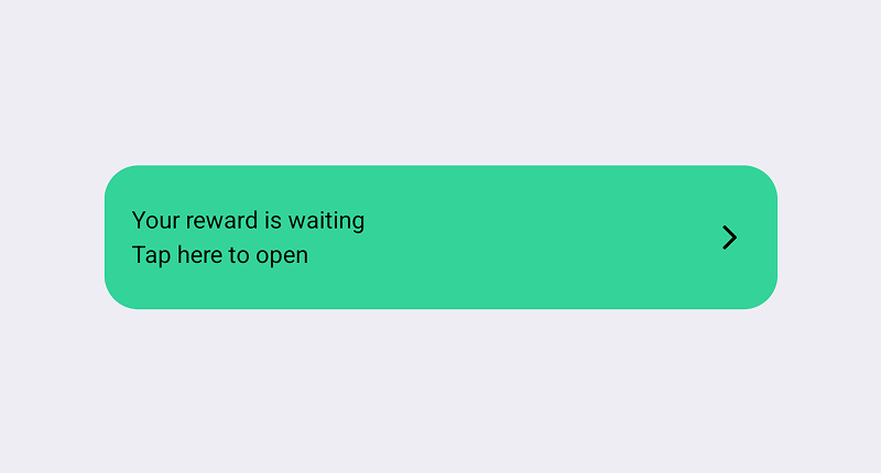
Now let's use the banner in our activity.
In our activity's layout, let's include a ComposeView that will hold our composable:
<!--activity_details.xml-->
<?xml version="1.0" encoding="utf-8"?>
<LinearLayout xmlns:android="http://schemas.android.com/apk/res/android"
              android:layout_width="match_parent"
              android:orientation="vertical"
              android:layout_height="match_parent">

    <androidx.compose.ui.platform.ComposeView
            android:id="@+id/banner"
            android:layout_width="match_parent"
            android:layout_height="wrap_content"
    />

<!--    The rest of your layout-->
</LinearLayout>
And connect XML to Compose:
class DetailsActivity : ComponentActivity() {
    override fun onCreate(savedInstanceState: Bundle?) {
        super.onCreate(savedInstanceState)

        setContentView(R.layout.activity_details)
        val banner = findViewById<ComposeView>(R.id.banner)
        banner.setContent {
            MyTheme {
                Banner(
                    Modifier
                        .padding(horizontal = 16.dp)
                        .fillMaxWidth()
                ) {
                    Column {
                        Text("Your reward is waiting")
                        Spacer(Modifier.size(4.dp))
                        Text("Tap here to open")
                    }
                }
            }
        }
    }
}
Our new banner is now written in Jetpack Compose, while maintaining the styling from our XML theme.
Even if our old XML theme is a gigantic theme with tons of attributes, we are cherry-picking the ones we need for our use case and resolve those attributes using the new resolveTheme API for a fraction of the cost.
As time goes by, and you work more with Compose instead of Views, any design system changes will be added to your Compose theme instead of your XML theme.
Once you are done with your XML migration and you no longer need the theme values accessible from Views, you can replace the respective resolveThemeX() calls with the actual values. This way the performance cost is removed:
val colors = ThemeProperty<Color>("colors")

val banner = ThemeToken<Color>("banner")
val onBanner = ThemeToken<Color>("onBanner")

val MyTheme = buildTheme {
    val context = LocalContext.current

    properties[colors] = mapOf(

        // no need to read from XML anymore. replace these lines:
        //      banner to resolveThemeColor(context, R.attr.color_banner),
        //      onBanner to resolveThemeColor(context, R.attr.color_onBanner),

        // with the actual values:
        banner to Color(0xFF34D399),
        onBanner to Color(0XFF022C22),
    )
}
And close up the work with your migration. As a result, you will have successfully migrated to Compose, stopped using XML themes over Compose themes.
💡 Tip
Consider building new screens and features in Compose instead of migrating existing ones. Rewriting features rarely ever benefits your customers or your dev team. Instead of focusing on learning Compose you will have to figure out how interop works which is an extra overhead to your migration. The reason why the above scenario is mentioned is that 99% of the times, that's what people have in their minds when thinking of migrating to Compose. Talk it out with your team ✌️
New theming guides
There are now new documentation guides on the Compose Unstyled docs:
- Custom Themes - Learn how to create custom Compose themes
- Use your Android XML Theme from Compose - A more detailed guide on using the resolveThemeX API
- Dynamic Themes - Learn how to create themes that update over time (such as automatic light and dark theme switching)
- Theme overrides - Advanced theming API for styling your apps
That's all I got for you in this update.
Want to stay in the loop? Make sure to follow Unstyled on Github.
Want to talk about this post? Discuss this on GitHub →

