Composable Component
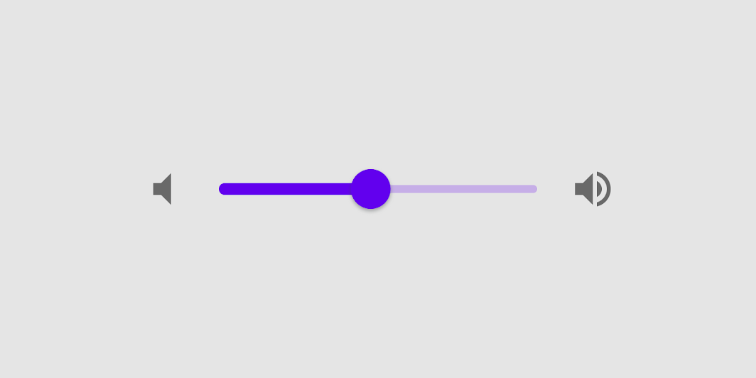
Sliders allow users to make selections from a range of values.
Common
@Composable
fun Slider(
    value: Float,
    onValueChange: (Float) -> Unit,
    modifier: Modifier = Modifier,
    enabled: Boolean = true,
    valueRange: ClosedFloatingPointRange<Float> = 0f..1f,
    @IntRange(from = 0) steps: Int = 0,
    onValueChangeFinished: (() -> Unit)? = null,
    interactionSource: MutableInteractionSource? = null,
    colors: SliderColors = SliderDefaults.colors(),
)
Parameters
| value | current value of the Slider. If outside of valueRange provided, value will be coerced to this range. |
| onValueChange | lambda in which value should be updated |
| modifier | modifiers for the Slider layout |
| enabled | whether or not component is enabled and can be interacted with or not |
| valueRange | range of values that Slider value can take. Passed value will be coerced to this range |
| steps | if positive, specifies the amount of discrete allowable values between the endpoints of valueRange. For example, a range from 0 to 10 with 4 steps allows 4 values evenly distributed between 0 and 10 (i.e., 2, 4, 6, 8). If steps is 0, the slider will behave continuously and allow any value from the range. Must not be negative. |
| onValueChangeFinished | lambda to be invoked when value change has ended. This callback shouldn't be used to update the slider value (use onValueChange for that), but rather to know when the user has completed selecting a new value by ending a drag or a click. |
| interactionSource | an optional hoisted MutableInteractionSource for observing and emitting Interactions for this slider. You can use this to change the slider's appearance or preview the slider in different states. Note that if null is provided, interactions will still happen internally. |
| colors | SliderColors that will be used to determine the color of the Slider parts in different state. See SliderDefaults.colors to customize. |
Code Examples
SliderSample
@Composable
fun SliderSample() {
    var sliderPosition by remember { mutableStateOf(0f) }
    Column(modifier = Modifier.padding(horizontal = 16.dp)) {
        Text(text = "%.2f".format(sliderPosition))
        Slider(value = sliderPosition, onValueChange = { sliderPosition = it })
    }
}
StepsSliderSample
@Composable
fun StepsSliderSample() {
    var sliderPosition by remember { mutableStateOf(0f) }
    Column(modifier = Modifier.padding(horizontal = 16.dp)) {
        Text(text = sliderPosition.roundToInt().toString())
        Slider(
            value = sliderPosition,
            onValueChange = { sliderPosition = it },
            valueRange = 0f..100f,
            onValueChangeFinished = {
                // launch some business logic update with the state you hold
                // viewModel.updateSelectedSliderValue(sliderPosition)
            },
            // Only allow multiples of 10. Excluding the endpoints of `valueRange`,
            // there are 9 steps (10, 20, ..., 90).
            steps = 9,
            colors =
                SliderDefaults.colors(
                    thumbColor = MaterialTheme.colors.secondary,
                    activeTrackColor = MaterialTheme.colors.secondary,
                ),
        )
    }
}