


Personal License
$99
Buy Now
- 150+ UI Blocks
- Copy-Paste Ready
- Free Updates
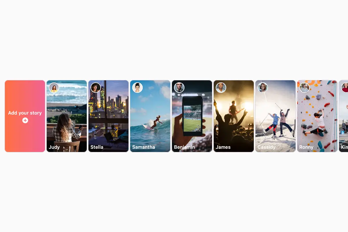
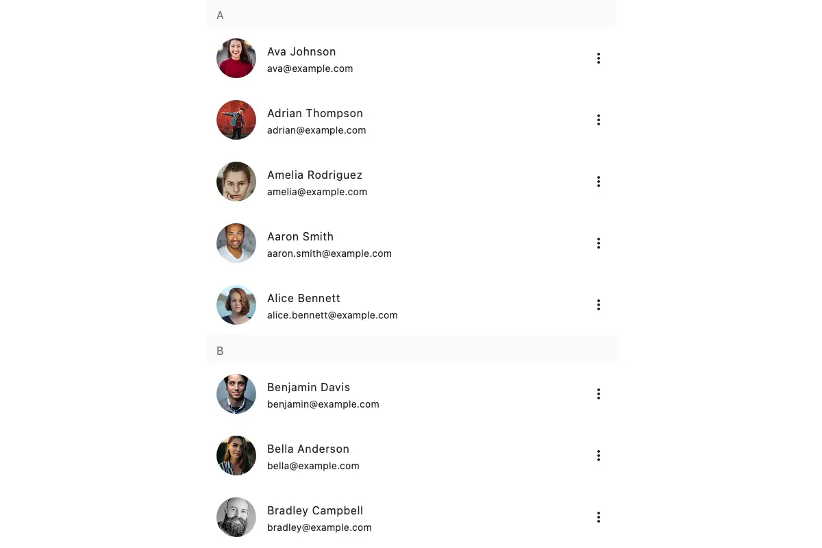
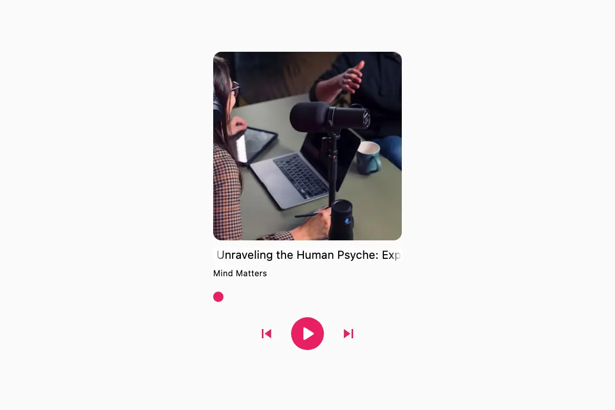
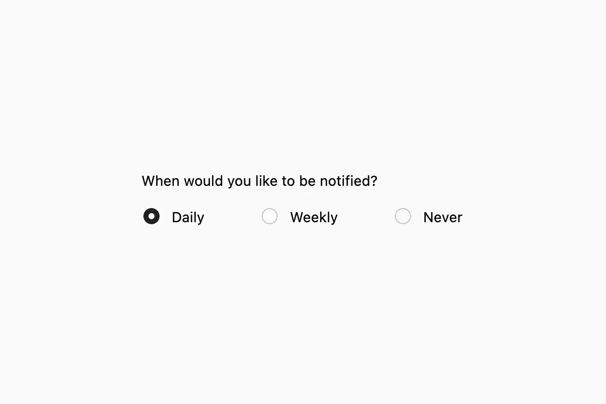
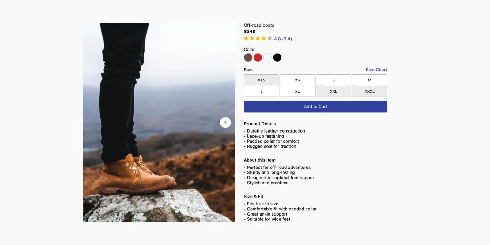
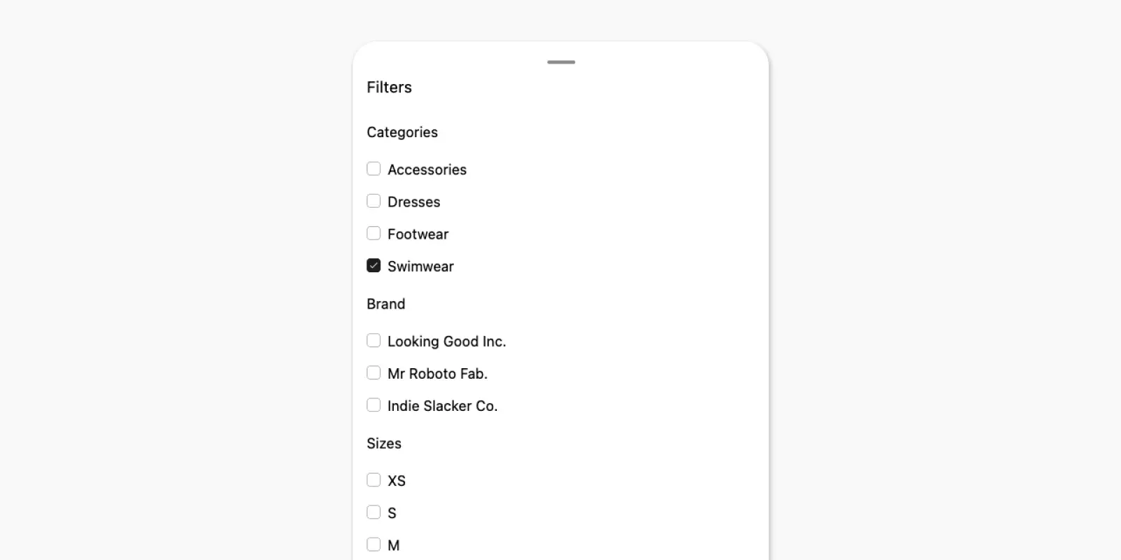
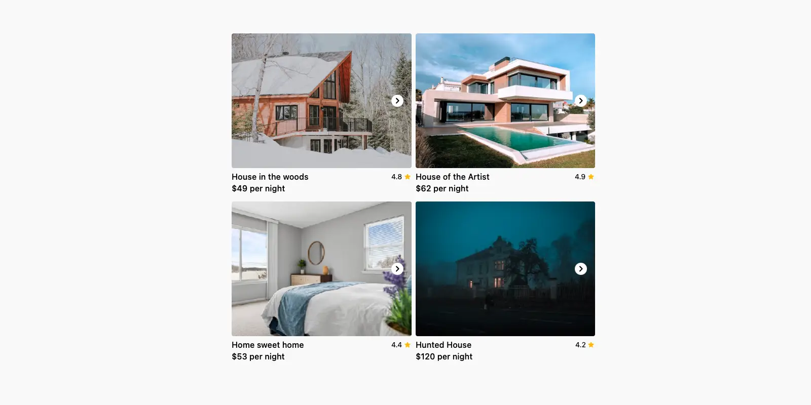
150 Ready-to-use components for Jetpack Compose and Compose Multiplatform. Copy paste into your apps.


A tiny one-time payment for lifetime access and free updates.

"Composables has been great to showcase capabilities of Compose. The components have interactive previews, orientation and different sizes. The code is clear and really concise. I would recommend it 100%"
We offer a 30-day money-back guarantee. If you are not satisfied by the quality of the product, email [email protected] for a full refund.
Every time we add more components to our website you will get access to them free of charge. No need for additional charges or subscriptions.
We only charge once for getting access to the components of our website. We do not charge you for every project you use the components on.
This is a self-serving product. This means that you are expected to have the technical knowledge to use the components we provide. However, we do provide technical support for website-related issues such as account creation and access issues.
All components are built in a very simple fashion that everyone can understand and use. We do expect you to have some knowledge of Jetpack Compose/Compose Multiplatform to set things up.
Yes. All examples are compatible with any project that supports Compose.
Yes. You can use it on open source projects, as long as your project is not a component library intended to redistribute the components.
Yes. You can use the components on any number of client projects as long as the project does not redistribute the components as a library.
Individual licenses are meant for one person. The team license includes access for up to 15 team members.
Yes and no. The site itself is built using HTML/CSS with a Kotlin backend. The UI Block previews are built using Compose Web.
Absolutely. Kindly leave your suggestion as an issue in the Composables GitHub repo.
Email us at [email protected].
