CompactCard
Composable Component
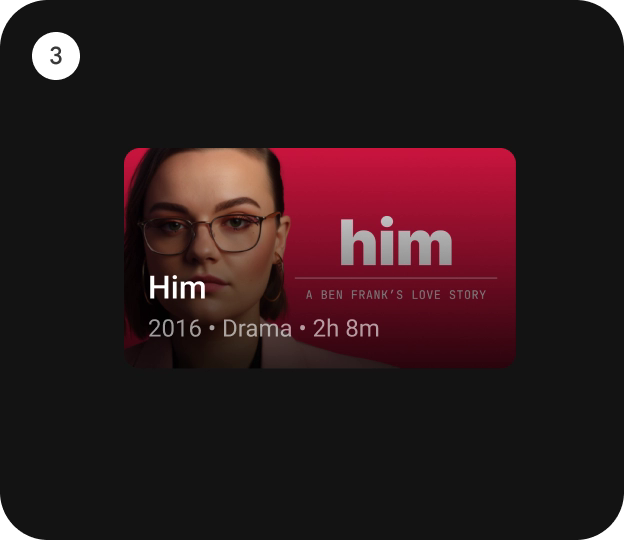
CompactCard is an opinionated TV Material card that offers a 4 slot layout to show information
about a subject.
Android
@Composable
fun CompactCard(
    onClick: () -> Unit,
    image: @Composable BoxScope.() -> Unit,
    title: @Composable () -> Unit,
    modifier: Modifier = Modifier,
    onLongClick: (() -> Unit)? = null,
    subtitle: @Composable () -> Unit = {},
    description: @Composable () -> Unit = {},
    shape: CardShape = CardDefaults.shape(),
    colors: CardColors = CardDefaults.compactCardColors(),
    scale: CardScale = CardDefaults.scale(),
    border: CardBorder = CardDefaults.border(),
    glow: CardGlow = CardDefaults.glow(),
    scrimBrush: Brush = CardDefaults.ScrimBrush,
    interactionSource: MutableInteractionSource? = null
)
Parameters
| onClick | called when this card is clicked. |
| image | defines the Composable image to be displayed on top of the Card. |
| title | defines the Composable title placed below the image in the Card. |
| modifier | the Modifier to be applied to this card. |
| onLongClick | called when this card is long clicked (long-pressed). |
| subtitle | defines the Composable supporting text placed below the title of the Card. |
| description | defines the Composable description placed below the subtitle of the Card. |
| shape | CardShape defines the shape of this card's container in different interaction states. See CardDefaults.shape. |
| colors | CardColors defines the background & content colors used in this card for different interaction states. See CardDefaults.compactCardColors. |
| scale | CardScale defines size of the card relative to its original size for different interaction states. See CardDefaults.scale. |
| border | CardBorder defines a border around the card for different interaction states. See CardDefaults.border. |
| glow | CardGlow defines a shadow to be shown behind the card for different interaction states. See CardDefaults.glow. |
| scrimBrush | Brush defines a brush/gradient to be used to draw the scrim over the image in the background. See CardDefaults.ScrimBrush. |
| interactionSource | an optional hoisted MutableInteractionSource for observing and emitting Interactions for this card. You can use this to change the card's appearance or preview the card in different states. Note that if null is provided, interactions will still happen internally. |
Code Examples
CompactCardSample
@Composable
fun CompactCardSample() {
    CompactCard(
        modifier = Modifier.size(150.dp, 120.dp),
        image = { Box(modifier = Modifier.fillMaxWidth().height(80.dp).background(Color.Blue)) },
        title = { Text(text = "Compact Card", modifier = Modifier.padding(8.dp)) },
        onClick = {}
    )
}
Create your own Component Library
Material Components are meant to be used as is and they do not allow customizations. To build your own Jetpack Compose component library use Compose Unstyled

