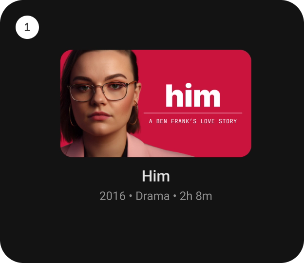
StandardCardContainer
Composable Component
StandardCardContainer is an opinionated TV Material Card layout with an image and text content
to show information about a subject.

Android
@Composable
fun StandardCardContainer(
    imageCard: @Composable (interactionSource: MutableInteractionSource) -> Unit,
    title: @Composable () -> Unit,
    modifier: Modifier = Modifier,
    subtitle: @Composable () -> Unit = {},
    description: @Composable () -> Unit = {},
    contentColor: CardContainerColors = CardContainerDefaults.contentColor(),
    interactionSource: MutableInteractionSource = remember { MutableInteractionSource() }
)
Parameters
| imageCard | defines the Composable to be used for the image card. |
| title | defines the Composable title placed below the image card in the CardContainer. |
| modifier | the Modifier to be applied to this CardContainer. |
| subtitle | defines the Composable supporting text placed below the title in CardContainer. |
| description | defines the Composable description placed below the subtitle in CardContainer. |
| contentColor | CardContainerColors defines the content color used in the CardContainer for different interaction states. See CardContainerDefaults.contentColor. |
| interactionSource | a hoisted MutableInteractionSource for observing and emitting Interactions for this CardContainer. This interaction source param would also be forwarded to be used with the imageCard composable. |
Code Examples
StandardCardContainerSample
@Composable
fun StandardCardContainerSample() {
    StandardCardContainer(
        modifier = Modifier.size(150.dp, 120.dp),
        imageCard = { interactionSource ->
            Card(onClick = {}, interactionSource = interactionSource) {
                Box(modifier = Modifier.fillMaxWidth().height(80.dp).background(Color.Blue))
            }
        },
        title = { Text("Standard Card") }
    )
}
Create your own Component Library
Material Components are meant to be used as is and they do not allow customizations. To build your own Jetpack Compose component library use Compose Unstyled
