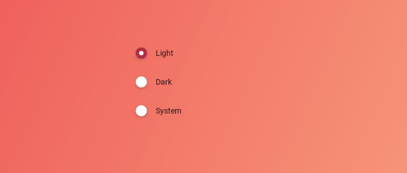
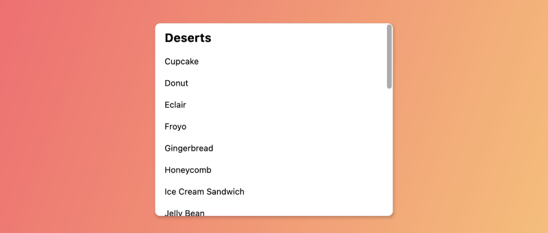
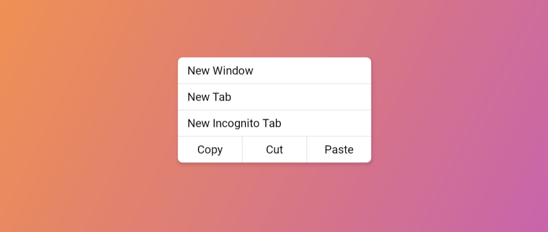
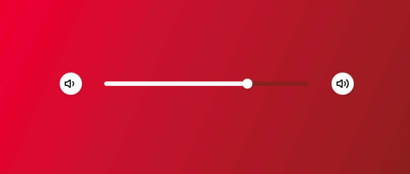
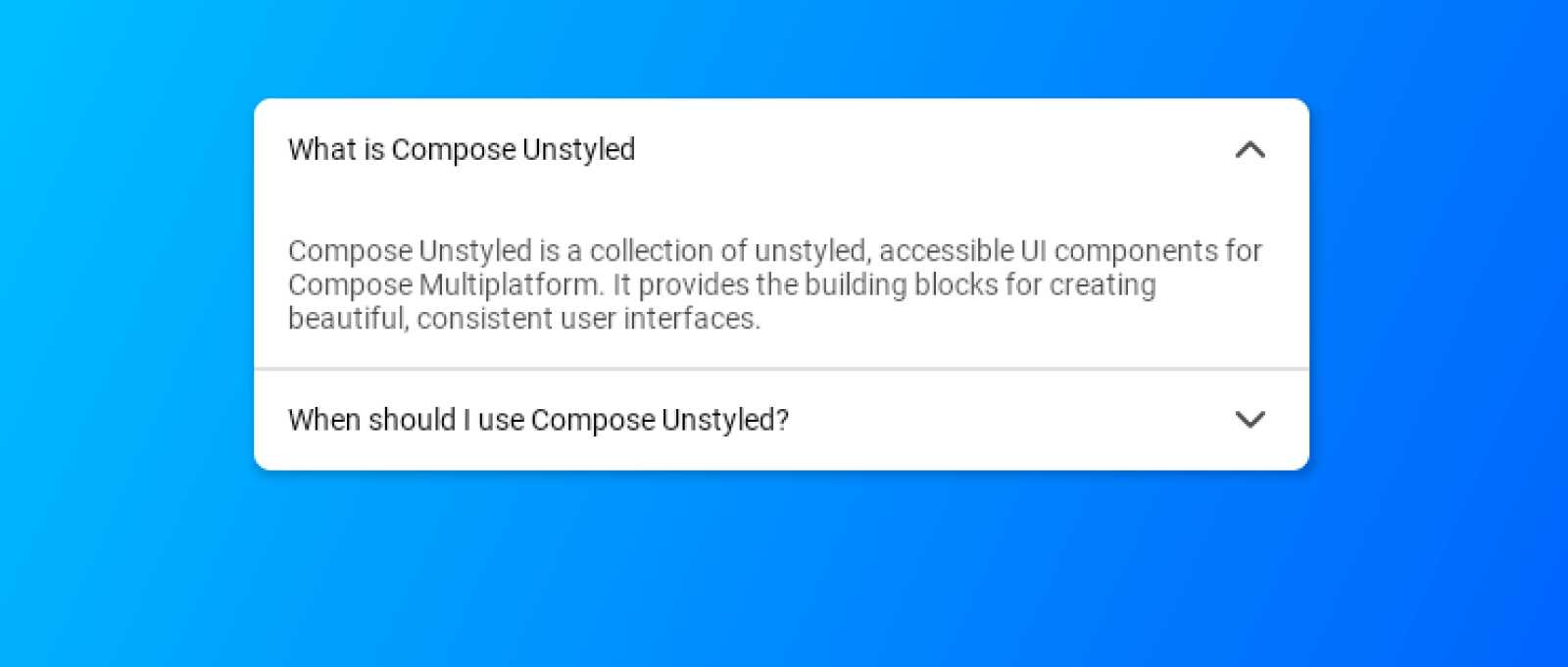
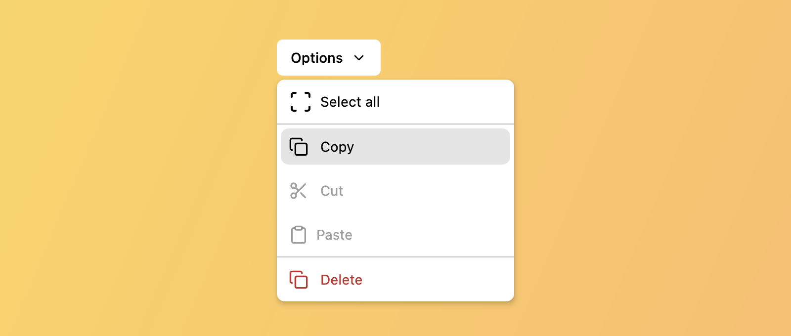
Components Unstyled, fully accessible components to build your design system with. Bottom SheetBottom Sheet (Modal)ButtonCheckboxDialogDisclosureDropdown MenuIconProgress IndicatorRadio GroupScroll AreaSeparatorsSliderTab GroupTextText FieldToggle Switch
Components Unstyled, fully accessible components to build your design system with. Bottom SheetBottom Sheet (Modal)ButtonCheckboxDialogDisclosureDropdown MenuIconProgress IndicatorRadio GroupScroll AreaSeparatorsSliderTab GroupTextText FieldToggle Switch


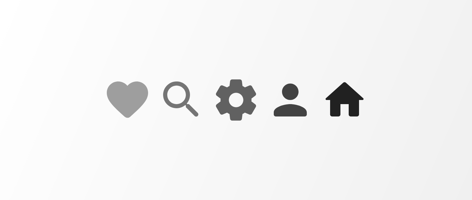