Build apps faster with our new App builder! Check it out →

ExposedDropdownMenuBox

Android

Component in Material Compose

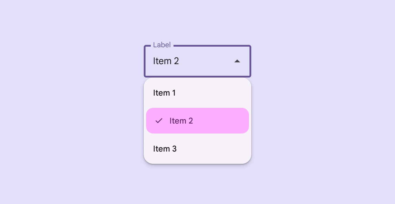
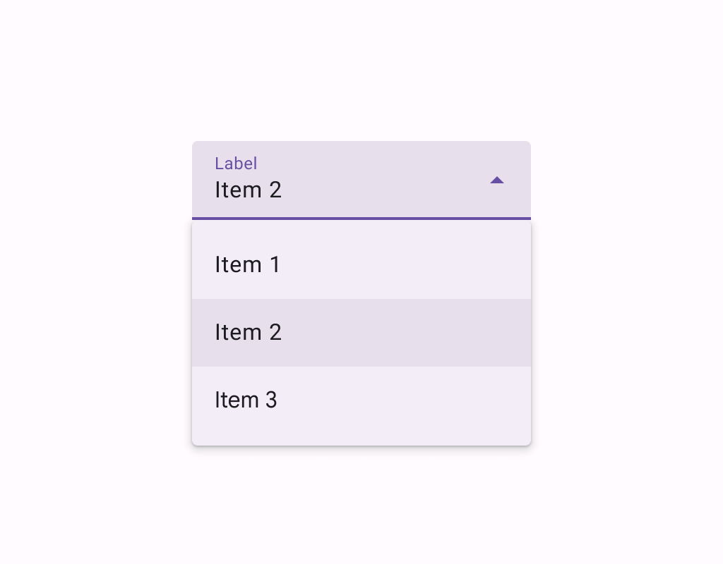
Material Design Exposed Dropdown Menu.

Box for Exposed Dropdown Menu. Expected to contain [TextField] and [ExposedDropdownMenuBoxScope.ExposedDropdownMenu] as a content.

An example of read-only Exposed Dropdown Menu:

@sample androidx.compose.material.samples.ExposedDropdownMenuSample

Last updated:

Installation

dependencies {
   implementation("androidx.compose.material:material:1.8.0-alpha04")
}

Overloads

@ExperimentalMaterialApi
@Composable
fun ExposedDropdownMenuBox(
    expanded: Boolean,
    onExpandedChange: (Boolean) -> Unit,
    modifier: Modifier = Modifier,
    content: @Composable ExposedDropdownMenuBoxScope.() -> Unit
)

Parameters

namedescription
expandedWhether Dropdown Menu should be expanded or not.
onExpandedChangeExecutes when the user clicks on the ExposedDropdownMenuBox.
modifierThe modifier to apply to this layout
contentThe content to be displayed inside ExposedDropdownMenuBox.

Code Examples

ExposedDropdownMenuSample

@OptIn(ExperimentalMaterialApi::class)
@Composable
fun ExposedDropdownMenuSample() {
    val options = listOf("Option 1", "Option 2", "Option 3", "Option 4", "Option 5")
    var expanded by remember { mutableStateOf(false) }
    val textFieldState = rememberTextFieldState(options[0])
    // We want to react on tap/press on TextField to show menu
    ExposedDropdownMenuBox(
        expanded = expanded,
        onExpandedChange = { expanded = it },
    ) {
        TextField(
            readOnly = true,
            state = textFieldState,
            label = { Text("Label") },
            trailingIcon = { ExposedDropdownMenuDefaults.TrailingIcon(expanded = expanded) },
            colors = ExposedDropdownMenuDefaults.textFieldColors()
        )
        ExposedDropdownMenu(expanded = expanded, onDismissRequest = { expanded = false }) {
            options.forEach { selectionOption ->
                DropdownMenuItem(
                    onClick = {
                        textFieldState.setTextAndPlaceCursorAtEnd(selectionOption)
                        expanded = false
                    }
                ) {
                    Text(text = selectionOption)
                }
            }
        }
    }
}

EditableExposedDropdownMenuSample

@OptIn(ExperimentalMaterialApi::class)
@Composable
fun EditableExposedDropdownMenuSample() {
    val options = listOf("Option 1", "Option 2", "Option 3", "Option 4", "Option 5")
    var expanded by remember { mutableStateOf(false) }
    val textFieldState = rememberTextFieldState()
    ExposedDropdownMenuBox(
        expanded = expanded,
        onExpandedChange = { expanded = it },
    ) {
        TextField(
            state = textFieldState,
            label = { Text("Label") },
            trailingIcon = { ExposedDropdownMenuDefaults.TrailingIcon(expanded = expanded) },
            colors = ExposedDropdownMenuDefaults.textFieldColors()
        )
        // filter options based on text field value
        val filteringOptions =
            options.filter { it.contains(textFieldState.text, ignoreCase = true) }
        if (filteringOptions.isNotEmpty()) {
            ExposedDropdownMenu(expanded = expanded, onDismissRequest = { expanded = false }) {
                filteringOptions.forEach { selectionOption ->
                    DropdownMenuItem(
                        onClick = {
                            textFieldState.setTextAndPlaceCursorAtEnd(selectionOption)
                            expanded = false
                        }
                    ) {
                        Text(text = selectionOption)
                    }
                }
            }
        }
    }
}
by @alexstyl