🌈 Create new beautiful Compose Gradients with our new wesite
->
Composables UI
Compose Unstyled
Partners
Composables UI
Compose Unstyled
Partners
Wear Material 3 Compose
/
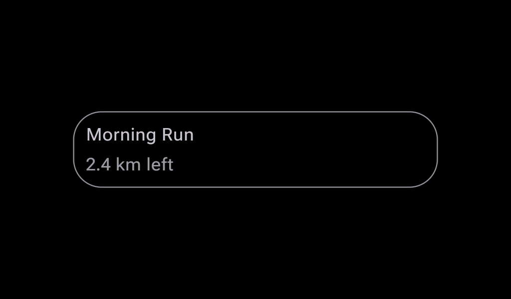
Card
Card
Kotlin
Copy
@Composable
fun CardSample() {
    Card(onClick = { /* Do something */ }) { Text("Card") }
}
More Wear Material 3 Compose components
View All
→
AlertDialog
In
Wear Material 3 Compose
AlertDialogContent
In
Wear Material 3 Compose
AnimatedPage
In
Wear Material 3 Compose
AnimatedText
In
Wear Material 3 Compose
AppCard
In
Wear Material 3 Compose
AppScaffold
In
Wear Material 3 Compose
ArcProgressIndicator
In
Wear Material 3 Compose
Button
In
Wear Material 3 Compose
ButtonGroup
In
Wear Material 3 Compose
CheckboxButton
In
Wear Material 3 Compose
ChildButton
In
Wear Material 3 Compose
CircularProgressIndicator
In
Wear Material 3 Compose
CompactButton
In
Wear Material 3 Compose
ConfirmationDialog
In
Wear Material 3 Compose
ConfirmationDialogContent
In
Wear Material 3 Compose
DatePicker
In
Wear Material 3 Compose
Dialog
In
Wear Material 3 Compose
EdgeButton
In
Wear Material 3 Compose
FadingExpandingLabel
In
Wear Material 3 Compose
FailureConfirmationDialog
In
Wear Material 3 Compose
FailureConfirmationDialogContent
In
Wear Material 3 Compose
FilledIconButton
In
Wear Material 3 Compose
FilledTonalButton
In
Wear Material 3 Compose
FilledTonalIconButton
In
Wear Material 3 Compose
HorizontalPageIndicator
In
Wear Material 3 Compose
HorizontalPagerScaffold
In
Wear Material 3 Compose
Icon
In
Wear Material 3 Compose
IconButton
In
Wear Material 3 Compose
IconToggleButton
In
Wear Material 3 Compose
LevelIndicator
In
Wear Material 3 Compose
LinearProgressIndicator
In
Wear Material 3 Compose
ListHeader
In
Wear Material 3 Compose
ListSubHeader
In
Wear Material 3 Compose
MaterialTheme
In
Wear Material 3 Compose
OneHandedGestureClickIndicator
In
Wear Material 3 Compose
OneHandedGestureHorizontalPageIndicator
In
Wear Material 3 Compose
OneHandedGestureScrollIndicator
In
Wear Material 3 Compose
OneHandedGestureVerticalPageIndicator
In
Wear Material 3 Compose
OpenOnPhoneDialog
In
Wear Material 3 Compose
OpenOnPhoneDialogContent
In
Wear Material 3 Compose
OutlinedButton
In
Wear Material 3 Compose
OutlinedCard
In
Wear Material 3 Compose
OutlinedIconButton
In
Wear Material 3 Compose
Picker
In
Wear Material 3 Compose
PickerGroup
In
Wear Material 3 Compose
ProvideTextStyle
In
Wear Material 3 Compose
RadioButton
In
Wear Material 3 Compose
ScreenScaffold
In
Wear Material 3 Compose
ScrollIndicator
In
Wear Material 3 Compose
SegmentedCircularProgressIndicator
In
Wear Material 3 Compose
Slider
In
Wear Material 3 Compose
SplitCheckboxButton
In
Wear Material 3 Compose
SplitRadioButton
In
Wear Material 3 Compose
SplitSwitchButton
In
Wear Material 3 Compose
Stepper
In
Wear Material 3 Compose
StepperLevelIndicator
In
Wear Material 3 Compose
SuccessConfirmationDialog
In
Wear Material 3 Compose
SuccessConfirmationDialogContent
In
Wear Material 3 Compose
SwipeToDismissBox
In
Wear Material 3 Compose
SwipeToReveal
In
Wear Material 3 Compose
SwitchButton
In
Wear Material 3 Compose
Text
In
Wear Material 3 Compose
TextButton
In
Wear Material 3 Compose
TextToggleButton
In
Wear Material 3 Compose
TimePicker
In
Wear Material 3 Compose
TimeText
In
Wear Material 3 Compose
TitleCard
In
Wear Material 3 Compose
VerticalPageIndicator
In
Wear Material 3 Compose
VerticalPagerScaffold
In
Wear Material 3 Compose
More Card components
View All
→
Card
In
Material 3 Compose
ElevatedCard
In
Material 3 Compose
OutlinedCard
In
Material 3 Compose
Card
In
Material Compose
AppCard
In
Wear Material 3 Compose
OutlinedCard
In
Wear Material 3 Compose
TitleCard
In
Wear Material 3 Compose
AppCard
In
Wear Material Compose
Card
In
Wear Material Compose
SwipeToRevealCard
In
Wear Material Compose
TitleCard
In
Wear Material Compose
Card
In
Compose TV Material
ClassicCard
In
Compose TV Material
CompactCard
In
Compose TV Material
StandardCardContainer
In
Compose TV Material
WideCardContainer
In
Compose TV Material
WideClassicCard
In
Compose TV Material
ActionCard
In
XR Glimmer
Card
In
XR Glimmer