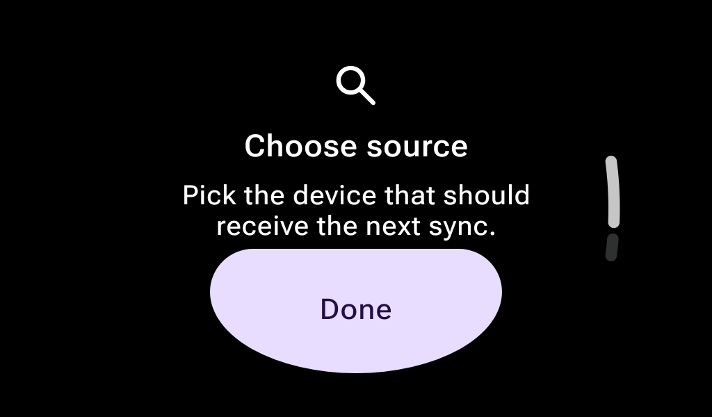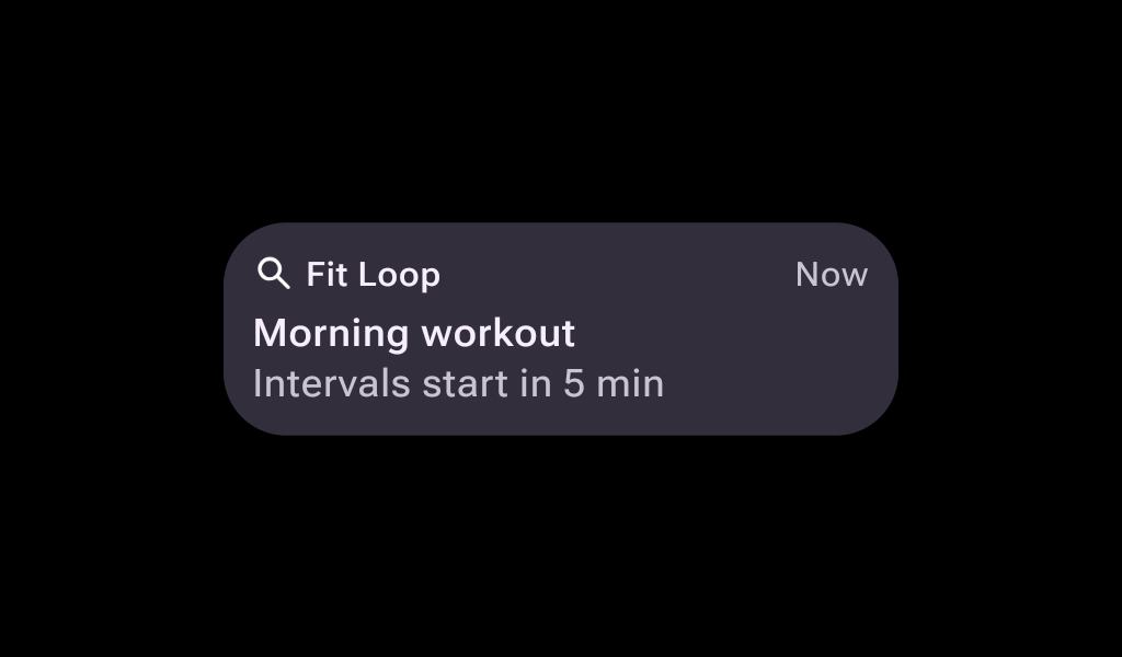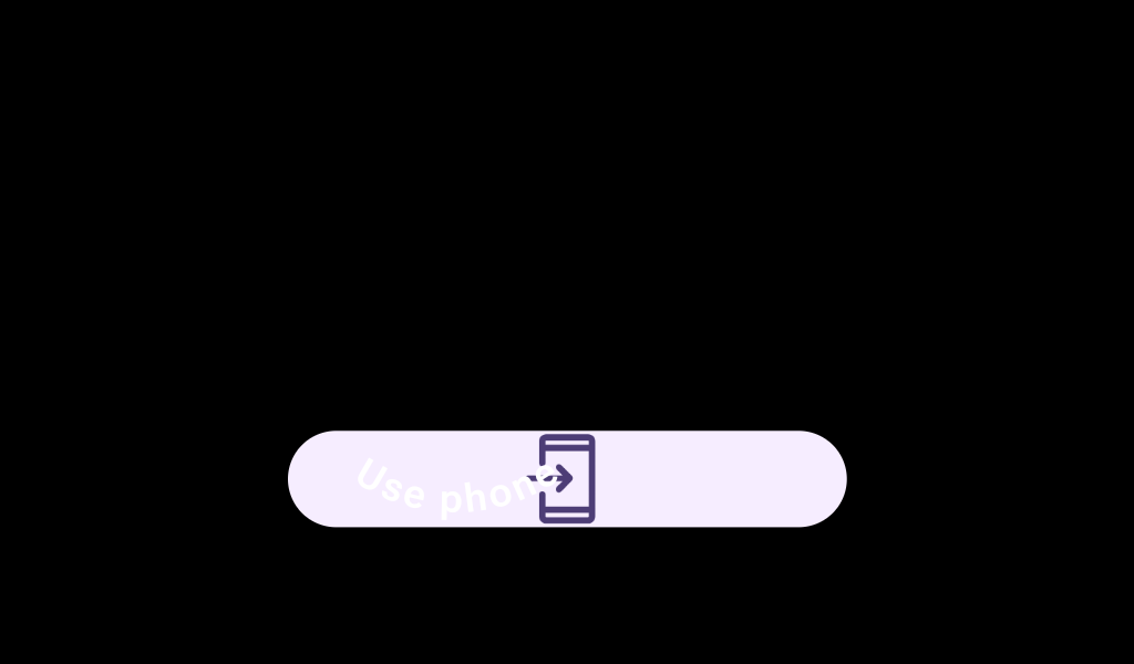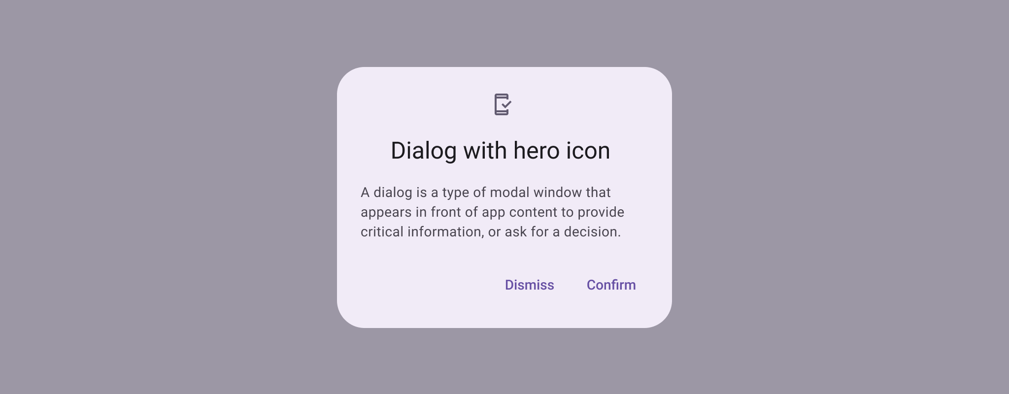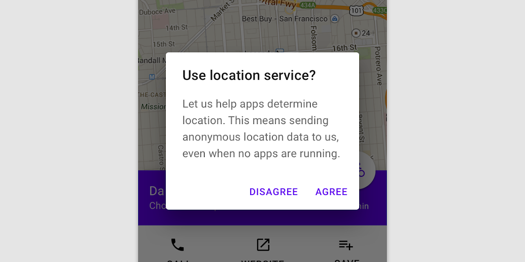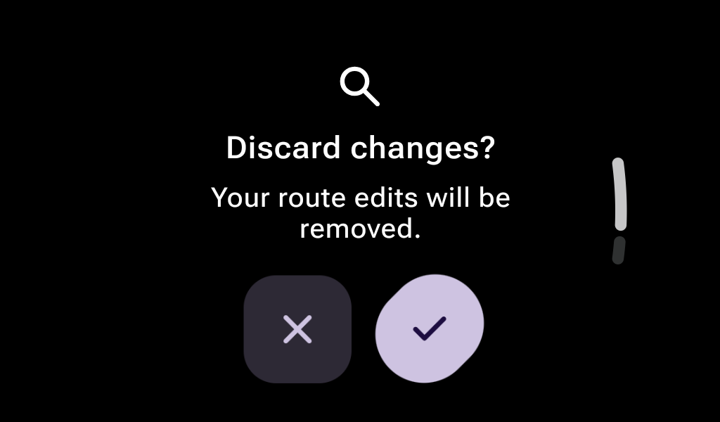
AlertDialog
In Wear Material 3 Compose

@Composable
fun ConfirmationDialogSample() {
    var showConfirmation by remember { mutableStateOf(false) }

    Box(Modifier.fillMaxSize()) {
        FilledTonalButton(
            modifier = Modifier.align(Alignment.Center),
            onClick = { showConfirmation = true },
            label = { Text("Show Confirmation") },
        )
    }

    // Has an icon and a short curved text content, which will be displayed along the bottom edge of
    // the screen.
    val curvedTextStyle = ConfirmationDialogDefaults.curvedTextStyle
    ConfirmationDialog(
        visible = showConfirmation,
        onDismissRequest = { showConfirmation = false },
        curvedText = { confirmationDialogCurvedText("Confirmed", curvedTextStyle) },
    ) {
        FavoriteIcon(ConfirmationDialogDefaults.IconSize)
    }
}