Source set: Common
Added in 1.11.0-rc01
@Composable
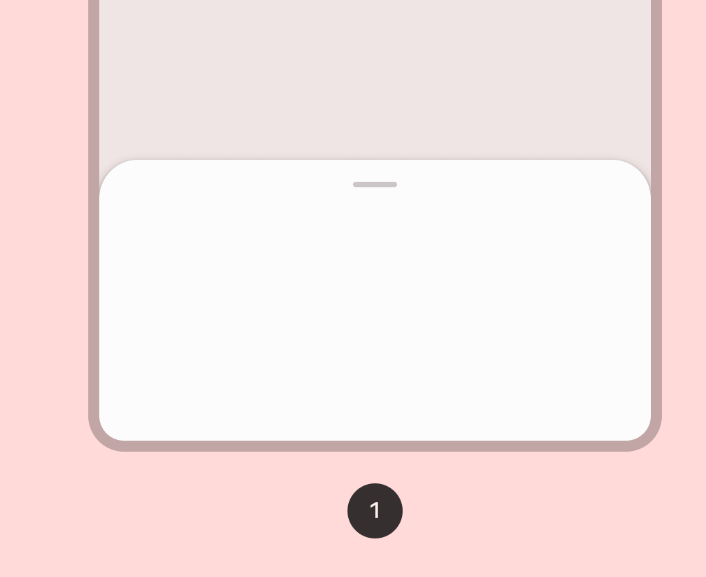
fun ModalBottomSheetLayout(
sheetContent: @Composable ColumnScope.() -> Unit,
modifier: Modifier = Modifier,
sheetState: ModalBottomSheetState = rememberModalBottomSheetState(Hidden),
sheetGesturesEnabled: Boolean = true,
sheetShape: Shape = MaterialTheme.shapes.large,
sheetElevation: Dp = ModalBottomSheetDefaults.Elevation,
sheetBackgroundColor: Color = MaterialTheme.colors.surface,
sheetContentColor: Color = contentColorFor(sheetBackgroundColor),
scrimColor: Color = ModalBottomSheetDefaults.scrimColor,
content: @Composable () -> Unit,
)Parameters
| sheetContent | The content of the bottom sheet. |
| modifier | Optional Modifier for the entire component. |
| sheetState | The state of the bottom sheet. |
| sheetGesturesEnabled | Whether the bottom sheet can be interacted with by gestures. |
| sheetShape | The shape of the bottom sheet. |
| sheetElevation | The elevation of the bottom sheet. |
| sheetBackgroundColor | The background color of the bottom sheet. |
| sheetContentColor | The preferred content color provided by the bottom sheet to its children. Defaults to the matching content color for sheetBackgroundColor, or if that is not a color from the theme, this will keep the same content color set above the bottom sheet. |
| scrimColor | The color of the scrim that is applied to the rest of the screen when the bottom sheet is visible. If the color passed is Color.Unspecified, then a scrim will no longer be applied and the bottom sheet will not block interaction with the rest of the screen when visible. |
| content | The content of rest of the screen. |

