import androidx.compose.animation.core.animateDpAsState
import androidx.compose.foundation.isSystemInDarkTheme
import androidx.compose.foundation.layout.Arrangement
import androidx.compose.foundation.layout.Box
import androidx.compose.foundation.layout.Column
import androidx.compose.foundation.layout.Row
import androidx.compose.foundation.layout.fillMaxSize
import androidx.compose.foundation.layout.fillMaxWidth
import androidx.compose.foundation.layout.padding
import androidx.compose.foundation.layout.size
import androidx.compose.foundation.layout.widthIn
import androidx.compose.foundation.lazy.LazyColumn
import androidx.compose.foundation.lazy.rememberLazyListState
import androidx.compose.material.icons.Icons
import androidx.compose.material.icons.automirrored.rounded.ArrowBack
import androidx.compose.material.icons.outlined.AccountCircle
import androidx.compose.material.icons.outlined.AutoAwesome
import androidx.compose.material.icons.outlined.CreditCard
import androidx.compose.material.icons.outlined.Description
import androidx.compose.material.icons.outlined.Email
import androidx.compose.material.icons.outlined.Handshake
import androidx.compose.material.icons.outlined.Lock
import androidx.compose.material.icons.outlined.Notifications
import androidx.compose.material.icons.outlined.QuestionMark
import androidx.compose.material.icons.outlined.Style
import androidx.compose.material3.CenterAlignedTopAppBar
import androidx.compose.material3.HorizontalDivider
import androidx.compose.material3.Icon
import androidx.compose.material3.IconButton
import androidx.compose.material3.MaterialTheme
import androidx.compose.material3.Scaffold
import androidx.compose.material3.Surface
import androidx.compose.material3.Text
import androidx.compose.material3.TopAppBarDefaults
import androidx.compose.runtime.Composable
import androidx.compose.runtime.derivedStateOf
import androidx.compose.runtime.getValue
import androidx.compose.runtime.remember
import androidx.compose.ui.Alignment
import androidx.compose.ui.Modifier
import androidx.compose.ui.draw.shadow
import androidx.compose.ui.graphics.vector.ImageVector
import androidx.compose.ui.unit.dp
@Composable
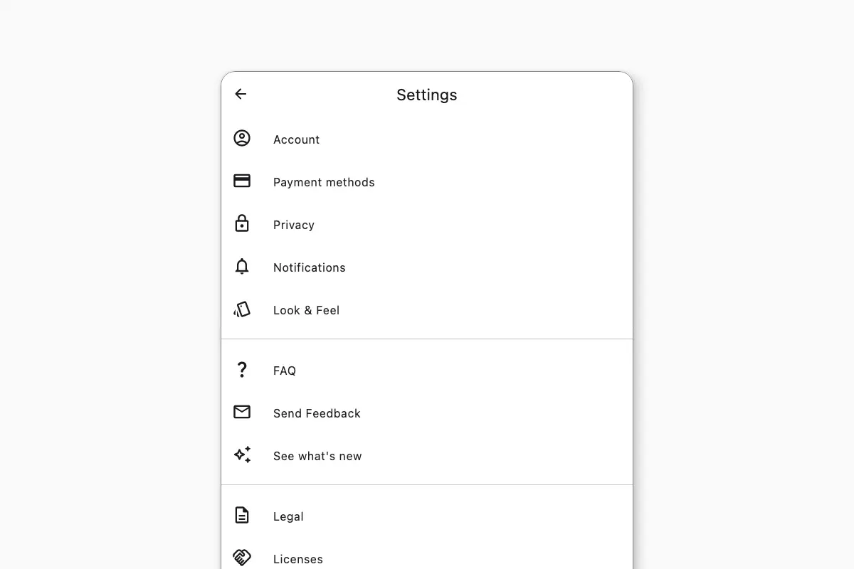
fun SettingsScreen() {
@Composable
fun CategoryItem(title: String, icon: ImageVector, onClick: () -> Unit) {
Surface(
onClick = onClick,
shape = MaterialTheme.shapes.medium,
) {
Row(
verticalAlignment = Alignment.CenterVertically,
modifier = Modifier.fillMaxWidth().padding(horizontal = 16.dp, vertical = 16.dp),
horizontalArrangement = Arrangement.spacedBy(30.dp)
) {
Icon(
icon,
contentDescription = null,
modifier = Modifier.size(28.dp),
tint = MaterialTheme.colorScheme.onSurface
)
Text(title, style = MaterialTheme.typography.bodyLarge)
}
}
}
@Composable
fun AppVersion(versionText: String, copyrights: String, onClick: () -> Unit) {
Surface(onClick = onClick) {
Row(
verticalAlignment = Alignment.CenterVertically,
modifier = Modifier.fillMaxWidth().padding(horizontal = 16.dp, vertical = 12.dp),
horizontalArrangement = Arrangement.spacedBy(30.dp)
) {
Box(
modifier = Modifier.size(30.dp),
)
Column(verticalArrangement = Arrangement.spacedBy(4.dp)) {
Text(
versionText,
style = MaterialTheme.typography.bodySmall,
color = MaterialTheme.colorScheme.onSurface.copy(0.44f)
)
Text(
copyrights,
style = MaterialTheme.typography.bodySmall,
color = MaterialTheme.colorScheme.onSurface.copy(0.44f)
)
}
}
}
}
val listState = rememberLazyListState()
val hasScrolled by remember {
derivedStateOf {
listState.firstVisibleItemScrollOffset > 0
}
}
val appBarElevation by animateDpAsState(targetValue = if (hasScrolled) 4.dp else 0.dp)
Scaffold(
containerColor = MaterialTheme.colorScheme.surface,
contentColor = MaterialTheme.colorScheme.onSurface,
topBar = {
CenterAlignedTopAppBar(
colors = TopAppBarDefaults.topAppBarColors(
containerColor = if (isSystemInDarkTheme()) {
MaterialTheme.colorScheme.surfaceVariant.copy(alpha = if (hasScrolled) 1f else 0f)
} else {
MaterialTheme.colorScheme.surface
},
),
modifier = Modifier.shadow(appBarElevation),
title = { Text(text = "Settings") },
navigationIcon = {
IconButton(onClick = { /*TODO*/ }) {
Icon(Icons.AutoMirrored.Rounded.ArrowBack, contentDescription = "Go back")
}
},
actions = { },
)
},
) { padding ->
Box(modifier = Modifier.fillMaxSize(), contentAlignment = Alignment.TopCenter) {
LazyColumn(contentPadding = padding, modifier = Modifier.widthIn(max = 600.dp), state = listState) {
item { CategoryItem(title = "Account", icon = Icons.Outlined.AccountCircle, onClick = { /*TODO*/ }) }
item {
CategoryItem(
title = "Payment methods",
icon = Icons.Outlined.CreditCard,
onClick = { /*TODO*/ })
}
item { CategoryItem(title = "Privacy", icon = Icons.Outlined.Lock, onClick = { /*TODO*/ }) }
item {
CategoryItem(
title = "Notifications",
icon = Icons.Outlined.Notifications,
onClick = { /*TODO*/ })
}
item { CategoryItem(title = "Look & Feel", icon = Icons.Outlined.Style, onClick = { /*TODO*/ }) }
item { HorizontalDivider(modifier = Modifier.padding(vertical = 12.dp)) }
item { CategoryItem(title = "FAQ", icon = Icons.Outlined.QuestionMark, onClick = { /*TODO*/ }) }
item { CategoryItem(title = "Send Feedback", icon = Icons.Outlined.Email, onClick = { /*TODO*/ }) }
item {
CategoryItem(
title = "See what's new",
icon = Icons.Outlined.AutoAwesome,
onClick = { /*TODO*/ })
}
item { HorizontalDivider(modifier = Modifier.padding(vertical = 12.dp)) }
item { CategoryItem(title = "Legal", icon = Icons.Outlined.Description, onClick = { /*TODO*/ }) }
item { CategoryItem(title = "Licenses", icon = Icons.Outlined.Handshake, onClick = { /*TODO*/ }) }
item { HorizontalDivider(modifier = Modifier.padding(vertical = 12.dp)) }
item {
AppVersion(
versionText = "Version 1.0.0",
copyrights = "© 2025 Your Company",
onClick = { /* TODO Add easter egg after 8 times is clicked */ })
}
}
}
}
}