Start native apps faster with the Composables CLI
->
Composables UI
Compose Unstyled
About
Blog
Composables UI
Compose Unstyled
About
Blog
Components
›
Chips
Chip components
for
Jetpack Compose
and
Compose Multiplatform
Browse all Chips components for
Jetpack Compose
and
Compose Multiplatform
.
New
Try Composables UI
Our new Compose component library for polished apps across Android, desktop, iOS, and web.
Explore the library
->
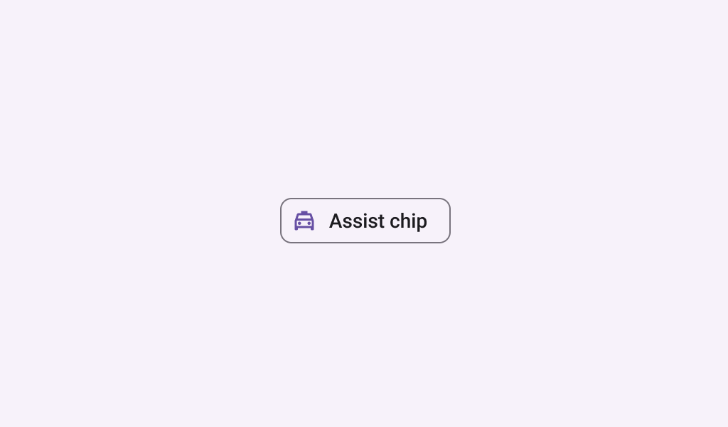
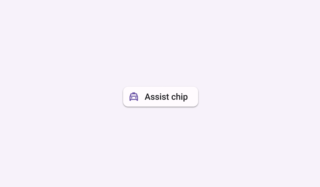
AssistChip
In
Material 3 Compose
AssistChip
In
Compose TV Material
Chip
In
Material Compose
Chip
In
Wear Material Compose
CompactChip
In
Wear Material Compose
ElevatedAssistChip
In
Material 3 Compose
ElevatedFilterChip
In
Material 3 Compose
ElevatedSuggestionChip
In
Material 3 Compose
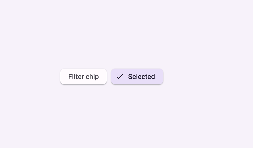
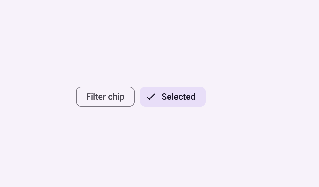
FilterChip
In
Material 3 Compose
FilterChip
In
Material Compose
FilterChip
In
Compose TV Material
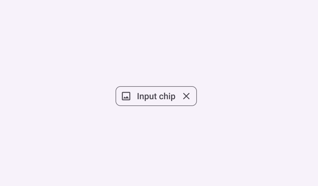
InputChip
In
Material 3 Compose
InputChip
In
Compose TV Material
OutlinedChip
In
Wear Material Compose
OutlinedCompactChip
In
Wear Material Compose
SelectableChip
In
Wear Material Compose
SplitSelectableChip
In
Wear Material Compose
SplitToggleChip
In
Wear Material Compose
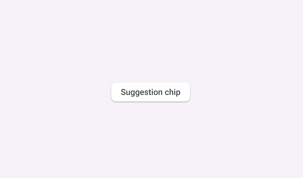
SuggestionChip
In
Material 3 Compose
SuggestionChip
In
Compose TV Material
SwipeToRevealChip
In
Wear Material Compose
TitleChip
In
XR Glimmer
ToggleChip
In
Wear Material Compose

