Start native apps faster with the Composables CLI
->
Composables UI
Compose Unstyled
About
Blog
Composables UI
Compose Unstyled
About
Blog
Components
›
Tabs
Tab components
for
Jetpack Compose
and
Compose Multiplatform
Browse all Tabs components for
Jetpack Compose
and
Compose Multiplatform
.
New
Try Composables UI
Our new Compose component library for polished apps across Android, desktop, iOS, and web.
Explore the library
->
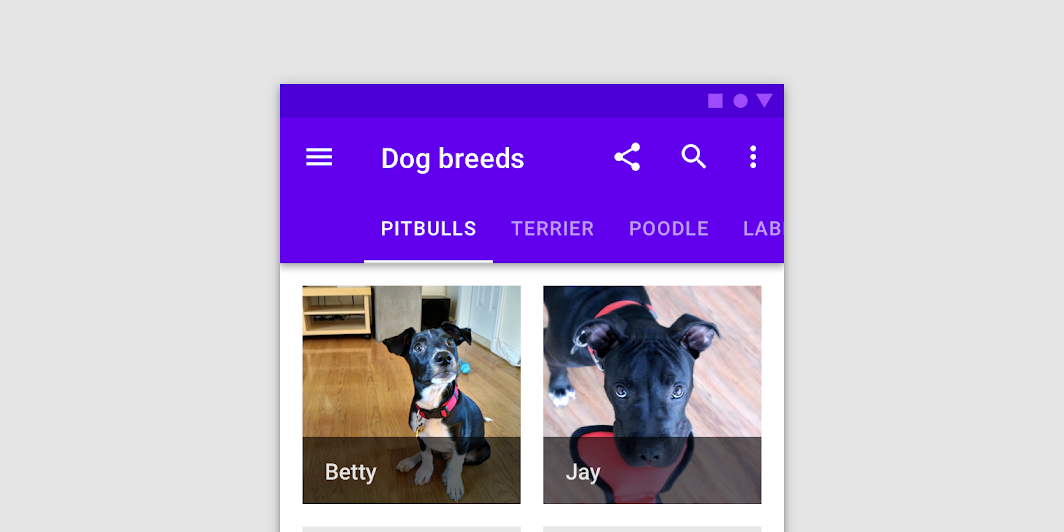
LeadingIconTab
In
Material 3 Compose
LeadingIconTab
In
Material Compose
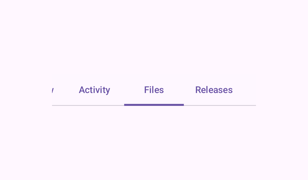
PrimaryScrollableTabRow
In
Material 3 Compose
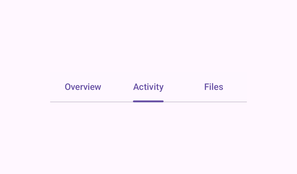
PrimaryTabRow
In
Material 3 Compose
ScrollableTabRow
In
Material 3 Compose
ScrollableTabRow
In
Material Compose
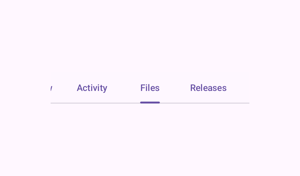
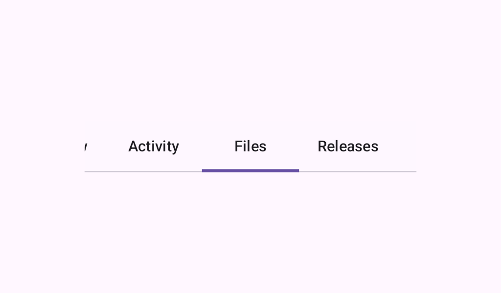
SecondaryScrollableTabRow
In
Material 3 Compose
SecondaryTabRow
In
Material 3 Compose
SelectableChip
In
Wear Material Compose
SplitSelectableChip
In
Wear Material Compose
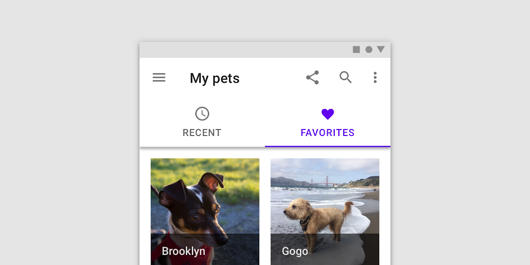
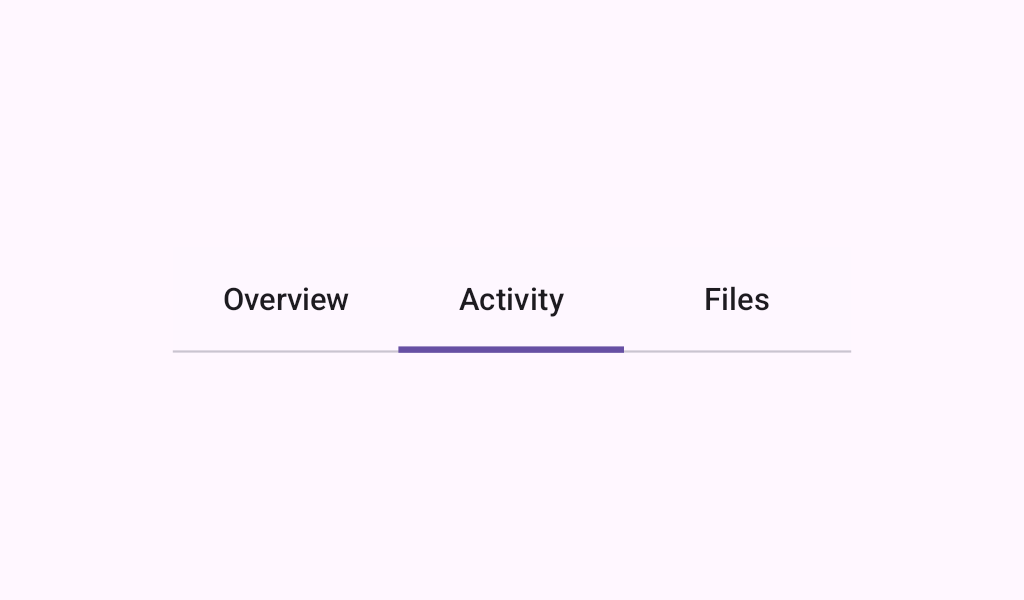
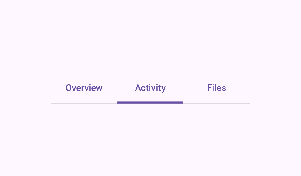
Tab
In
Material 3 Compose
Tab
In
Material Compose
Tab
In
Compose TV Material
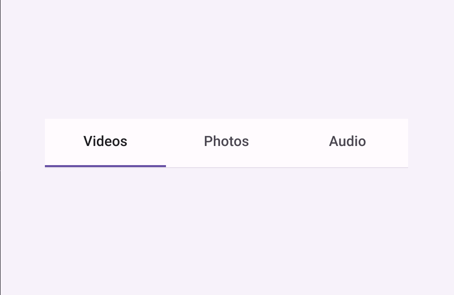
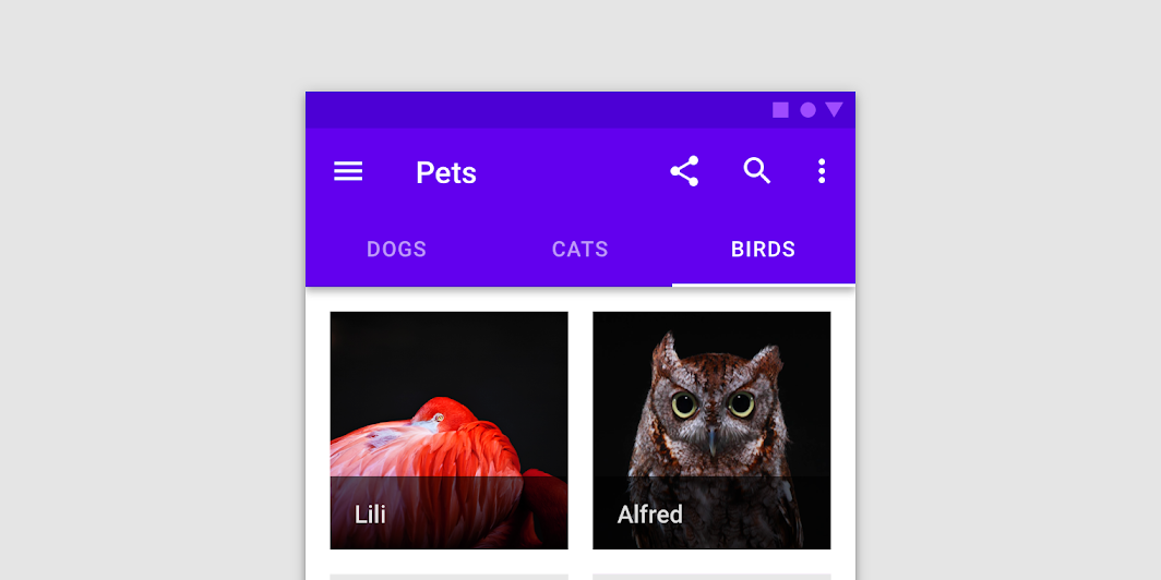
TabRow
In
Material 3 Compose
TabRow
In
Material Compose
TabRow
In
Compose TV Material

