Start native apps faster with the Composables CLI
->
Composables UI
Compose Unstyled
About
Blog
Composables UI
Compose Unstyled
About
Blog
Components
›
Text
Text components
for
Jetpack Compose
and
Compose Multiplatform
Browse all Text components for
Jetpack Compose
and
Compose Multiplatform
.
New
Try Composables UI
Our new Compose component library for polished apps across Android, desktop, iOS, and web.
Explore the library
->
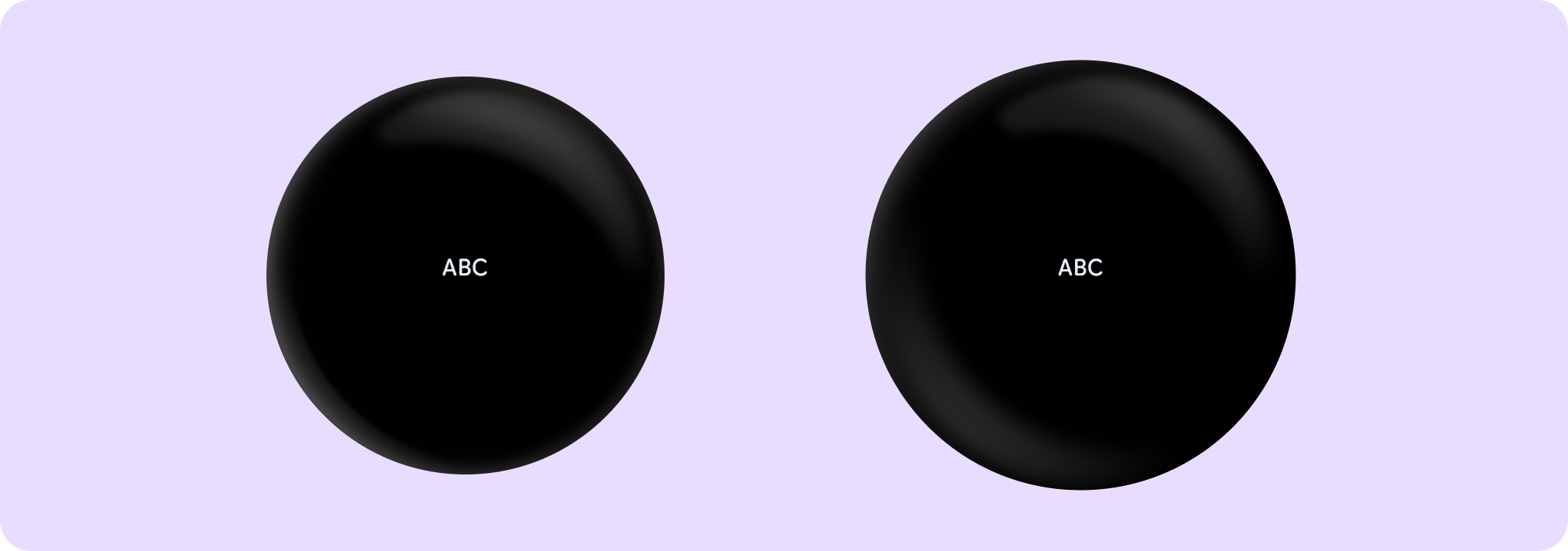
AnimatedText
In
Wear Material 3 Compose
FadingExpandingLabel
In
Wear Material 3 Compose
Label
In
Material 3 Compose
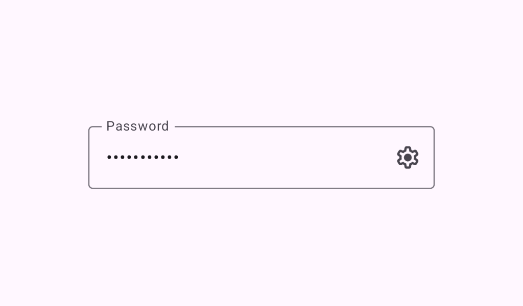
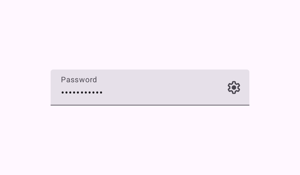
OutlinedSecureTextField
In
Material 3 Compose
OutlinedSecureTextField
In
Material Compose
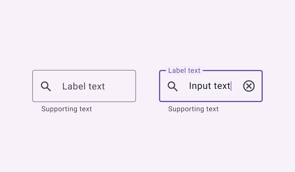
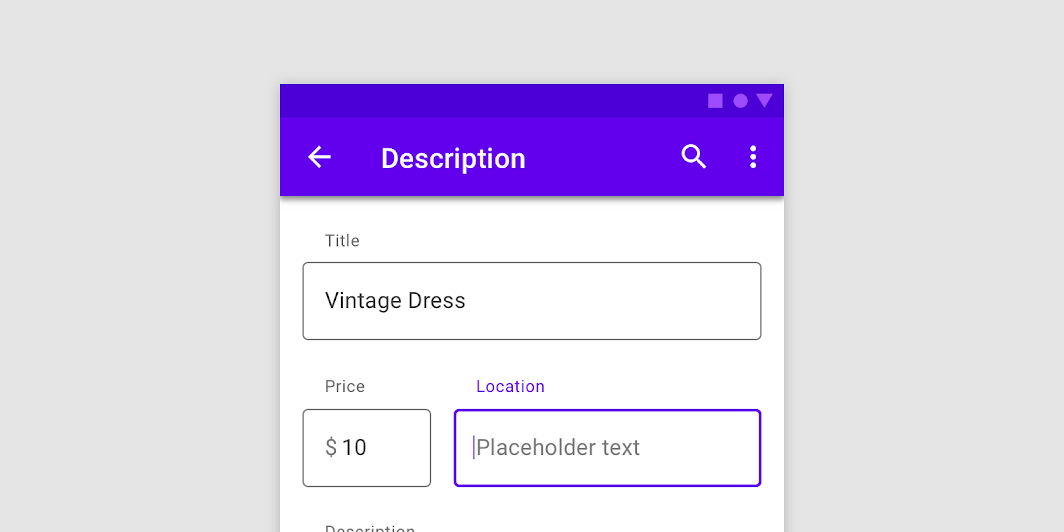
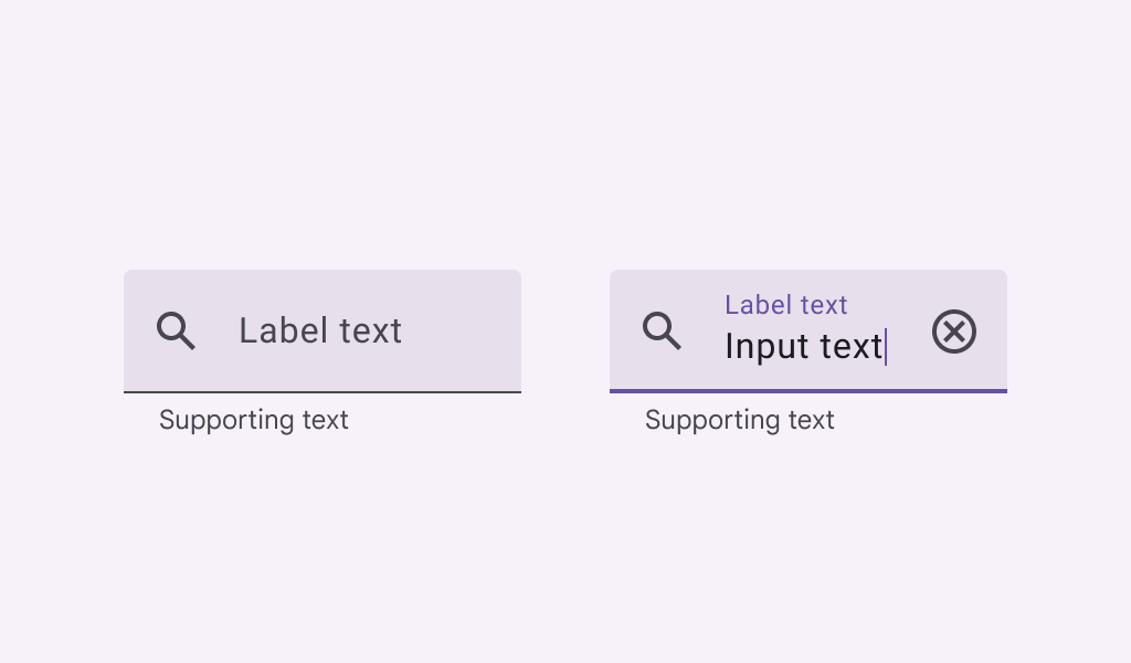
OutlinedTextField
In
Material 3 Compose
OutlinedTextField
In
Material Compose
SecureTextField
In
Material 3 Compose
SecureTextField
In
Material Compose
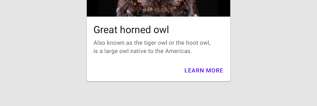
Text
In
Material 3 Compose
Text
In
Material Compose
Text
In
Wear Material 3 Compose
Text
In
Wear Material Compose
Text
In
Compose TV Material
Text
In
XR Glimmer
TextButton
In
Material 3 Compose
TextButton
In
Material Compose
TextButton
In
Wear Material 3 Compose
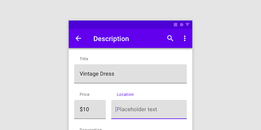
TextField
In
Material 3 Compose
TextField
In
Material Compose
TextToggleButton
In
Wear Material 3 Compose
TimeText
In
Wear Material 3 Compose
TimeText
In
Wear Material Compose


