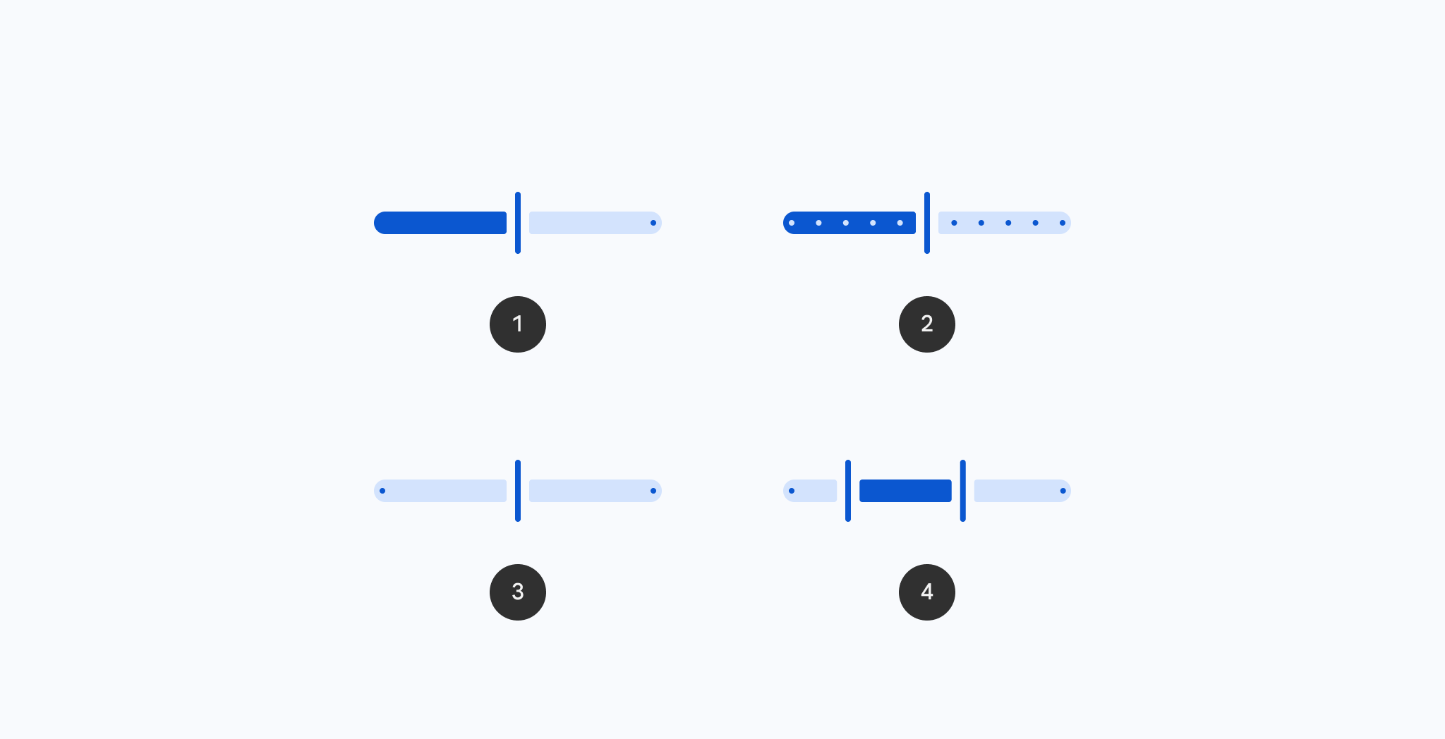
Compose Unstyled v1.49: Introducing Platform Themes. Read blog->
Unstyled
UI Kit
Book
Docs
Blog
940+
Documentation
Theming
Unstyled Components
Universal Components
Blog
Component Catalogue
Jetpack Compose Reference
Getting Started
Overview
Installation
Components
Theming
Theming
Android XML Themes
Dynamic Themes
Theme Overrides
Platform Themes
Composable Primitives
Bottom Sheet
Bottom Sheet (Modal)
Button
Checkbox
Checkbox (TriState)
Dialog
Disclosure
Dropdown Menu
Icon
Modal
Progress Indicator
Radio Group
Scroll Area
Separators
Slider
Tab Group
Text
Tooltip
Text Field
Toggle Switch
Styling
ColoredIndication
focusRing
outline
Responsive Design
Stack
currentWindowContainerSize
defaultMinimumComponentInteractiveSize
Modifiers
buildModifier
Unstyled
UI Kit
Book
new
Docs
Blog
Slider components for
Jetpack Compose and Compose Multiplatform
Browse all Sliders components for Jetpack Compose and Compose Multiplatform.
←
View all components
InlineSlider
In Wear Material Compose
RangeSlider
In Material 3 Compose
RangeSlider
In Material Compose
Slider
In Material 3 Compose
Slider
In Material Compose
Slider
In Wear Material 3 Compose
VerticalSlider
In Material 3 Compose
Add subscriptions to your apps in minutes.
Start for Free