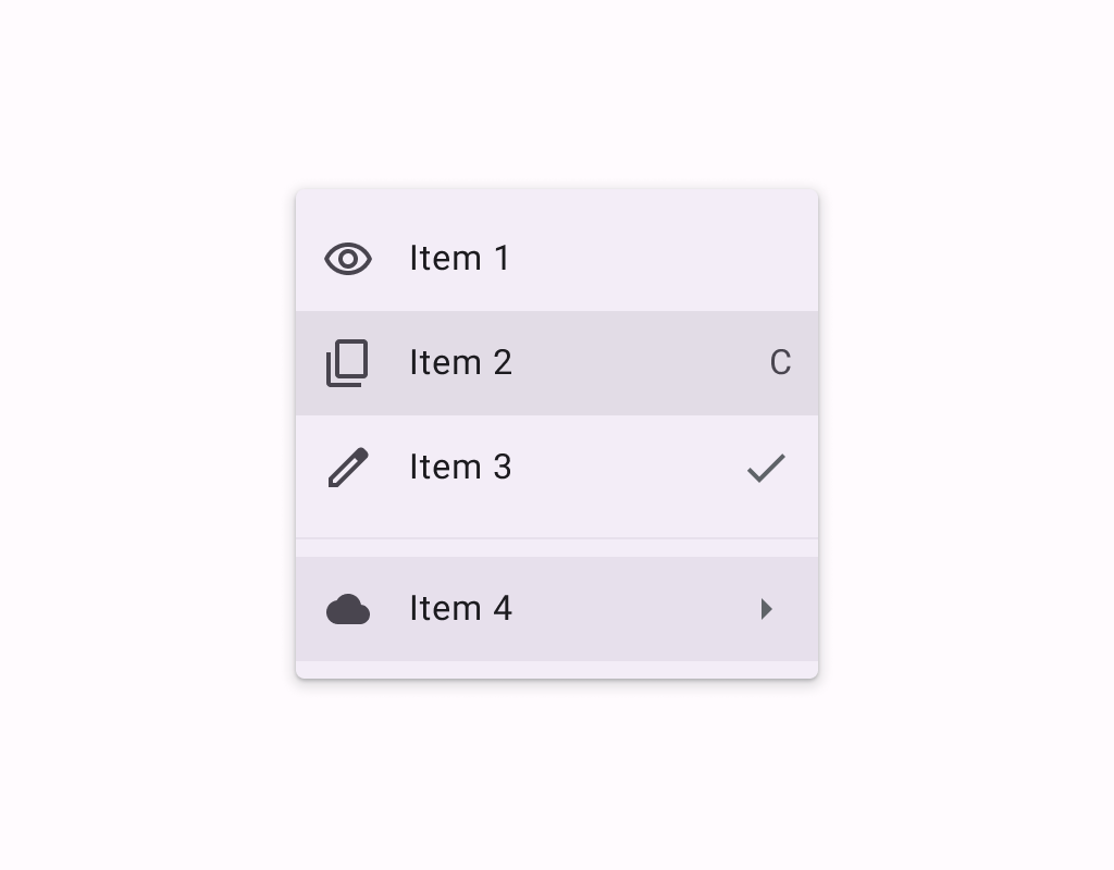
DropdownMenuItem
Menus display a list of choices on a temporary surface. They appear when users interact with a
DropdownMenuItem
Composable Component
Menus display a list of choices on a temporary surface. They appear when users interact with a button, action, or other control.
Common
@Composable
expect fun DropdownMenuItem(
    text: @Composable () -> Unit,
    onClick: () -> Unit,
    modifier: Modifier = Modifier,
    leadingIcon: @Composable (() -> Unit)? = null,
    trailingIcon: @Composable (() -> Unit)? = null,
    enabled: Boolean = true,
    colors: MenuItemColors = MenuDefaults.itemColors(),
    contentPadding: PaddingValues = MenuDefaults.DropdownMenuItemContentPadding,
    interactionSource: MutableInteractionSource? = null,
)
Parameters
| text | text of the menu item |
| onClick | called when this menu item is clicked |
| modifier | the Modifier to be applied to this menu item |
| leadingIcon | optional leading icon to be displayed at the beginning of the item's text |
| trailingIcon | optional trailing icon to be displayed at the end of the item's text. This trailing icon slot can also accept Text to indicate a keyboard shortcut. |
| enabled | controls the enabled state of this menu item. When false, this component will not respond to user input, and it will appear visually disabled and disabled to accessibility services. |
| colors | MenuItemColors that will be used to resolve the colors used for this menu item in different states. See MenuDefaults.itemColors. |
| contentPadding | the padding applied to the content of this menu item |
| interactionSource | an optional hoisted MutableInteractionSource for observing and emitting Interactions for this menu item. You can use this to change the menu item's appearance or preview the menu item in different states. Note that if null is provided, interactions will still happen internally. |
Common
@ExperimentalMaterial3ExpressiveApi
@Composable
fun DropdownMenuItem(
    onClick: () -> Unit,
    text: @Composable () -> Unit,
    shape: Shape,
    modifier: Modifier = Modifier,
    leadingIcon: @Composable (() -> Unit)? = null,
    trailingIcon: @Composable (() -> Unit)? = null,
    enabled: Boolean = true,
    colors: MenuItemColors = MenuDefaults.itemColors(),
    contentPadding: PaddingValues = MenuDefaults.DropdownMenuItemContentPadding,
    interactionSource: MutableInteractionSource? = null,
)
Parameters
| onClick | called when this menu item is clicked |
| text | text of the menu item. |
| shape | Shape of this menu item. The shapes provided should be determined by the number of items in the group or menu as well as the item's position in the menu. Please use MenuDefaults.leadingItemShape for the first item in a list, MenuDefaults.middleItemShape for the middle items in a list, and MenuDefaults.trailingItemShape for the last item in a list. |
| modifier | the Modifier to be applied to this menu item. |
| leadingIcon | optional leading icon to be displayed when the item is unchecked. |
| trailingIcon | optional trailing icon to be displayed at the end of the item's text. |
| enabled | controls the enabled state of this menu item. When false, this component will not respond to user input. |
| colors | MenuItemColors that will be used to resolve the colors for this menu item. |
| contentPadding | the padding applied to the content of this menu item. |
| interactionSource | an optional hoisted MutableInteractionSource for observing and emitting Interactions for this menu item. |
Common
@ExperimentalMaterial3ExpressiveApi
@Composable
fun DropdownMenuItem(
    checked: Boolean,
    onCheckedChange: (Boolean) -> Unit,
    text: @Composable () -> Unit,
    shapes: MenuItemShapes,
    modifier: Modifier = Modifier,
    leadingIcon: @Composable (() -> Unit)? = null,
    checkedLeadingIcon: @Composable (() -> Unit)? = null,
    trailingIcon: @Composable (() -> Unit)? = null,
    enabled: Boolean = true,
    colors: MenuItemColors = MenuDefaults.selectableItemColors(),
    contentPadding: PaddingValues = MenuDefaults.DropdownMenuItemContentPadding,
    interactionSource: MutableInteractionSource? = null,
)
Parameters
| checked | whether this menu item is currently checked. |
| onCheckedChange | called when this menu item is clicked, with the new checked state. |
| text | text of the menu item. |
| shapes | MenuItemShapes that will be used to resolve the shapes for this menu item. The shape of this item is determined by the value of checked. The shapes provided should be determined by the number of items in the group or menu as well as the item's position in the menu. There is a convenience function that can be used to easily determine the shape to be used at MenuDefaults.itemShape |
| modifier | the Modifier to be applied to this menu item. |
| leadingIcon | optional leading icon to be displayed when the item is unchecked. |
| checkedLeadingIcon | optional leading icon to be displayed when the item is checked. |
| trailingIcon | optional trailing icon to be displayed at the end of the item's text. |
| enabled | controls the enabled state of this menu item. When false, this component will not respond to user input. |
| colors | MenuItemColors that will be used to resolve the colors for this menu item. There are two predefined MenuItemColors at MenuDefaults.selectableItemColors and MenuDefaults.selectableItemVibrantColors which you can use or modify. |
| contentPadding | the padding applied to the content of this menu item. |
| interactionSource | an optional hoisted MutableInteractionSource for observing and emitting Interactions for this menu item. |
Common
@ExperimentalMaterial3ExpressiveApi
@Composable
fun DropdownMenuItem(
    selected: Boolean,
    onClick: () -> Unit,
    text: @Composable () -> Unit,
    shapes: MenuItemShapes,
    modifier: Modifier = Modifier,
    leadingIcon: @Composable (() -> Unit)? = null,
    checkedLeadingIcon: @Composable (() -> Unit)? = null,
    trailingIcon: @Composable (() -> Unit)? = null,
    enabled: Boolean = true,
    colors: MenuItemColors = MenuDefaults.selectableItemColors(),
    contentPadding: PaddingValues = MenuDefaults.DropdownMenuItemContentPadding,
    interactionSource: MutableInteractionSource? = null,
)
Parameters
| selected | whether this menu item is currently selected. |
| onClick | called when this menu item is clicked. |
| text | text of the menu item. |
| shapes | MenuItemShapes that will be used to resolve the shapes for this menu item. The shape of this item is determined by the value of selected. The shapes provided should be determined by the number of items in the group or menu as well as the item's position in the menu. There is a convenience function that can be used to easily determine the shape to be used at MenuDefaults.itemShape |
| modifier | the Modifier to be applied to this menu item. |
| leadingIcon | optional leading icon to be displayed when the item is unchecked. |
| checkedLeadingIcon | optional leading icon to be displayed when the item is checked. |
| trailingIcon | optional trailing icon to be displayed at the end of the item's text. |
| enabled | controls the enabled state of this menu item. When false, this component will not respond to user input. |
| colors | MenuItemColors that will be used to resolve the colors for this menu item. There are two predefined MenuItemColors at MenuDefaults.selectableItemColors and MenuDefaults.selectableItemVibrantColors which you can use or modify. |
| contentPadding | the padding applied to the content of this menu item. |
| interactionSource | an optional hoisted MutableInteractionSource for observing and emitting Interactions for this menu item. |
Android
@Composable
actual fun DropdownMenuItem(
    text: @Composable () -> Unit,
    onClick: () -> Unit,
    modifier: Modifier,
    leadingIcon: @Composable (() -> Unit)?,
    trailingIcon: @Composable (() -> Unit)?,
    enabled: Boolean,
    colors: MenuItemColors,
    contentPadding: PaddingValues,
    interactionSource: MutableInteractionSource?,
)
Code Examples
ExposedDropdownMenuSample
@OptIn(ExperimentalMaterial3ExpressiveApi::class)
@Preview
@Composable
fun ExposedDropdownMenuSample() {
    val options: List<String> = SampleData.take(5)
    var expanded by remember { mutableStateOf(false) }
    val textFieldState = rememberTextFieldState(options[0])
    var checkedIndex: Int? by remember { mutableStateOf(null) }
    ExposedDropdownMenuBox(expanded = expanded, onExpandedChange = { expanded = it }) {
        TextField(
            // The `menuAnchor` modifier must be passed to the text field to handle
            // expanding/collapsing the menu on click. A read-only text field has
            // the anchor type `PrimaryNotEditable`.
            modifier = Modifier.menuAnchor(ExposedDropdownMenuAnchorType.PrimaryNotEditable),
            state = textFieldState,
            readOnly = true,
            lineLimits = TextFieldLineLimits.SingleLine,
            label = { Text("Label") },
            trailingIcon = { ExposedDropdownMenuDefaults.TrailingIcon(expanded = expanded) },
            colors = ExposedDropdownMenuDefaults.textFieldColors(),
        )
        ExposedDropdownMenu(
            expanded = expanded,
            onDismissRequest = { expanded = false },
            containerColor = MenuDefaults.groupStandardContainerColor,
            shape = MenuDefaults.standaloneGroupShape,
        ) {
            val optionCount = options.size
            options.forEachIndexed { index, option ->
                DropdownMenuItem(
                    shapes = MenuDefaults.itemShape(index, optionCount),
                    text = { Text(option, style = MaterialTheme.typography.bodyLarge) },
                    selected = index == checkedIndex,
                    onClick = {
                        textFieldState.setTextAndPlaceCursorAtEnd(option)
                        checkedIndex = index
                    },
                    checkedLeadingIcon = { Icon(Icons.Filled.Check, contentDescription = null) },
                    contentPadding = ExposedDropdownMenuDefaults.ItemContentPadding,
                )
            }
        }
    }
}
GroupedMenuSample
@OptIn(ExperimentalMaterial3Api::class, ExperimentalMaterial3ExpressiveApi::class)
@Preview
@Composable
fun GroupedMenuSample() {
    val groupInteractionSource = remember { MutableInteractionSource() }
    var expanded by remember { mutableStateOf(false) }
    var homeChecked by remember { mutableStateOf(false) }
    val groupLabels = listOf("Modification", "Navigation")
    val groupItemLabels = listOf(listOf("Edit", "Settings"), listOf("Home", "More Options"))
    val groupItemLeadingIcons =
        listOf(
            listOf(Icons.Outlined.Edit, Icons.Outlined.Settings),
            listOf(null, Icons.Outlined.Info),
        )
    val groupItemCheckedLeadingIcons =
        listOf(
            listOf(Icons.Filled.Edit, Icons.Filled.Settings),
            listOf(Icons.Filled.Check, Icons.Filled.Info),
        )
    val groupItemTrailingIcons: List<List<ImageVector?>> =
        listOf(
            listOf(null, null),
            listOf(
                if (homeChecked) {
                    Icons.Filled.Home
                } else {
                    Icons.Outlined.Home
                },
                Icons.Filled.MoreVert,
            ),
        )
    val groupItemSupportingText: List<List<String?>> =
        listOf(listOf("Edit mode", null), listOf(null, "Opens menu"))
    val checked = remember {
        listOf(mutableStateListOf(false, false), mutableStateListOf(false, false))
    }
    Box(modifier = Modifier.fillMaxSize().wrapContentSize(Alignment.TopStart)) {
        // Icon button should have a tooltip associated with it for a11y.
        TooltipBox(
            positionProvider =
                TooltipDefaults.rememberTooltipPositionProvider(TooltipAnchorPosition.Above),
            tooltip = { PlainTooltip { Text("Localized description") } },
            state = rememberTooltipState(),
        ) {
            IconButton(onClick = { expanded = true }) {
                Icon(Icons.Default.MoreVert, contentDescription = "Localized description")
            }
        }
        DropdownMenuPopup(expanded = expanded, onDismissRequest = { expanded = false }) {
            val groupCount = groupLabels.size
            groupLabels.fastForEachIndexed { groupIndex, label ->
                DropdownMenuGroup(
                    shapes = MenuDefaults.groupShape(groupIndex, groupCount),
                    interactionSource = groupInteractionSource,
                ) {
                    MenuDefaults.Label { Text(label) }
                    HorizontalDivider(
                        modifier =
                            Modifier.padding(horizontal = MenuDefaults.HorizontalDividerPadding)
                    )
                    val groupItemCount = groupItemLabels[groupIndex].size
                    groupItemLabels[groupIndex].fastForEachIndexed { itemIndex, itemLabel ->
                        DropdownMenuItem(
                            text = {
                                val itemSupportingText =
                                    groupItemSupportingText[groupIndex][itemIndex]
                                if (itemSupportingText != null) {
                                    MenuDefaults.LabelWithSupportingText(
                                        supportingText = { Text(itemSupportingText) }
                                    ) {
                                        Text(itemLabel)
                                    }
                                } else {
                                    Text(itemLabel)
                                }
                            },
                            shapes = MenuDefaults.itemShape(itemIndex, groupItemCount),
                            leadingIcon =
                                groupItemLeadingIcons[groupIndex][itemIndex]?.let { iconData ->
                                    { Icon(iconData, contentDescription = null) }
                                },
                            checkedLeadingIcon = {
                                Icon(
                                    groupItemCheckedLeadingIcons[groupIndex][itemIndex],
                                    contentDescription = null,
                                )
                            },
                            trailingIcon =
                                groupItemTrailingIcons[groupIndex][itemIndex]?.let { iconData ->
                                    { Icon(iconData, contentDescription = null) }
                                },
                            checked = checked[groupIndex][itemIndex],
                            onCheckedChange = { checked[groupIndex][itemIndex] = it },
                        )
                    }
                }
                if (groupIndex != groupCount - 1) {
                    Spacer(Modifier.height(MenuDefaults.GroupSpacing))
                }
            }
            if (checked.last().last()) {
                DropdownMenuButtonGroup()
            }
        }
    }
}
MenuSample
@OptIn(ExperimentalMaterial3Api::class, ExperimentalMaterial3ExpressiveApi::class)
@Preview
@Composable
fun MenuSample() {
    var expanded by remember { mutableStateOf(false) }
    Box(modifier = Modifier.fillMaxSize().wrapContentSize(Alignment.TopStart)) {
        // Icon button should have a tooltip associated with it for a11y.
        TooltipBox(
            positionProvider =
                TooltipDefaults.rememberTooltipPositionProvider(TooltipAnchorPosition.Above),
            tooltip = { PlainTooltip { Text("Localized description") } },
            state = rememberTooltipState(),
        ) {
            IconButton(onClick = { expanded = true }) {
                Icon(Icons.Default.MoreVert, contentDescription = "Localized description")
            }
        }
        DropdownMenu(expanded = expanded, onDismissRequest = { expanded = false }) {
            DropdownMenuItem(
                text = { Text("Edit") },
                onClick = { /* Handle edit! */ },
                leadingIcon = { Icon(Icons.Outlined.Edit, contentDescription = null) },
            )
            DropdownMenuItem(
                text = { Text("Settings") },
                onClick = { /* Handle settings! */ },
                leadingIcon = { Icon(Icons.Outlined.Settings, contentDescription = null) },
            )
            HorizontalDivider()
            DropdownMenuItem(
                text = { Text("Send Feedback") },
                onClick = { /* Handle send feedback! */ },
                leadingIcon = { Icon(Icons.Outlined.Email, contentDescription = null) },
                trailingIcon = { Text("F11", textAlign = TextAlign.Center) },
            )
        }
    }
}
Create your own Component Library
Material Components are meant to be used as is and they do not allow customizations. To build your own Jetpack Compose component library use Compose Unstyled


