Composable Component
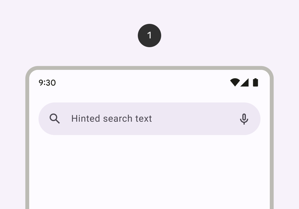
A search bar represents a field that allows users to enter a keyword or phrase and get relevant information. It can be used as a way to navigate through an app via search queries.
Common
@ExperimentalMaterial3Api
@Composable
fun AppBarWithSearch(
    state: SearchBarState,
    inputField: @Composable () -> Unit,
    modifier: Modifier = Modifier,
    navigationIcon: @Composable (() -> Unit)? = null,
    actions: @Composable (RowScope.() -> Unit)? = null,
    shape: Shape = SearchBarDefaults.inputFieldShape,
    colors: AppBarWithSearchColors = SearchBarDefaults.appBarWithSearchColors(),
    tonalElevation: Dp = SearchBarDefaults.TonalElevation,
    shadowElevation: Dp = SearchBarDefaults.ShadowElevation,
    contentPadding: PaddingValues = SearchBarDefaults.AppBarContentPadding,
    windowInsets: WindowInsets = SearchBarDefaults.windowInsets,
    scrollBehavior: SearchBarScrollBehavior? = null,
)
Parameters
| state | the state of the search bar. This state should also be passed to the inputField and the expanded search bar. |
| inputField | the input field of this search bar that allows entering a query, typically a SearchBarDefaults.InputField. |
| modifier | the Modifier to be applied to this search bar when collapsed. |
| navigationIcon | the icon displayed at the start of the app bar before the search bar. This should typically be an IconButton or IconToggleButton. |
| actions | the icons displayed at the end of the app bar after the search bar. This should typically be IconButtons. The default layout here is a Row, so icons inside will be placed horizontally. |
| shape | the shape of this search bar when collapsed. |
| colors | SearchBarColors that will be used to resolve the colors used for this search bar. See SearchBarDefaults.colors. |
| tonalElevation | when SearchBarColors.containerColor is ColorScheme.surface, a translucent primary color overlay is applied on top of the container. A higher tonal elevation value will result in a darker color in light theme and lighter color in dark theme. See also: Surface. |
| shadowElevation | the elevation for the shadow below this search bar. |
| contentPadding | the spacing values to apply internally between the container and the content. |
| windowInsets | the window insets that the search bar will respect when collapsed. |
| scrollBehavior | a SearchBarScrollBehavior which works in conjunction with a scrolled content to change the search bar appearance as the content scrolls. If null, the search bar will not automatically react to scrolling. |
Code Examples
DockedSearchBarScaffoldSample
@OptIn(ExperimentalMaterial3ExpressiveApi::class)
@Preview
@Composable
fun DockedSearchBarScaffoldSample() {
    val textFieldState = rememberTextFieldState()
    val searchBarState = rememberWithGapSearchBarState()
    val scope = rememberCoroutineScope()
    val scrollBehavior = SearchBarDefaults.enterAlwaysSearchBarScrollBehavior()
    val appBarWithSearchColors = SearchBarDefaults.appBarWithSearchColors()
    val inputField =
        @Composable {
            SearchBarDefaults.InputField(
                textFieldState = textFieldState,
                searchBarState = searchBarState,
                colors = appBarWithSearchColors.searchBarColors.inputFieldColors,
                onSearch = { scope.launch { searchBarState.animateToCollapsed() } },
                placeholder = {
                    Text(modifier = Modifier.clearAndSetSemantics {}, text = "Search")
                },
                leadingIcon = { SampleLeadingIcon(searchBarState, scope) },
                trailingIcon = { SampleTrailingIcon() },
            )
        }
    Scaffold(
        modifier = Modifier.nestedScroll(scrollBehavior.nestedScrollConnection),
        topBar = {
            AppBarWithSearch(
                scrollBehavior = scrollBehavior,
                state = searchBarState,
                colors = appBarWithSearchColors,
                inputField = inputField,
                navigationIcon = { SampleNavigationIcon(searchBarState) },
                actions = { SampleActions(searchBarState) },
            )
            ExpandedDockedSearchBarWithGap(state = searchBarState, inputField = inputField) {
                SampleSearchResults(
                    onResultClick = { result ->
                        textFieldState.setTextAndPlaceCursorAtEnd(result)
                        scope.launch { searchBarState.animateToCollapsed() }
                    }
                )
            }
        },
    ) { padding ->
        LazyColumn(contentPadding = padding, verticalArrangement = Arrangement.spacedBy(8.dp)) {
            val list = List(100) { "Text $it" }
            items(count = list.size) {
                Text(
                    text = list[it],
                    modifier = Modifier.fillMaxWidth().padding(horizontal = 16.dp),
                )
            }
        }
    }
}
FullScreenSearchBarScaffoldSample
@OptIn(ExperimentalMaterial3ExpressiveApi::class)
@Preview
@Composable
fun FullScreenSearchBarScaffoldSample() {
    val textFieldState = rememberTextFieldState()
    val searchBarState = rememberContainedSearchBarState()
    val scope = rememberCoroutineScope()
    val scrollBehavior = SearchBarDefaults.enterAlwaysSearchBarScrollBehavior()
    val appBarWithSearchColors =
        SearchBarDefaults.appBarWithSearchColors(
            searchBarColors = SearchBarDefaults.containedColors(state = searchBarState)
        )
    val inputField =
        @Composable {
            SearchBarDefaults.InputField(
                textFieldState = textFieldState,
                searchBarState = searchBarState,
                colors = appBarWithSearchColors.searchBarColors.inputFieldColors,
                onSearch = { scope.launch { searchBarState.animateToCollapsed() } },
                placeholder = {
                    Text(modifier = Modifier.clearAndSetSemantics {}, text = "Search")
                },
                leadingIcon = { SampleLeadingIcon(searchBarState, scope) },
                trailingIcon = { SampleTrailingIcon() },
            )
        }
    Scaffold(
        modifier = Modifier.nestedScroll(scrollBehavior.nestedScrollConnection),
        topBar = {
            AppBarWithSearch(
                scrollBehavior = scrollBehavior,
                state = searchBarState,
                colors = appBarWithSearchColors,
                inputField = inputField,
                navigationIcon = { SampleNavigationIcon(searchBarState, isAnimated = true) },
                actions = { SampleActions(searchBarState, isAnimated = true) },
            )
            ExpandedFullScreenContainedSearchBar(
                state = searchBarState,
                inputField = inputField,
                colors = appBarWithSearchColors.searchBarColors,
            ) {
                SampleSearchResults(
                    onResultClick = { result ->
                        textFieldState.setTextAndPlaceCursorAtEnd(result)
                        scope.launch { searchBarState.animateToCollapsed() }
                    }
                )
            }
        },
    ) { padding ->
        LazyColumn(contentPadding = padding, verticalArrangement = Arrangement.spacedBy(8.dp)) {
            val list = List(100) { "Text $it" }
            items(count = list.size) {
                Text(
                    text = list[it],
                    modifier = Modifier.fillMaxWidth().padding(horizontal = 16.dp),
                )
            }
        }
    }
}