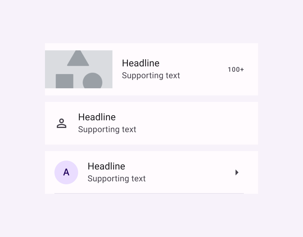
ListItem
Lists are continuous, vertical indexes of text or images.
ListItem
Composable Component
Lists are continuous, vertical indexes of text or images.
Common
@Composable
fun ListItem(
    headlineContent: @Composable () -> Unit,
    modifier: Modifier = Modifier,
    overlineContent: @Composable (() -> Unit)? = null,
    supportingContent: @Composable (() -> Unit)? = null,
    leadingContent: @Composable (() -> Unit)? = null,
    trailingContent: @Composable (() -> Unit)? = null,
    colors: ListItemColors = ListItemDefaults.colors(),
    tonalElevation: Dp = ListItemDefaults.Elevation,
    shadowElevation: Dp = ListItemDefaults.Elevation,
)
Parameters
| headlineContent | the headline content of the list item |
| modifier | Modifier to be applied to the list item |
| overlineContent | the content displayed above the headline content |
| supportingContent | the supporting content of the list item |
| leadingContent | the leading content of the list item |
| trailingContent | the trailing meta text, icon, switch or checkbox |
| colors | ListItemColors that will be used to resolve the background and content color for this list item in different states. See ListItemDefaults.colors |
| tonalElevation | the tonal elevation of this list item |
| shadowElevation | the shadow elevation of this list item |
Common
@ExperimentalMaterial3ExpressiveApi
@Composable
fun ListItem(
    onClick: () -> Unit,
    modifier: Modifier = Modifier,
    enabled: Boolean = true,
    leadingContent: @Composable (() -> Unit)? = null,
    trailingContent: @Composable (() -> Unit)? = null,
    overlineContent: @Composable (() -> Unit)? = null,
    supportingContent: @Composable (() -> Unit)? = null,
    verticalAlignment: Alignment.Vertical = ListItemDefaults.verticalAlignment(),
    onLongClick: (() -> Unit)? = null,
    onLongClickLabel: String? = null,
    shapes: ListItemShapes = ListItemDefaults.shapes(),
    colors: ListItemColors = ListItemDefaults.colors(),
    elevation: ListItemElevation = ListItemDefaults.elevation(),
    contentPadding: PaddingValues = ListItemDefaults.ContentPadding,
    interactionSource: MutableInteractionSource? = null,
    content: @Composable () -> Unit,
)
Parameters
| onClick | called when this list item is clicked. |
| modifier | the Modifier to be applied to this list item. |
| enabled | controls the enabled state of this list item. When false, this component will not respond to user input, and it will appear visually disabled and disabled to accessibility services. |
| leadingContent | the leading content of this list item, such as an icon or avatar. |
| trailingContent | the trailing content of this list item, such as a checkbox, switch, or icon. |
| overlineContent | the content displayed above the main content of the list item. |
| supportingContent | the content displayed below the main content of the list item. |
| verticalAlignment | the vertical alignment of children within the list item, after accounting for contentPadding. |
| onLongClick | called when this list item is long clicked (long-pressed). |
| onLongClickLabel | semantic / accessibility label for the onLongClick action. |
| shapes | the ListItemShapes that this list item will use to morph between depending on the user's interaction with the list item. See ListItemDefaults.shapes. |
| colors | the ListItemColors that will be used to resolve the colors used for this list item in different states. See ListItemDefaults.colors. |
| elevation | the ListItemElevation used to resolve the elevation for this list item in different states. See ListItemDefaults.elevation. |
| contentPadding | the padding to be applied to the content of this list item. |
| interactionSource | an optional hoisted MutableInteractionSource for observing and emitting Interactions for this list item. You can use this to change the list item's appearance or preview the list item in different states. Note that if null is provided, interactions will still happen internally. |
| content | the main content of this list item. Also known as the headline or label. |
Common
@ExperimentalMaterial3ExpressiveApi
@Composable
fun ListItem(
    selected: Boolean,
    onClick: () -> Unit,
    modifier: Modifier = Modifier,
    enabled: Boolean = true,
    leadingContent: @Composable (() -> Unit)? = null,
    trailingContent: @Composable (() -> Unit)? = null,
    overlineContent: @Composable (() -> Unit)? = null,
    supportingContent: @Composable (() -> Unit)? = null,
    verticalAlignment: Alignment.Vertical = ListItemDefaults.verticalAlignment(),
    onLongClick: (() -> Unit)? = null,
    onLongClickLabel: String? = null,
    shapes: ListItemShapes = ListItemDefaults.shapes(),
    colors: ListItemColors = ListItemDefaults.colors(),
    elevation: ListItemElevation = ListItemDefaults.elevation(),
    contentPadding: PaddingValues = ListItemDefaults.ContentPadding,
    interactionSource: MutableInteractionSource? = null,
    content: @Composable () -> Unit,
)
Parameters
| selected | whether or not this list item is selected. |
| onClick | called when this list item is clicked. |
| modifier | the Modifier to be applied to this list item. |
| enabled | controls the enabled state of this list item. When false, this component will not respond to user input, and it will appear visually disabled and disabled to accessibility services. |
| leadingContent | the leading content of this list item, such as an icon or avatar. |
| trailingContent | the trailing content of this list item, such as a checkbox, switch, or icon. |
| overlineContent | the content displayed above the main content of the list item. |
| supportingContent | the content displayed below the main content of the list item. |
| verticalAlignment | the vertical alignment of children within the list item, after accounting for contentPadding. |
| onLongClick | called when this list item is long clicked (long-pressed). |
| onLongClickLabel | semantic / accessibility label for the onLongClick action. |
| shapes | the ListItemShapes that this list item will use to morph between depending on the user's interaction with the list item. See ListItemDefaults.shapes. |
| colors | the ListItemColors that will be used to resolve the colors used for this list item in different states. See ListItemDefaults.colors. |
| elevation | the ListItemElevation used to resolve the elevation for this list item in different states. See ListItemDefaults.elevation. |
| contentPadding | the padding to be applied to the content of this list item. |
| interactionSource | an optional hoisted MutableInteractionSource for observing and emitting Interactions for this list item. You can use this to change the list item's appearance or preview the list item in different states. Note that if null is provided, interactions will still happen internally. |
| content | the main content of this list item. Also known as the headline or label. |
Common
@ExperimentalMaterial3ExpressiveApi
@Composable
fun ListItem(
    checked: Boolean,
    onCheckedChange: (Boolean) -> Unit,
    modifier: Modifier = Modifier,
    enabled: Boolean = true,
    leadingContent: @Composable (() -> Unit)? = null,
    trailingContent: @Composable (() -> Unit)? = null,
    overlineContent: @Composable (() -> Unit)? = null,
    supportingContent: @Composable (() -> Unit)? = null,
    verticalAlignment: Alignment.Vertical = ListItemDefaults.verticalAlignment(),
    onLongClick: (() -> Unit)? = null,
    onLongClickLabel: String? = null,
    shapes: ListItemShapes = ListItemDefaults.shapes(),
    colors: ListItemColors = ListItemDefaults.colors(),
    elevation: ListItemElevation = ListItemDefaults.elevation(),
    contentPadding: PaddingValues = ListItemDefaults.ContentPadding,
    interactionSource: MutableInteractionSource? = null,
    content: @Composable () -> Unit,
)
Parameters
| checked | whether this list item is toggled on or off. |
| onCheckedChange | called when this toggleable list item is clicked. |
| modifier | the Modifier to be applied to this list item. |
| enabled | controls the enabled state of this list item. When false, this component will not respond to user input, and it will appear visually disabled and disabled to accessibility services. |
| leadingContent | the leading content of this list item, such as an icon or avatar. |
| trailingContent | the trailing content of this list item, such as a checkbox, switch, or icon. |
| overlineContent | the content displayed above the main content of the list item. |
| supportingContent | the content displayed below the main content of the list item. |
| verticalAlignment | the vertical alignment of children within the list item, after accounting for contentPadding. |
| onLongClick | called when this list item is long clicked (long-pressed). |
| onLongClickLabel | semantic / accessibility label for the onLongClick action. |
| shapes | the ListItemShapes that this list item will use to morph between depending on the user's interaction with the list item. See ListItemDefaults.shapes. |
| colors | the ListItemColors that will be used to resolve the colors used for this list item in different states. See ListItemDefaults.colors. |
| elevation | the ListItemElevation used to resolve the elevation for this list item in different states. See ListItemDefaults.elevation. |
| contentPadding | the padding to be applied to the content of this list item. |
| interactionSource | an optional hoisted MutableInteractionSource for observing and emitting Interactions for this list item. You can use this to change the list item's appearance or preview the list item in different states. Note that if null is provided, interactions will still happen internally. |
| content | the main content of this list item. Also known as the headline or label. |
Code Examples
ClickableListItemSample
@OptIn(ExperimentalMaterial3ExpressiveApi::class)
@Preview
@Composable
fun ClickableListItemSample() {
    Column {
        HorizontalDivider()
        repeat(3) { idx ->
            var count by rememberSaveable { mutableIntStateOf(0) }
            ListItem(
                onClick = { count++ },
                leadingContent = { Icon(Icons.Default.Home, contentDescription = null) },
                trailingContent = { Text("$count") },
                supportingContent = { Text("Additional info") },
                content = { Text("Item ${idx + 1}") },
            )
            HorizontalDivider()
        }
    }
}
ClickableListItemWithClickableChildSample
@OptIn(ExperimentalMaterial3ExpressiveApi::class)
@Preview
@Composable
fun ClickableListItemWithClickableChildSample() {
    Column {
        HorizontalDivider()
        repeat(3) { idx ->
            ListItem(
                onClick = { /* ListItem onClick callback */ },
                leadingContent = { Icon(Icons.Default.Home, contentDescription = null) },
                trailingContent = {
                    IconButton(onClick = { /* Child onClick callback */ }) {
                        Icon(Icons.Default.Favorite, contentDescription = "Localized description")
                    }
                },
                supportingContent = { Text("The trailing icon has a separate click action") },
                content = { Text("Item ${idx + 1}") },
            )
            HorizontalDivider()
        }
    }
}
ListItemWithModeChangeOnLongClickSample
@OptIn(ExperimentalMaterial3ExpressiveApi::class)
@Preview
@Composable
fun ListItemWithModeChangeOnLongClickSample() {
    Column {
        HorizontalDivider()
        var inClickMode by rememberSaveable { mutableStateOf(true) }
        val counts = rememberSaveable { mutableStateListOf(0, 0, 0) }
        val checked = rememberSaveable { mutableStateListOf(false, false, false) }
        repeat(3) { idx ->
            if (inClickMode) {
                ListItem(
                    onClick = { counts[idx]++ },
                    onLongClick = {
                        checked[idx] = true
                        inClickMode = false
                    },
                    leadingContent = { Icon(Icons.Default.Home, contentDescription = null) },
                    trailingContent = { Text("${counts[idx]}") },
                    supportingContent = { Text("Long-click to change interaction mode.") },
                    content = { Text("Item ${idx + 1}") },
                )
            } else {
                ListItem(
                    checked = checked[idx],
                    onCheckedChange = { checked[idx] = it },
                    onLongClick = {
                        inClickMode = true
                        checked.clear()
                        checked.addAll(listOf(false, false, false))
                    },
                    leadingContent = { Checkbox(checked = checked[idx], onCheckedChange = null) },
                    trailingContent = { Icon(Icons.Default.Favorite, contentDescription = null) },
                    supportingContent = { Text("Long-click to change interaction mode.") },
                    content = { Text("Item ${idx + 1}") },
                )
            }
            HorizontalDivider()
        }
    }
}
MultiSelectionListItemSample
@OptIn(ExperimentalMaterial3ExpressiveApi::class)
@Preview
@Composable
fun MultiSelectionListItemSample() {
    Column {
        HorizontalDivider()
        repeat(3) { idx ->
            var checked by rememberSaveable { mutableStateOf(false) }
            ListItem(
                checked = checked,
                onCheckedChange = { checked = it },
                leadingContent = { Checkbox(checked = checked, onCheckedChange = null) },
                trailingContent = { Icon(Icons.Default.Favorite, contentDescription = null) },
                supportingContent = { Text("Additional info") },
                content = { Text("Item ${idx + 1}") },
            )
            HorizontalDivider()
        }
    }
}
OneLineListItem
@Preview
@Composable
fun OneLineListItem() {
    Column {
        HorizontalDivider()
        ListItem(
            headlineContent = { Text("One line list item with 24x24 icon") },
            leadingContent = {
                Icon(Icons.Filled.Favorite, contentDescription = "Localized description")
            },
        )
        HorizontalDivider()
    }
}
SingleSelectionListItemSample
@OptIn(ExperimentalMaterial3ExpressiveApi::class)
@Preview
@Composable
fun SingleSelectionListItemSample() {
    Column(Modifier.selectableGroup()) {
        HorizontalDivider()
        var selectedIndex: Int? by rememberSaveable { mutableStateOf(null) }
        repeat(3) { idx ->
            val selected = selectedIndex == idx
            ListItem(
                selected = selected,
                onClick = { selectedIndex = if (selected) null else idx },
                leadingContent = { RadioButton(selected = selected, onClick = null) },
                trailingContent = { Icon(Icons.Default.Favorite, contentDescription = null) },
                supportingContent = { Text("Additional info") },
                content = { Text("Item ${idx + 1}") },
            )
            HorizontalDivider()
        }
    }
}
ThreeLineListItemWithExtendedSupporting
@Preview
@Composable
fun ThreeLineListItemWithExtendedSupporting() {
    Column {
        HorizontalDivider()
        ListItem(
            headlineContent = { Text("Three line list item") },
            supportingContent = { Text("Secondary text that\nspans multiple lines") },
            leadingContent = {
                Icon(Icons.Filled.Favorite, contentDescription = "Localized description")
            },
            trailingContent = { Text("meta") },
        )
        HorizontalDivider()
    }
}
ThreeLineListItemWithOverlineAndSupporting
@Preview
@Composable
fun ThreeLineListItemWithOverlineAndSupporting() {
    Column {
        HorizontalDivider()
        ListItem(
            headlineContent = { Text("Three line list item") },
            overlineContent = { Text("OVERLINE") },
            supportingContent = { Text("Secondary text") },
            leadingContent = {
                Icon(Icons.Filled.Favorite, contentDescription = "Localized description")
            },
            trailingContent = { Text("meta") },
        )
        HorizontalDivider()
    }
}
TwoLineListItem
@Preview
@Composable
fun TwoLineListItem() {
    Column {
        HorizontalDivider()
        ListItem(
            headlineContent = { Text("Two line list item with trailing") },
            supportingContent = { Text("Secondary text") },
            trailingContent = { Text("meta") },
            leadingContent = {
                Icon(Icons.Filled.Favorite, contentDescription = "Localized description")
            },
        )
        HorizontalDivider()
    }
}


