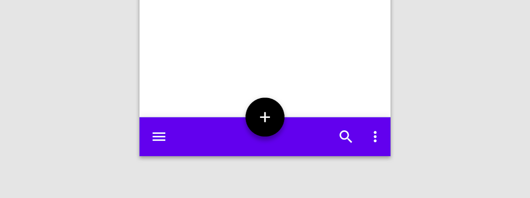
A bottom app bar displays navigation and key actions at the bottom of screens.
SimpleBottomAppBar
@Composable
fun SimpleBottomAppBar() {
    BottomAppBar(windowInsets = AppBarDefaults.bottomAppBarWindowInsets) {
        // Leading icons should typically have a high content alpha
        CompositionLocalProvider(LocalContentAlpha provides ContentAlpha.high) {
            IconButton(onClick = { /* doSomething() */ }) {
                Icon(Icons.Filled.Menu, contentDescription = "Localized description")
            }
        }
        // The actions should be at the end of the BottomAppBar. They use the default medium
        // content alpha provided by BottomAppBar
        Spacer(Modifier.weight(1f, true))
        IconButton(onClick = { /* doSomething() */ }) {
            Icon(Icons.Filled.Favorite, contentDescription = "Localized description")
        }
        IconButton(onClick = { /* doSomething() */ }) {
            Icon(Icons.Filled.Favorite, contentDescription = "Localized description")
        }
    }
}