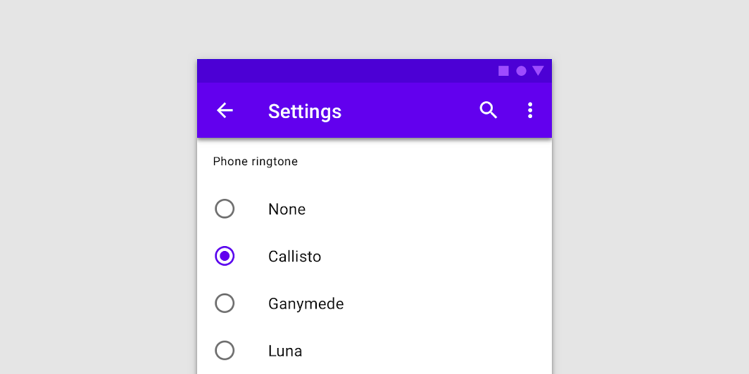
RadioButton
Source set: Common
@Composable
fun RadioButton(
    selected: Boolean,
    onClick: (() -> Unit)?,
    modifier: Modifier = Modifier,
    enabled: Boolean = true,
    interactionSource: MutableInteractionSource? = null,
    colors: RadioButtonColors = RadioButtonDefaults.colors(),
)
Parameters
| selected | whether this radio button is selected or not |
| onClick | callback to be invoked when the RadioButton is clicked. If null, then this RadioButton will not handle input events, and only act as a visual indicator of selected state |
| modifier | Modifier to be applied to the radio button |
| enabled | Controls the enabled state of the RadioButton. When false, this button will not be selectable and appears disabled |
| interactionSource | an optional hoisted MutableInteractionSource for observing and emitting Interactions for this radio button. You can use this to change the radio button's appearance or preview the radio button in different states. Note that if null is provided, interactions will still happen internally. |
| colors | RadioButtonColors that will be used to resolve the color used for this RadioButton in different states. See RadioButtonDefaults.colors. |
