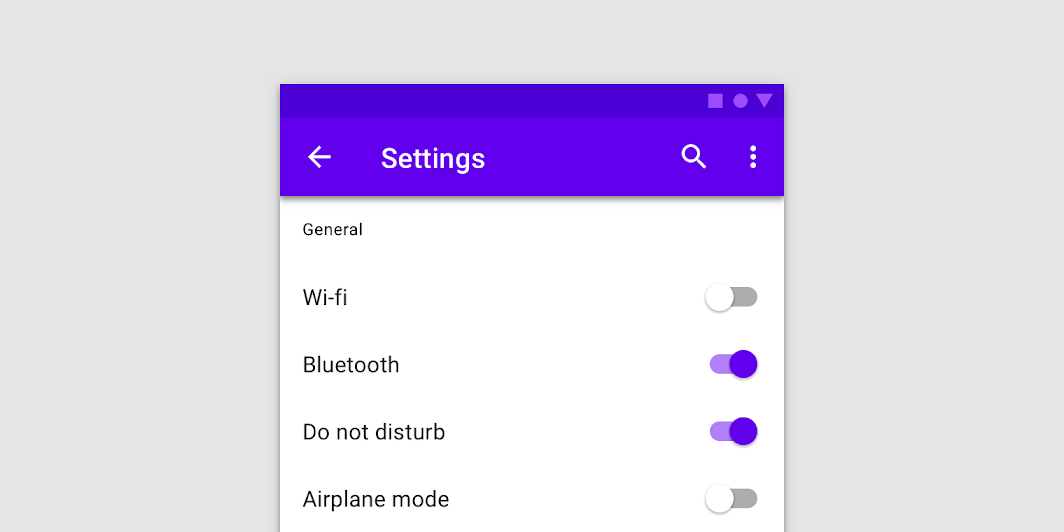
Switch
Source set: Common
@Composable
fun Switch(
    checked: Boolean,
    onCheckedChange: ((Boolean) -> Unit)?,
    modifier: Modifier = Modifier,
    enabled: Boolean = true,
    interactionSource: MutableInteractionSource? = null,
    colors: SwitchColors = SwitchDefaults.colors(),
)
Parameters
| checked | whether or not this component is checked |
| onCheckedChange | callback to be invoked when Switch is being clicked, therefore the change of checked state is requested. If null, then this is passive and relies entirely on a higher-level component to control the "checked" state. |
| modifier | Modifier to be applied to the switch layout |
| enabled | whether the component is enabled or grayed out |
| interactionSource | an optional hoisted MutableInteractionSource for observing and emitting Interactions for this switch. You can use this to change the switch's appearance or preview the switch in different states. Note that if null is provided, interactions will still happen internally. |
| colors | SwitchColors that will be used to determine the color of the thumb and track in different states. See SwitchDefaults.colors. |
