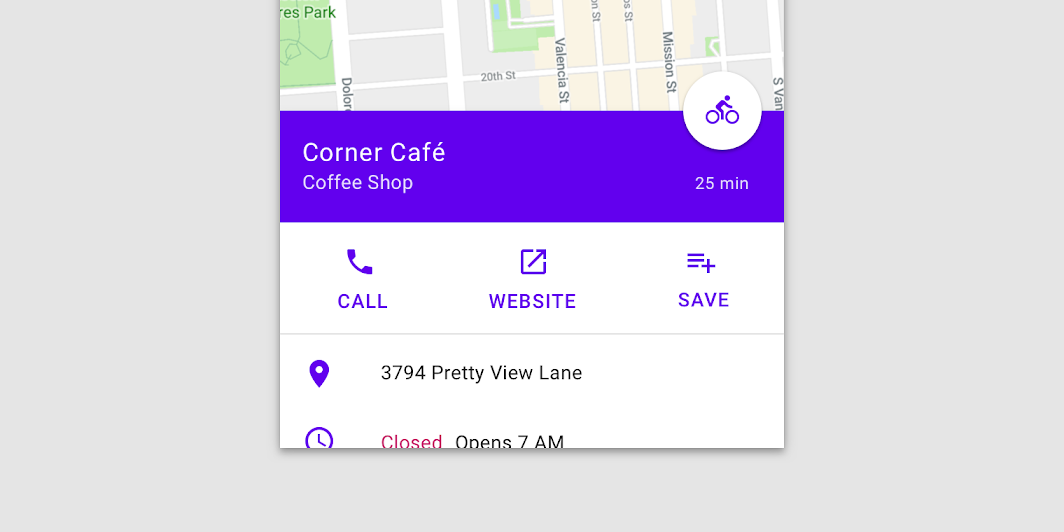
BottomSheetScaffold
Source set: Common
@Composable
fun BottomSheetScaffold(
    sheetContent: @Composable ColumnScope.() -> Unit,
    modifier: Modifier = Modifier,
    scaffoldState: BottomSheetScaffoldState = rememberBottomSheetScaffoldState(),
    topBar: (@Composable () -> Unit)? = null,
    snackbarHost: @Composable (SnackbarHostState) -> Unit = { SnackbarHost(it) },
    floatingActionButton: (@Composable () -> Unit)? = null,
    floatingActionButtonPosition: FabPosition = FabPosition.End,
    sheetGesturesEnabled: Boolean = true,
    sheetShape: Shape = MaterialTheme.shapes.large,
    sheetElevation: Dp = BottomSheetScaffoldDefaults.SheetElevation,
    sheetBackgroundColor: Color = MaterialTheme.colors.surface,
    sheetContentColor: Color = contentColorFor(sheetBackgroundColor),
    sheetPeekHeight: Dp = BottomSheetScaffoldDefaults.SheetPeekHeight,
    backgroundColor: Color = MaterialTheme.colors.background,
    contentColor: Color = contentColorFor(backgroundColor),
    content: @Composable (PaddingValues) -> Unit,
)
Parameters
| sheetContent | The content of the bottom sheet. |
| modifier | An optional Modifier for the root of the scaffold. |
| scaffoldState | The state of the scaffold. |
| topBar | An optional top app bar. |
| snackbarHost | The composable hosting the snackbars shown inside the scaffold. |
| floatingActionButton | An optional floating action button. |
| floatingActionButtonPosition | The position of the floating action button. |
| sheetGesturesEnabled | Whether the bottom sheet can be interacted with by gestures. |
| sheetShape | The shape of the bottom sheet. |
| sheetElevation | The elevation of the bottom sheet. |
| sheetBackgroundColor | The background color of the bottom sheet. |
| sheetContentColor | The preferred content color provided by the bottom sheet to its children. Defaults to the matching content color for sheetBackgroundColor, or if that is not a color from the theme, this will keep the same content color set above the bottom sheet. |
| sheetPeekHeight | The height of the bottom sheet when it is collapsed. If the peek height equals the sheet's full height, the sheet will only have a collapsed state. |
| backgroundColor | The background color of the scaffold body. |
| contentColor | The color of the content in scaffold body. Defaults to either the matching content color for backgroundColor, or, if it is not a color from the theme, this will keep the same value set above this Surface. |
| content | The main content of the screen. You should use the provided PaddingValues to properly offset the content, so that it is not obstructed by the bottom sheet when collapsed. |
