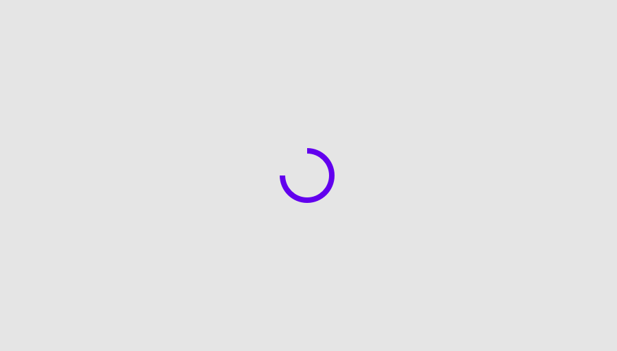


CircularProgressIndicatorSample
@Sampled
@Composable
fun CircularProgressIndicatorSample() {
    var progress by remember { mutableStateOf(0.1f) }
    val animatedProgress by
        animateFloatAsState(
            targetValue = progress,
            animationSpec = ProgressIndicatorDefaults.ProgressAnimationSpec,
        )

    Column(horizontalAlignment = Alignment.CenterHorizontally) {
        CircularProgressIndicator(progress = animatedProgress)
        Spacer(Modifier.requiredHeight(30.dp))
        OutlinedButton(onClick = { if (progress < 1f) progress += 0.1f }) { Text("Increase") }
    }
}