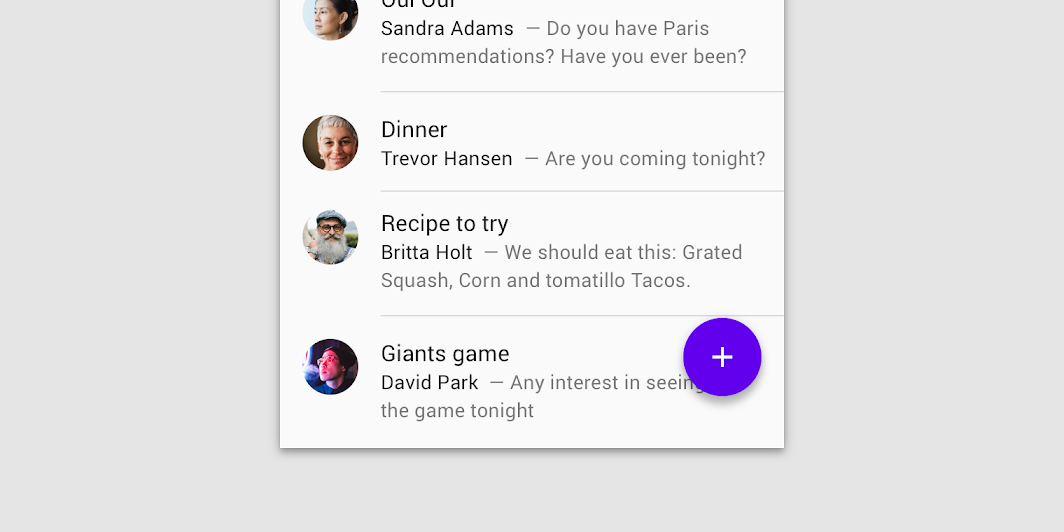
Material Design list Lists are continuous, vertical indexes of text or images.
ThreeLineListItems
@Sampled
@Composable
@OptIn(ExperimentalMaterialApi::class)
fun ThreeLineListItems() {
    Column {
        ListItem(
            text = { Text("Three line list item") },
            secondaryText = {
                Text(
                    "This is a long secondary text for the current list item, " +
                        "displayed on two lines"
                )
            },
            singleLineSecondaryText = false,
            trailing = { Text("meta") },
        )
        Divider()
        ListItem(
            text = { Text("Three line list item") },
            overlineText = { Text("OVERLINE") },
            secondaryText = { Text("Secondary text") },
        )
        Divider()
        ListItem(
            text = { Text("Three line list item with 24x24 icon") },
            secondaryText = {
                Text(
                    "This is a long secondary text for the current list item " +
                        "displayed on two lines"
                )
            },
            singleLineSecondaryText = false,
            icon = { Icon(Icons.Filled.Favorite, contentDescription = null) },
        )
        Divider()
        ListItem(
            text = { Text("Three line list item with trailing icon") },
            secondaryText = {
                Text(
                    "This is a long secondary text for the current list" +
                        " item, displayed on two lines"
                )
            },
            singleLineSecondaryText = false,
            trailing = {
                Icon(Icons.Filled.Favorite, contentDescription = "Localized description")
            },
        )
        Divider()
        ListItem(
            text = { Text("Three line list item") },
            overlineText = { Text("OVERLINE") },
            secondaryText = { Text("Secondary text") },
            trailing = { Text("meta") },
        )
        Divider()
    }
}

// Demos for mixing RTL and LTR ListItems:
ClickableListItems
@Sampled
@Composable
@OptIn(ExperimentalMaterialApi::class)
fun ClickableListItems() {
    Column {
        var switched by remember { mutableStateOf(false) }
        val onSwitchedChange: (Boolean) -> Unit = { switched = it }
        ListItem(
            text = { Text("Switch ListItem") },
            trailing = {
                Switch(
                    checked = switched,
                    onCheckedChange = null, // null recommended for accessibility with screenreaders
                )
            },
            modifier =
                Modifier.toggleable(
                    role = Role.Switch,
                    value = switched,
                    onValueChange = onSwitchedChange,
                ),
        )
        Divider()
        var checked by remember { mutableStateOf(true) }
        val onCheckedChange: (Boolean) -> Unit = { checked = it }
        ListItem(
            text = { Text("Checkbox ListItem") },
            trailing = {
                Checkbox(
                    checked = checked,
                    onCheckedChange = null, // null recommended for accessibility with screenreaders
                )
            },
            modifier =
                Modifier.toggleable(
                    role = Role.Checkbox,
                    value = checked,
                    onValueChange = onCheckedChange,
                ),
        )
        Divider()
    }
}