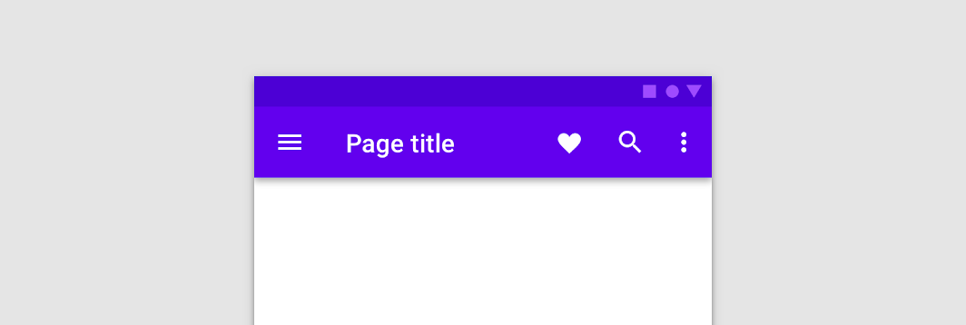

SimpleTopAppBar
@Sampled
@Composable
fun SimpleTopAppBar() {
    TopAppBar(
        windowInsets = AppBarDefaults.topAppBarWindowInsets,
        title = { Text("Simple TopAppBar") },
        navigationIcon = {
            IconButton(onClick = { /* doSomething() */ }) {
                Icon(Icons.Filled.Menu, contentDescription = null)
            }
        },
        actions = {
            // RowScope here, so these icons will be placed horizontally
            IconButton(onClick = { /* doSomething() */ }) {
                Icon(Icons.Filled.Favorite, contentDescription = "Localized description")
            }
            IconButton(onClick = { /* doSomething() */ }) {
                Icon(Icons.Filled.Favorite, contentDescription = "Localized description")
            }
        },
    )
}