
When building cross-platform apps with Compose Multiplatform (CMP), one thing stands out: Material Compose was never built with cross-platform in mind.
This is counter-intuitive as CMP promises to build apps on every platform with a single codebase. However, controls such as buttons and text fields look huge on desktop and web, and keyboard navigation is not supported.
Today, we are happy to introduce Composables One: truly universal components for any platform.
A great replacement for Material Compose
Composables One has two goals:
First, to provide a great alternative to Material Compose that addresses the gaps that come with Material Compose, such as true universal components, missing components, and keyboard navigation.
Second, to be a great starting point for your own component system. Instead of giving you a static Gradle dependency, Composables One is distributed as a single zip file.
This way, you can check out all components in your codebase and customize them as you move forward when needed.
Powered by Compose Unstyled
Composables One is built on top of Compose Unstyled, our very own Compose Multiplatform library that provides the extra design system layer that Compose is missing.
Instead of relying on Material Compose as the basis for the components and having to work around all of Material's issues, we built all components from scratch on top of Foundation.
The improvement in quality and developer experience is evident from all the positive remarks by developers and the stars on the open-source repo.
Huge shoutout to the community for making this possible!
Attention to (multiplatform) detail without lock-in
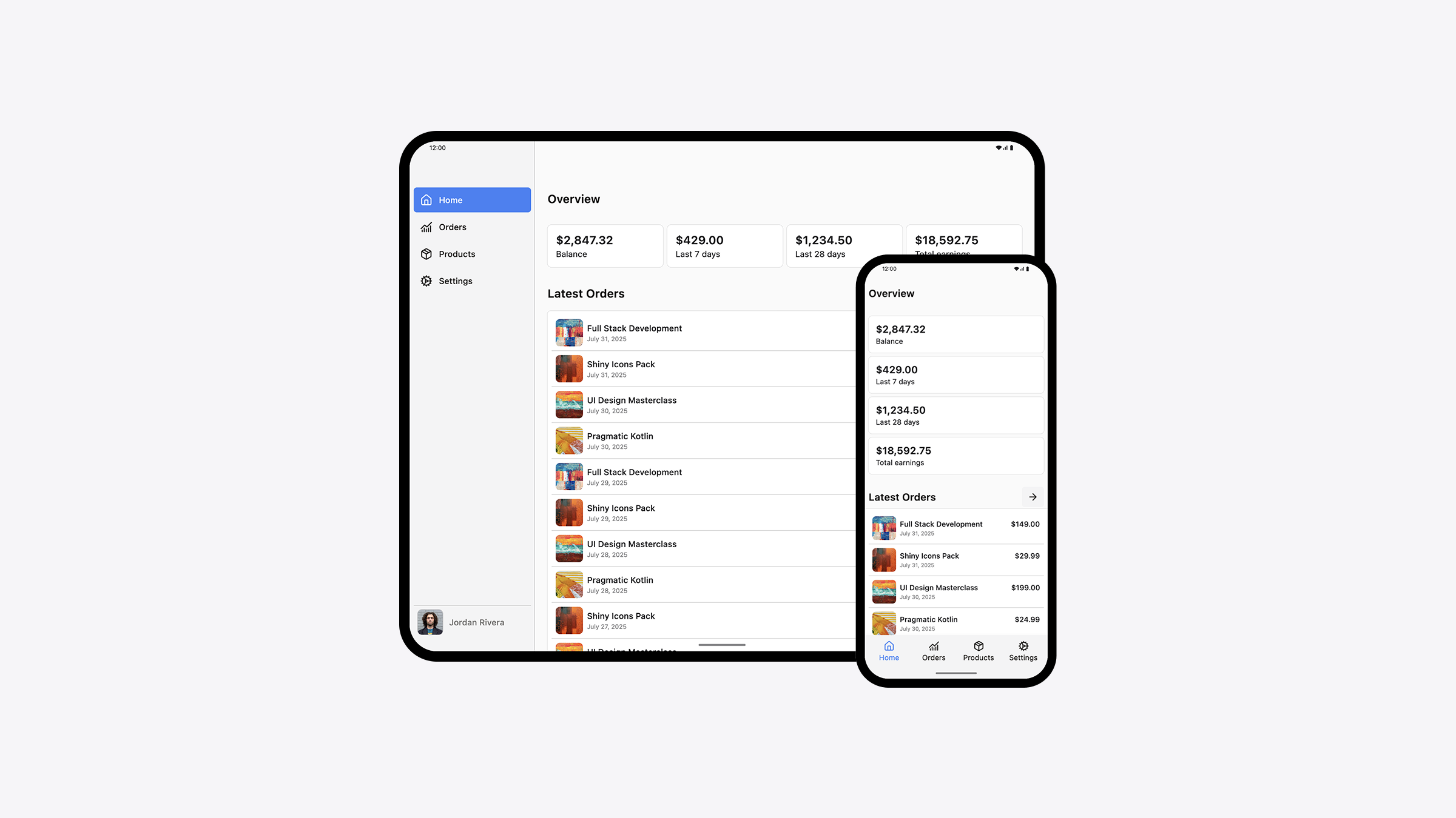
Components in Composables One adapt to the platform they are running on.
When using it on mobile devices where touch is the main source of input, all controls have a larger size. On desktop and web, controls occupy less space as the user's main input device is the keyboard and mouse.
Composables One comes with dedicated Screen Scaffolds for building responsive screens more easily. As a result, you have a standard way to build apps for any screen size and platform.
Carefully crafted API for a great developer experience
A great component library emphasizes not only looks and user experience, but also developer experience. It must be a joy to work with as it is your tool for building great apps.
As a result, a lot of care and thought has been put into the API for Composables One.
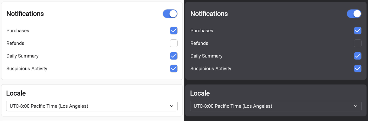
Light and dark support
All components in Composables One are themeable. There is built-in support for both light and dark themes.
Give it a try
Try out the demo app built using Composables One, discover all components in the documentation and consider purchasing a one-time license.
We are confident you will love Composables One. If you are not happy with the quality, there is a 30-day money-back guarantee, so there is nothing to lose.
If you want to discuss about this article, view the related discussion.
Happy coding!
