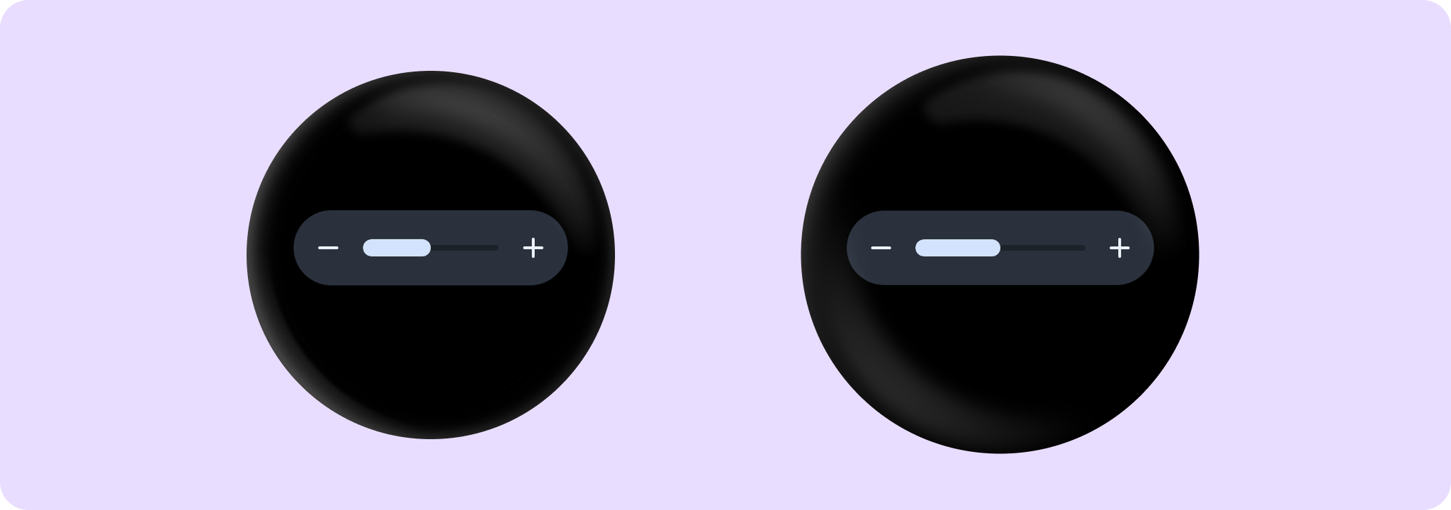
Slider
Source set: Android
@Composable
public fun Slider(
    value: Float,
    onValueChange: (Float) -> Unit,
    steps: Int,
    modifier: Modifier = Modifier,
    decreaseIcon: @Composable () -> Unit = { SliderDefaults.DecreaseIcon() },
    increaseIcon: @Composable () -> Unit = { SliderDefaults.IncreaseIcon() },
    enabled: Boolean = true,
    valueRange: ClosedFloatingPointRange<Float> = 0f..(steps + 1).toFloat(),
    segmented: Boolean = steps <= MaxSegmentSteps,
    shape: Shape = SliderDefaults.shape,
    colors: SliderColors = SliderDefaults.sliderColors(),
)
Parameters
| value | Current value of the Slider. If outside of valueRange provided, value will be coerced to this range. |
| onValueChange | Lambda in which value should be updated. |
| steps | Specifies the number of discrete values, excluding min and max values, evenly distributed across the whole value range. Must not be negative. If 0, slider will have only min and max values and no steps in between. |
| decreaseIcon | A slot for an icon which is placed on the decrease (start) button such as SliderDefaults.DecreaseIcon. |
| increaseIcon | A slot for an icon which is placed on the increase (end) button such as SliderDefaults.IncreaseIcon. |
| modifier | Modifiers for the Slider layout. |
| enabled | Controls the enabled state of the slider. When false, this slider will not be clickable. |
| valueRange | Range of values that Slider value can take. Passed value will be coerced to this range. |
| segmented | A boolean value which specifies whether a bar will be split into segments or not. Recommendation is while using this flag do not have more than MaxSegmentSteps steps as it might affect user experience. By default true if number of steps is <= MaxSegmentSteps. |
| shape | Defines slider's shape. It is strongly recommended to use the default as this shape is a key characteristic of the Wear Material3 Theme. |
| colors | SliderColors that will be used to resolve the background and content color for this slider in different states. |
Slider
Source set: Android
@Composable
public fun Slider(
    value: Int,
    onValueChange: (Int) -> Unit,
    valueProgression: IntProgression,
    modifier: Modifier = Modifier,
    decreaseIcon: @Composable () -> Unit = { SliderDefaults.DecreaseIcon() },
    increaseIcon: @Composable () -> Unit = { SliderDefaults.IncreaseIcon() },
    enabled: Boolean = true,
    segmented: Boolean = valueProgression.stepsNumber() <= MaxSegmentSteps,
    shape: Shape = SliderDefaults.shape,
    colors: SliderColors = SliderDefaults.sliderColors(),
)
Parameters
| value | Current value of the Slider. If outside of valueProgression provided, value will be coerced to this range. |
| onValueChange | Lambda in which value should be updated. |
| valueProgression | Progression of values that Slider value can take. Consists of rangeStart, rangeEnd and step. Range will be equally divided by step size. |
| decreaseIcon | A slot for an icon which is placed on the decrease (start) button such as SliderDefaults.DecreaseIcon. |
| increaseIcon | A slot for an icon which is placed on the increase (end) button such as SliderDefaults.IncreaseIcon. |
| modifier | Modifiers for the Slider layout. |
| enabled | Controls the enabled state of the slider. When false, this slider will not be clickable. |
| segmented | A boolean value which specifies whether a bar will be split into segments or not. Recommendation is while using this flag do not have more than MaxSegmentSteps steps as it might affect user experience. By default true if number of steps is <= MaxSegmentSteps. |
| shape | Defines slider's shape. It is strongly recommended to use the default as this shape is a key characteristic of the Wear Material3 Theme. |
| colors | SliderColors that will be used to resolve the background and content color for this slider in different states. |
